


According to the seasonally adjusted data, M2 expanded by $83B in February. January was revised down from $245B to $176B. No doubt, money supply growth is decelerating but is still far from contractionary.
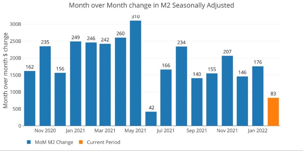
Figure 1: MoM M2 Change (Seasonally Adjusted)
The table below shows that M2 is decelerating quite a bit at 4.7% when compared to the 6-month and 12-month averages (8.9% and 11% respectively).
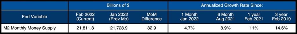
Figure 2: M2 Growth Rates
As can be seen below, the current rate of 4.7% in February has actually fallen below the 10-year average for February of 6.6%.
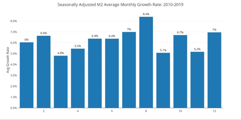
Figure 3: Average Monthly Growth Rates
The Fed only offers weekly data that is not seasonally adjusted. The chart shows how the rebound in non-seasonally adjusted money supply is quite weak compared to recent history, especially given that Dec 27 concluded 9 weeks of expanding M2.
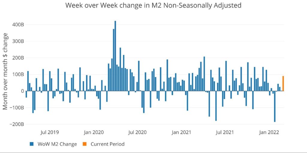
Figure 4: WoW M2 Change
The “Wenzel” 13-week Money Supply
The late Robert Wenzel of Economic Policy Journal used a modified calculation to track Money Supply. He used a trailing 13-week average growth rate annualized as defined in his book The Fed Flunks. He specifically used the weekly data that was not seasonally adjusted. His analogy was that in order to know what to wear outside, he wants to know the current weather, not temperatures that have been averaged throughout the year.
The objective of the 13-week average is to smooth some of the choppy data without bringing in too much history that could blind someone from seeing what’s in front of them. The 13-week average growth rate can be seen in the table below. Decelerating trends are in red and accelerating trends in green. Money Supply growth on a 13-week annualized basis was mostly accelerating for 16 weeks in a row. It has now been flat or down for 7 weeks in a row.


Figure 5: WoW Trailing 13-week Average Money Supply Growth
The plot below helps show the seasonality of the Money Supply and compares the current year to previous years. It shows that the current trajectory is starting to look way down. In recent years, this has reversed strongly in April, but the Fed is currently trying to rein in inflation. This could cause money supply to decelerate further in the months ahead.
Because M2 growth has been extremely high in recent years, the market has become used to a certain level of growth. This deceleration could quickly put pressure on the stock market.
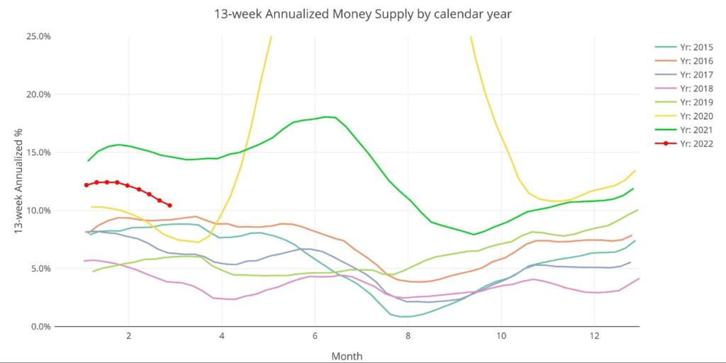
Figure 6: Yearly 13-week Overlay
Behind the Inflation Curve
The graph below shows YoY M2 compared to inflation and Fed Funds. As discussed before, the current trajectory is looking uncomfortably similar to the early 1970s with three major differences.
- The money growth has been more extreme in recent years
- Inflation is actually higher if measured the same way
- The Fed is much further behind the curve
As shown below, inflation tends to lag increases in M2 by about 1-2 years. Notice how all the black spikes occur a few years after the large orange bars. While most forecasters are talking about peak inflation occurring now, the chart below suggests we are in the early innings. Keep in mind, inflation only reversed once the Fed brought rates up above the inflation rate.
However, this time they are further below the rate of inflation than ever before. In addition, the chart shows that it takes time for higher rates to bring inflation back down. The Fed does not have the luxury to wait for higher rates to work when they are so far behind the curve.
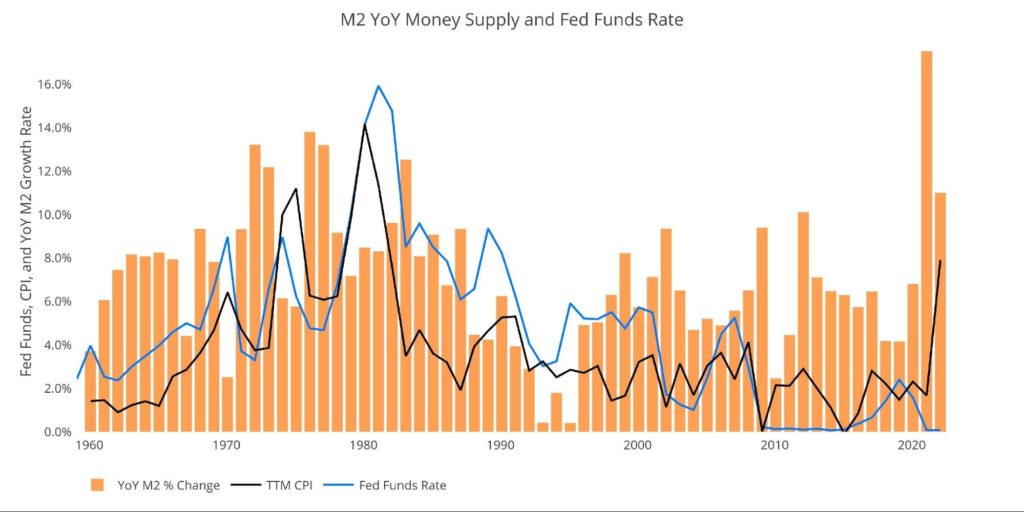
Figure 7: YoY M2 Change with CPI and Fed Funds
Historical Perspective
The charts below are designed to put the current trends into historical perspective. The orange bars represent annualized percentage change rather than raw dollar amount. As can be seen, the most recent period is more comparable to growth rates before Covid.
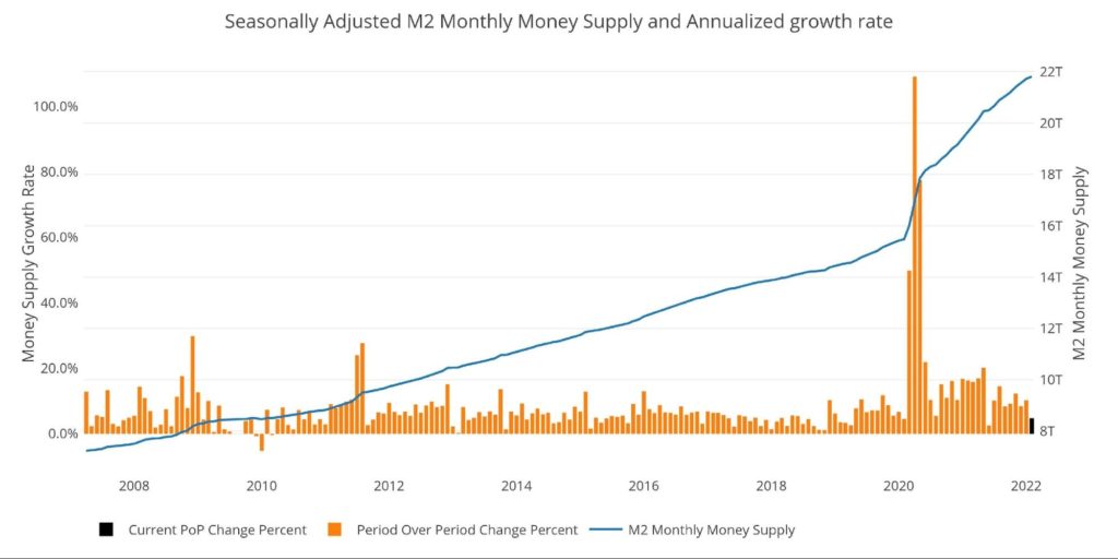
Figure 8: M2 with Growth Rate
Taking a historical look at the 13-week annualized average also shows the unprecedented growth seen over the past 24 months. This chart overlays the log return of the S&P. Mr. Wenzel proposed that large drops in Money Supply could be a sign of stock market pullbacks.
His theory, derived from Murray Rothbard, states that when the market experiences a shrinking growth rate of Money Supply (or even negative) it can create liquidity issues in the stock market, leading to a sell-off. While not a perfect predictive tool, many of the dips in Money Supply precede market dips. Specifically, the major dips in 2002 and 2008 from 10% down to 0%.
This current drop in money supply could make it hard for the stock market to bounce back and make new all-time highs soon.
Please note the chart only shows market data through Feb 28 to align with available M2 data. This only captures a short time period of the war in Ukraine.
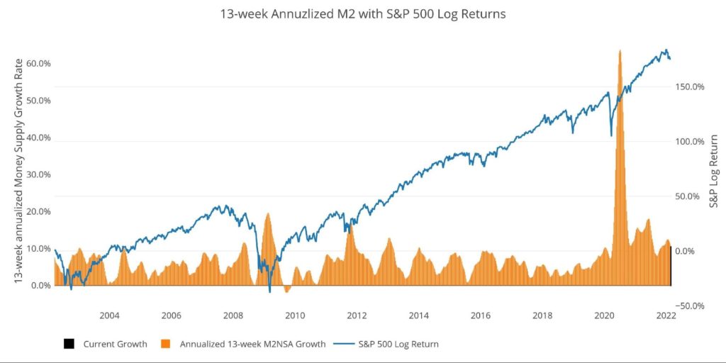
Figure 9: 13-week M2 Annualized and S&P 500
One other consideration is the massive liquidity buildup in the system. The Fed offers Reverse Repurchase Agreements (reverse repos). Essentially this is a tool that allows financial institutions to swap cash for instruments on the Fed balance sheet.
Current Reverse Repo hit a record $1.9T on Dec 31, dwarfing the old records of ~$500B in 2016-2017. The latest rate is $1.76T and growing rapidly. The reverse repos typically top out at quarter-end before coming back down. The current spile shows a trajectory that could very well take out the Dec 31 high and even exceed $2T! It will retreat after March 31, but this would still be a massive figure!
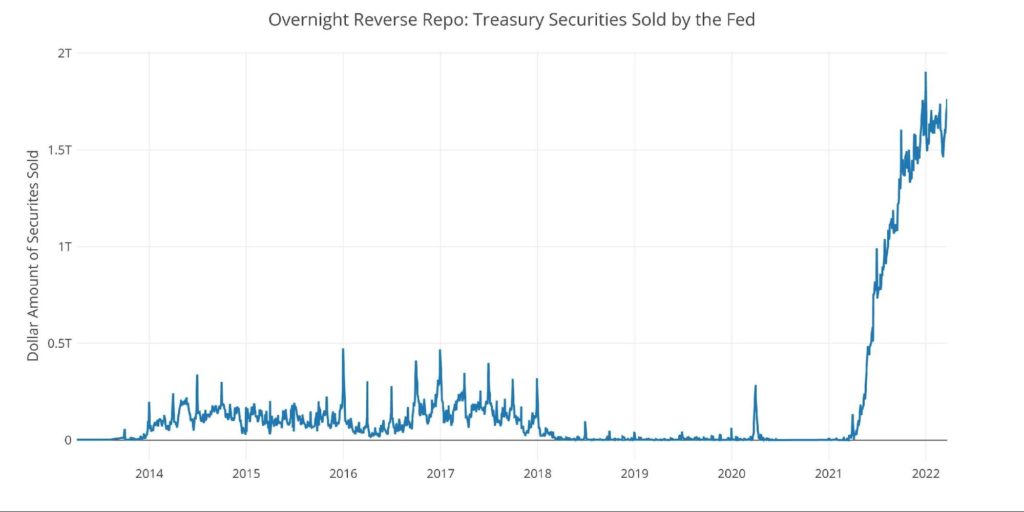
Figure 10: Fed Reverse Repurchase Agreements
What it means for Gold and Silver
Inflation is an expansion of the Money Supply that generally leads to higher prices. Therefore, gold and silver can be used as insurance assets to protect against dollar devaluation (higher prices). Money Supply has been growing at alarming rates for years, and absolutely exploded over the last 2 years. It should be no surprise to any rational individual that this has shown up big time in the CPI.
That being said, the current deceleration is noteworthy. It’s quite possible that the market could see turbulence as there is less fuel to keep propelling markets higher. Gold and silver have a lot of cross-currents at the moment as shown in the recent technical analysis. Regardless of the short-term movements, the math shows the Fed cannot raise rates without causing catastrophic damage to the Federal Deficit and the Economy at large. Any pullback in gold and silver (if one even occurs), could be short-lived.
Data Source: https://fred.stlouisfed.org/series/M2SL and also series WM2NS and RRPONTSYD. Historical data changes over time so numbers of future articles may not match exactly. M1 is not used because the calculation was recently changed and backdated to March 2020, distorting the graph.
Data Updated: Monthly on fourth Tuesday of the month on 3-week lag
Most recent data: Feb 28, 2022
Interactive charts and graphs can always be found on the Exploring Finance dashboard: https://exploringfinance.shinyapps.io/USDebt/

Call 1-888-GOLD-160 and speak with a Precious Metals Specialist today!
Buka akaun dagangan patuh syariah anda di Weltrade.
Source link