


The analysis below covers the Employment picture released on the first Friday of every month. While most of the attention goes to the headline number, it can be helpful to look at the details, revisions, and other reports to get a better gauge of what is really going on.
Current Trends
While the BLS reported 353k jobs, the Household Survey actually reported a loss of -31k. December was an even bigger miss with 333k vs -683k.
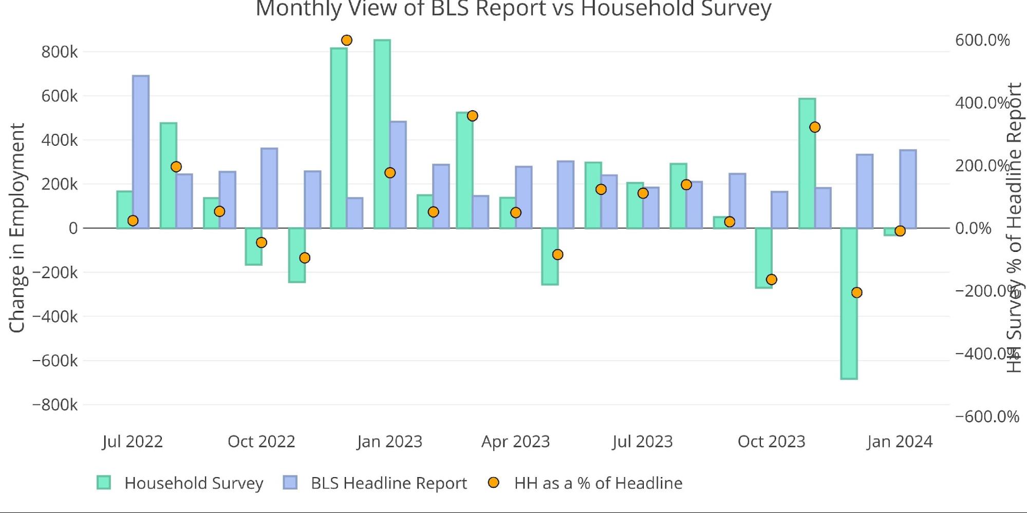
Figure: 1 Primary Report vs Household Survey – Monthly
While November surprised to the upside, the overall trend continues to be the Household survey coming in lower than the BLS Report. This is important because many believe the Household survey is a more accurate measure of employment when compared to the headline number. The numbers have been deviating more and more each year since 2018.
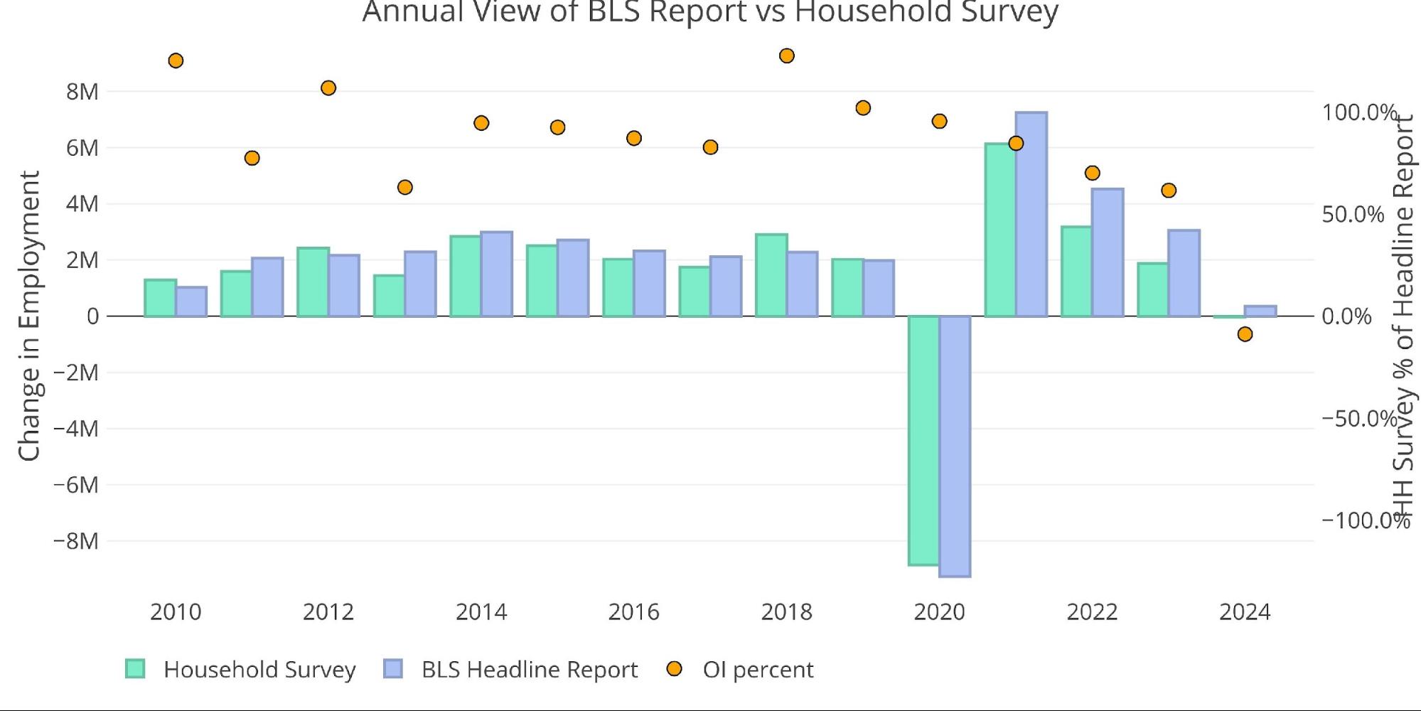
Figure: 2 Primary Report vs Household Survey – Annual
The BLS also publishes the data behind their Birth/Death assumptions. January is always a big drop, but this was smaller than last year (-144k in Jan 2023 vs -121k in Jan 2024). Birth/death specifically refers to assumptions made about new business being formed.
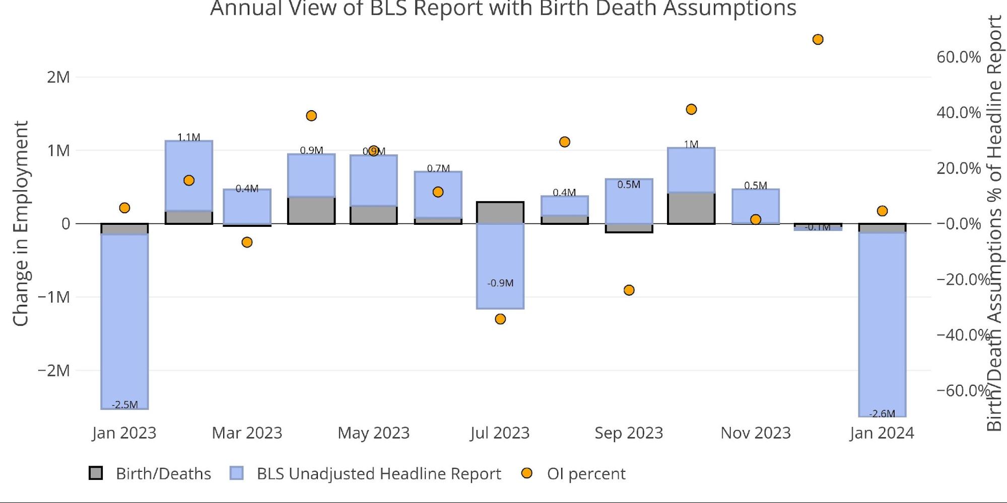
Figure: 3 Primary Unadjusted Report With Birth Death Assumptions – Monthly
Digging Into the Report
The 353k jobs surprised to the upside and was the biggest report since Jan 2023.
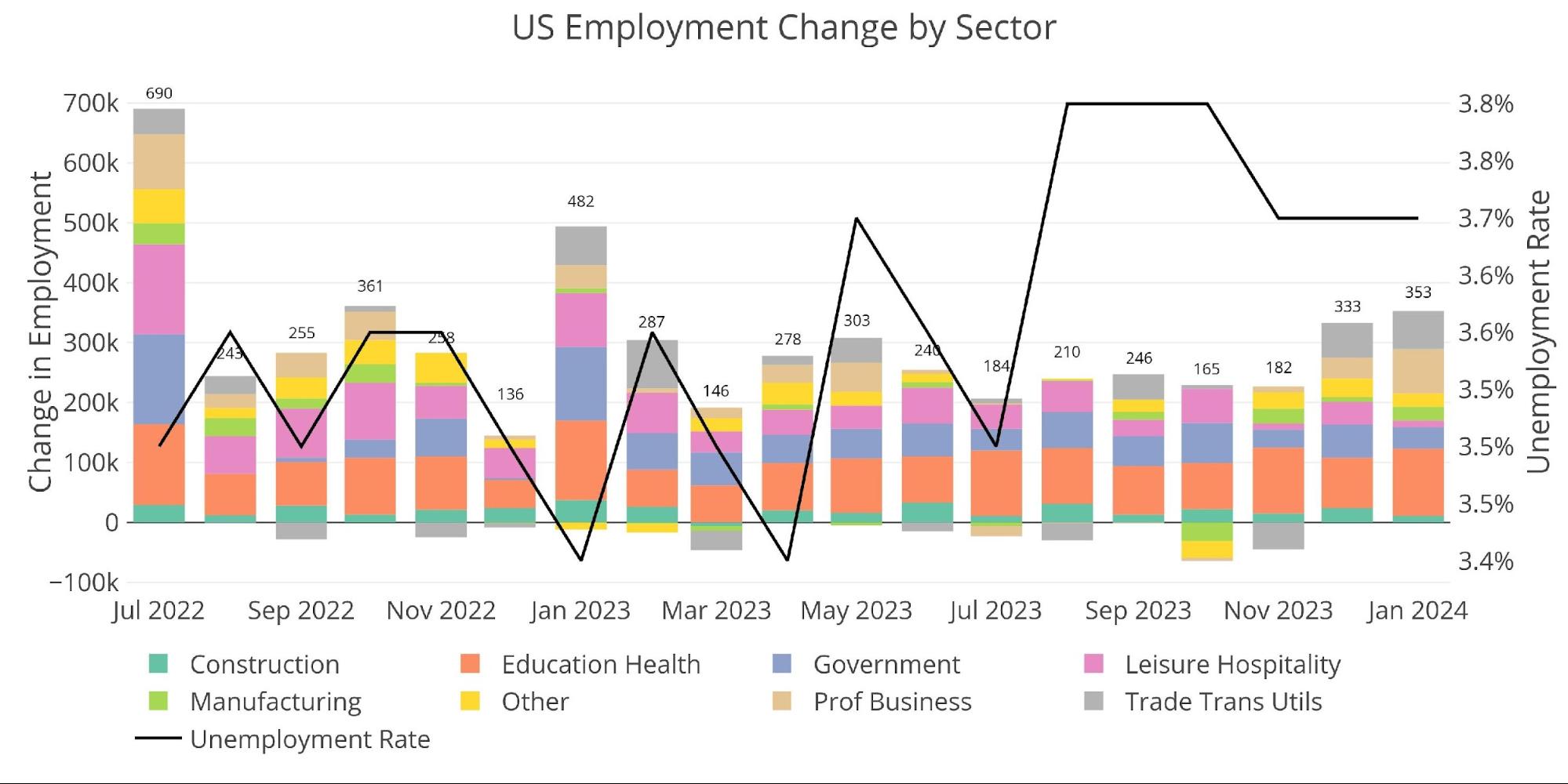
Figure: 4 Change by sector
The number of multiple job holders has climbed again.
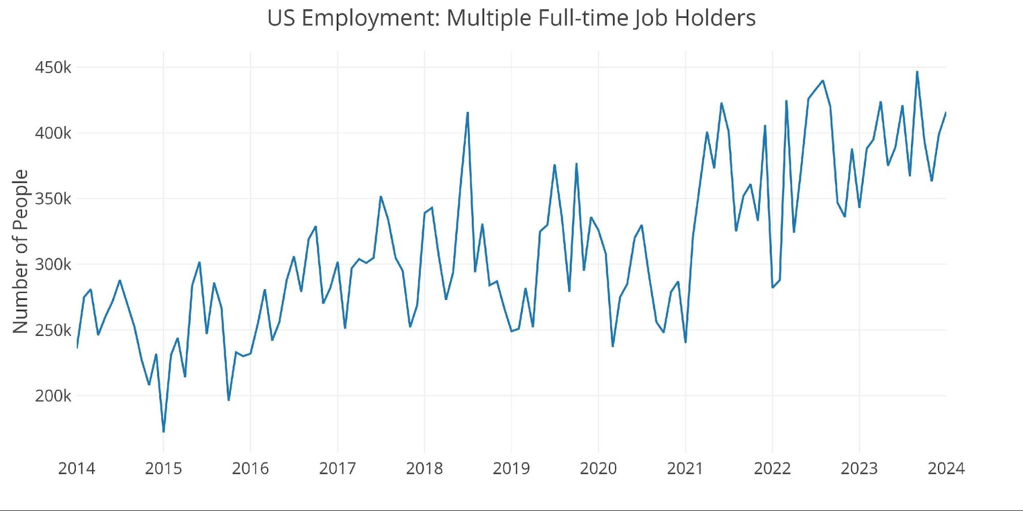
Figure: 5 Multiple Full-Time Employees
Jobs by Category
With the unexpectedly strong report, 5 of the 8 employment categories were actually above the 12-month trend, with some well above (Professional Business and Trade/Transport).
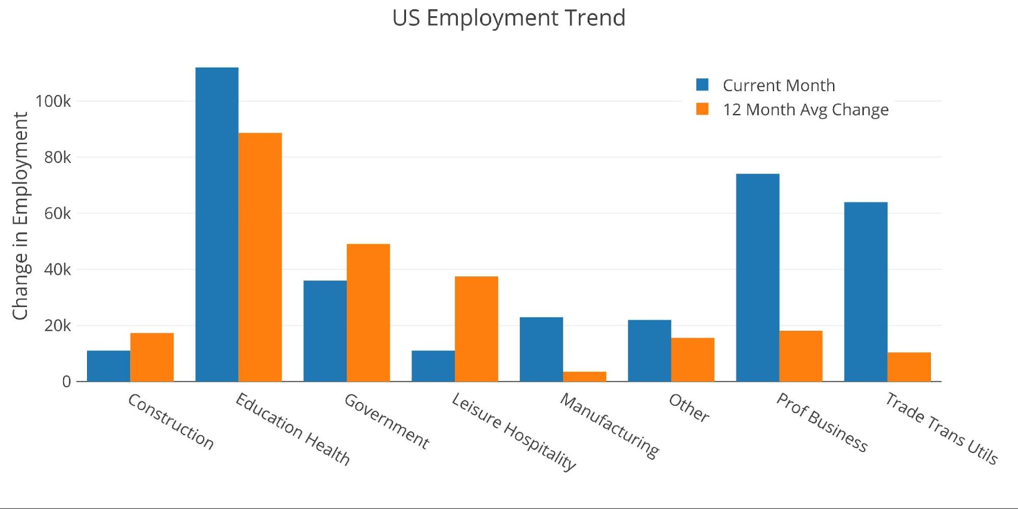
Figure: 6 Current vs TTM
The table below shows a detailed breakdown of the numbers.
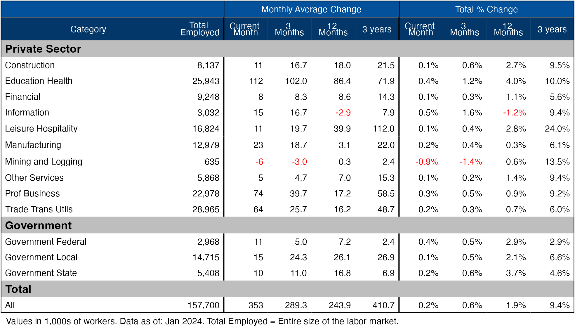
Figure: 7 Labor Market Detail
Revisions
Another data point to highlight is the number of revisions. Over the last three months, the numbers have actually been revised up.
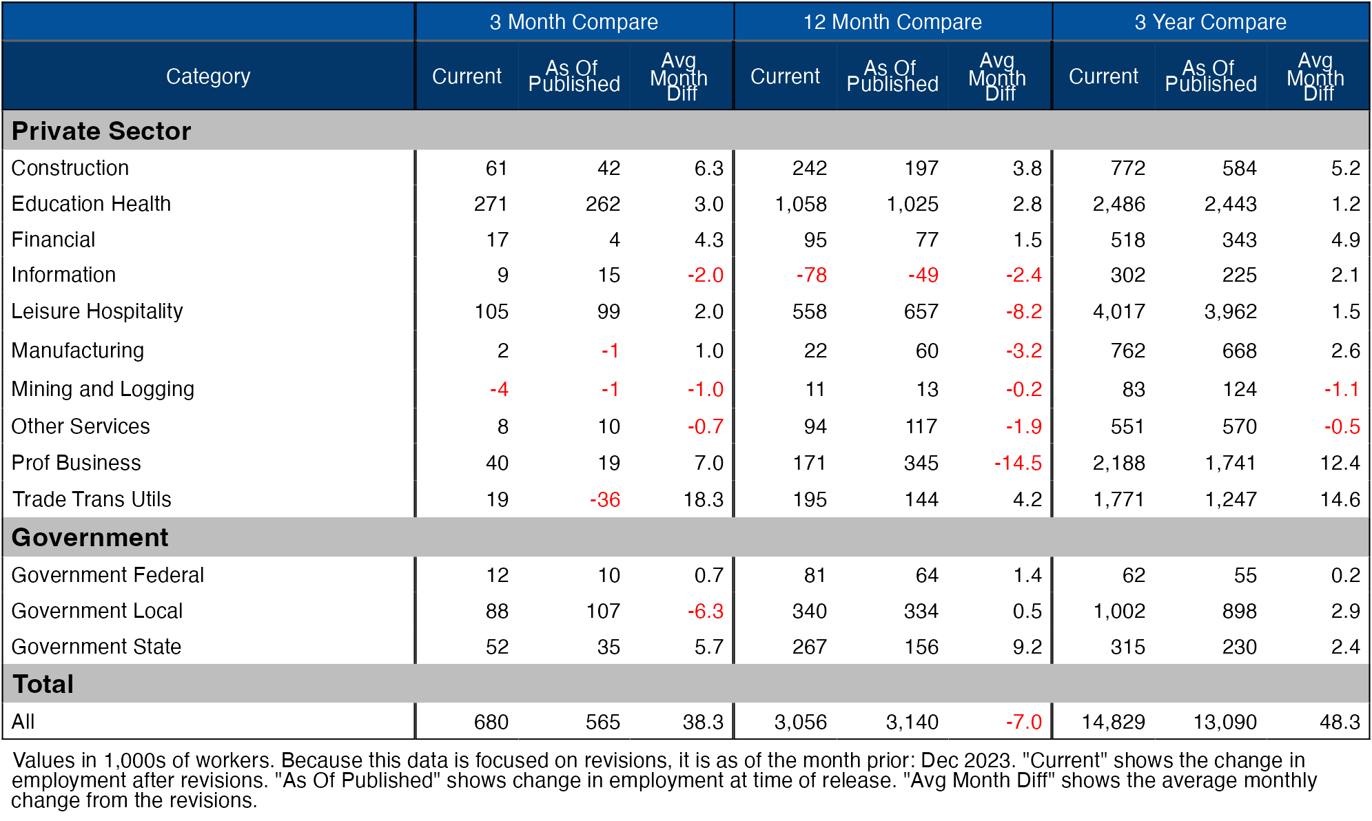
Figure: 8 Revisions
Historical Perspective
The chart below shows data going back to 1955.
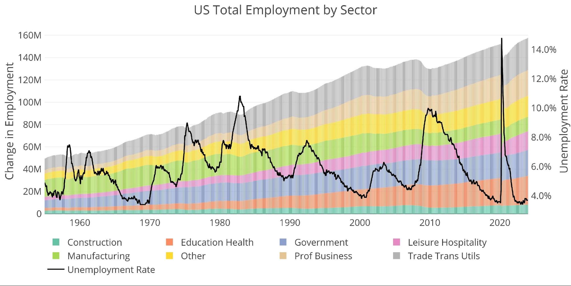
Figure: 9 Historical Labor Market
The labor force participation rate is still well below the highs before the Global Financial Crisis.
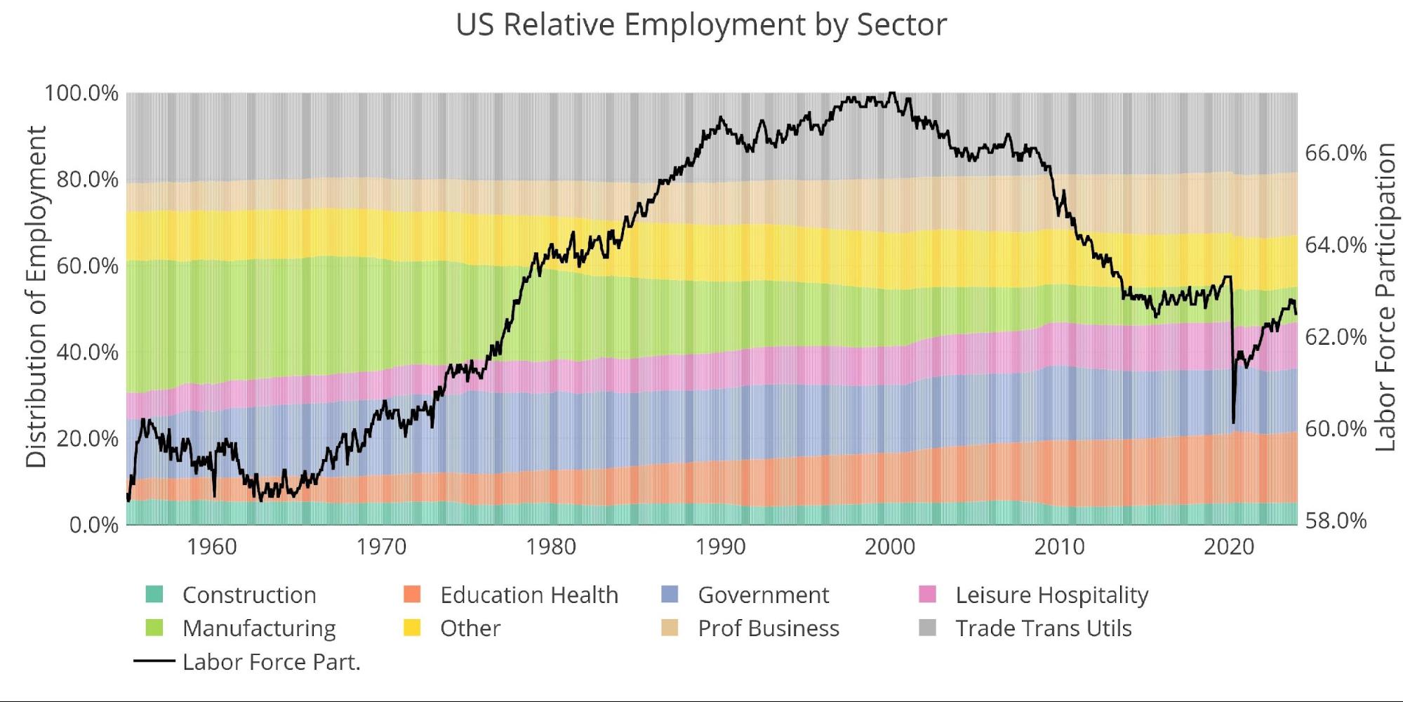
Figure: 10 Labor Market Distribution
Data Source: https://fred.stlouisfed.org/series/PAYEMS and also series CIVPART
Data Updated: Monthly on first Friday of the month
Last Updated: Jan 2024
Interactive charts and graphs can always be found on the Exploring Finance dashboard: https://exploringfinance.shinyapps.io/USDebt/

Call 1-888-GOLD-160 and speak with a Precious Metals Specialist today!
Buka akaun dagangan patuh syariah anda di Weltrade.
Source link