


According to the seasonally adjusted data, M2 increased by $23B in May. This was the smallest monthly increase in M2 since the start of Covid aside from the contraction last month, which was the first monthly reduction in adjusted M2 in 12 years!
Despite extremely small growth, money supply is still expanding which is going to make it very hard for inflation to get back to 2%. Even though inflation is unlikely to come down, the stock market and economy are built on a rapidly expanding money supply. With such sluggish growth, it will be very challenging for the stock market to hit new highs and the economy to avoid recession.
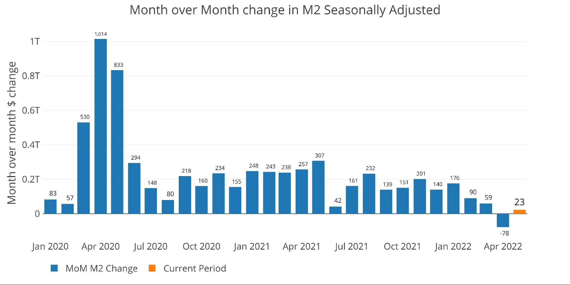
Figure: 1 MoM M2 Change (Seasonally Adjusted)
The chart below shows non-seasonally adjusted money supply. The current slowdown can be seen very clearly when compared to the growth since Covid. Three of the last six months have seen reductions in the money supply. This is clearly not enough to reverse the massive increases in the money supply that took place in 2020 and 2021.
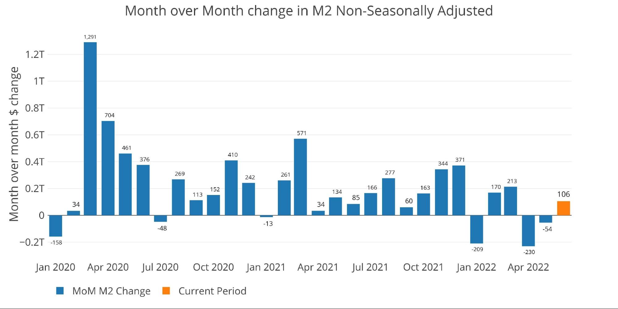
Figure: 2 MoM M2 Change (Non-Seasonally Adjusted)
The table below shows this slowdown more clearly. Over the past three years, M2 growth has averaged 14.1% annualized. In the past year, that has fallen to 6.5%, dipping to 3.9% over the last 6 months, and falling to 1.3% in the most recent month. This is a dramatic slowdown.

Figure: 3 M2 Growth Rates
When looking at the average monthly growth rate by month before Covid, May historically expands at an annualized 6.3%. This compares to 1.3% for the current month.
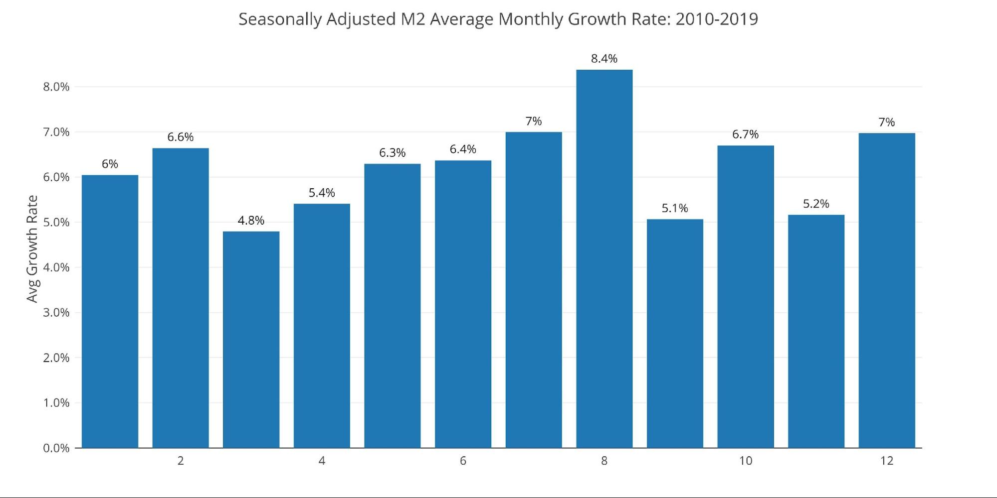
Figure: 4 Average Monthly Growth Rates
The Fed only offers weekly data that is not seasonally adjusted. The chart below shows that May probably avoided being negative by a $106B expansion in the most recent week.
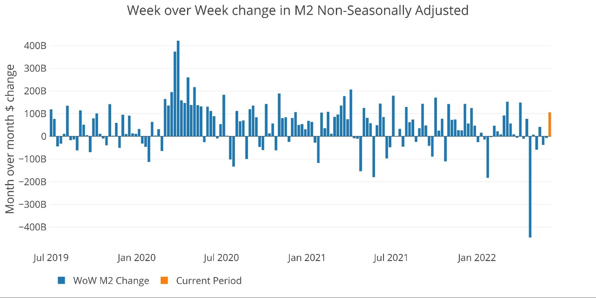
Figure: 5 WoW M2 Change
The “Wenzel” 13-week Money Supply
The late Robert Wenzel of Economic Policy Journal used a modified calculation to track Money Supply. He used a trailing 13-week average growth rate annualized as defined in his book The Fed Flunks. He specifically used the weekly data that was not seasonally adjusted. His analogy was that in order to know what to wear outside, he wants to know the current weather, not temperatures that have been averaged throughout the year.
The objective of the 13-week average is to smooth some of the choppy data without bringing in too much history that could blind someone from seeing what’s in front of them. The 13-week average growth rate can be seen in the table below. Decelerating trends are in red and accelerating trends in green.
Growth has now reached 3.02% which is the lowest reading in more than 60 weeks and is the 19th straight week of decelerating money supply.


Figure: 6 WoW Trailing 13-week Average Money Supply Growth
The plot below helps show the seasonality of the Money Supply and compares the current year to previous years. It shows the current trajectory moving down quite steeply. Money supply growth is now at the slowest growth for this time of year going back to at least 2013.
The Money Supply growth rate does not typically bottom until August, meaning that money supply growth could definitely turn negative in the months ahead. Again, this reduction is not strong enough to halt inflation but it will most certainly hurt the economy and stock market.
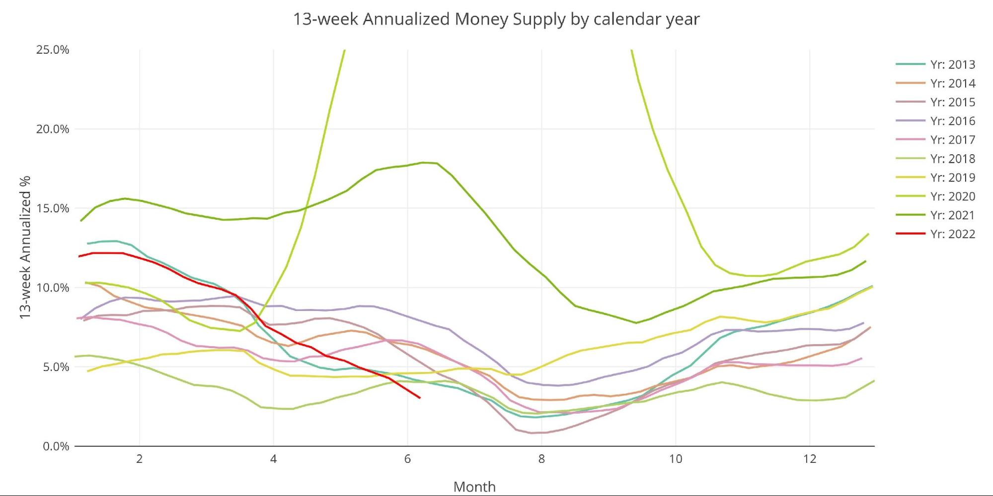
Figure: 7 Yearly 13-week Overlay
Behind the Inflation Curve
To combat rising prices, the Fed must undo most of the money it has created over the last several years. This would require bringing interest rates above the rate of inflation.
Unfortunately, the chart below shows that the Fed has never been further behind the inflation curve. A recession on its own will not cure this inflation problem because of the lagged effects. Looking at the period of 1970, inflation always moved higher on a delay after significant expansion in the money supply. Price increases are still waiting to feel the full effects of the M2 growth. Furthermore, history shows it required rates higher than inflation to bring prices back down.
The blue line below (Fed Funds Rate) has almost always gotten above the black line (CPI) to force inflation back down. The one anomaly was in 2011 after the Great Recession. The mainstream is now assuming this is the norm, but the chart shows that it’s far more common that interest rates must exceed inflation to bend the curve back down. The recent period has made the Fed complacent. This is very dangerous!
Note: This chart does not reflect the most recent 75 bps hike
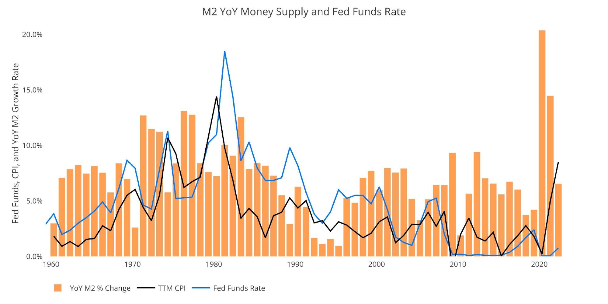
Figure: 8 YoY M2 Change with CPI and Fed Funds
Historical Perspective
The charts below are designed to put the current trends into historical perspective. The orange bars represent annualized percentage change rather than raw dollar amount. The current slowdown can be seen on the right side with the black bar at the smallest level since November 2018.
If a few months of M2 slow down can cause this much pain across the economy (stock market, real estate, bond yields, etc.), how much carnage would unfold in a prolonged fight against inflation where M2 had to shrink consistently for months?
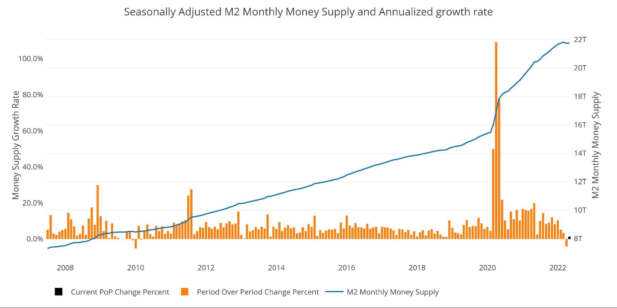
Figure: 9 M2 with Growth Rate
Taking a historical look at the 13-week annualized average also shows the current predicament. This chart overlays the log return of the S&P. Mr. Wenzel proposed that large drops in Money Supply could be a sign of stock market pullbacks. His theory, derived from Murray Rothbard, states that when the market experiences a shrinking growth rate of Money Supply (or even negative) it can create liquidity issues in the stock market, leading to a sell-off.
The current value of 3.0% is the lowest value since December 2018. Remember that 2018 Q4 is right when the Fed had to pause the last tightening cycle because of the market pullback.
While not a perfect predictive tool, many of the dips in Money Supply precede market dips. Specifically, the major dips in 2002 and 2008 from 10% down to 0%. The economy is now grappling with a peak growth rate of 63.7% in July 2020 down to 3%. This is a major collapse.
The latest stock market pullback is further evidence of this relationship. Based on the chart below, history would indicate that the market pullback is just getting started.
Please note the chart only shows market data through June 6 to align with available M2 data.

Figure: 10 13-week M2 Annualized and S&P 500
One other consideration is the massive liquidity buildup in the system. The Fed offers Reverse Repurchase Agreements (reverse repos). Essentially this is a tool that allows financial institutions to swap cash for instruments on the Fed balance sheet.
Current Reverse Repo exceeded $2T on May 23 for the first time in history. This dwarfs the old records of ~$500B in 2016-2017. Repos hit a record $2.3T on June 23rd but will likely see a new record on June 30 at quarter end when Reverse Repos tend to peak.
Bottom line, even though M2 has slowed there is still trillions of dollars in liquidity sloshing around. New money will not be available to prop up the stock market, but excess liquidity is still available to bid up prices and keep inflation elevated.
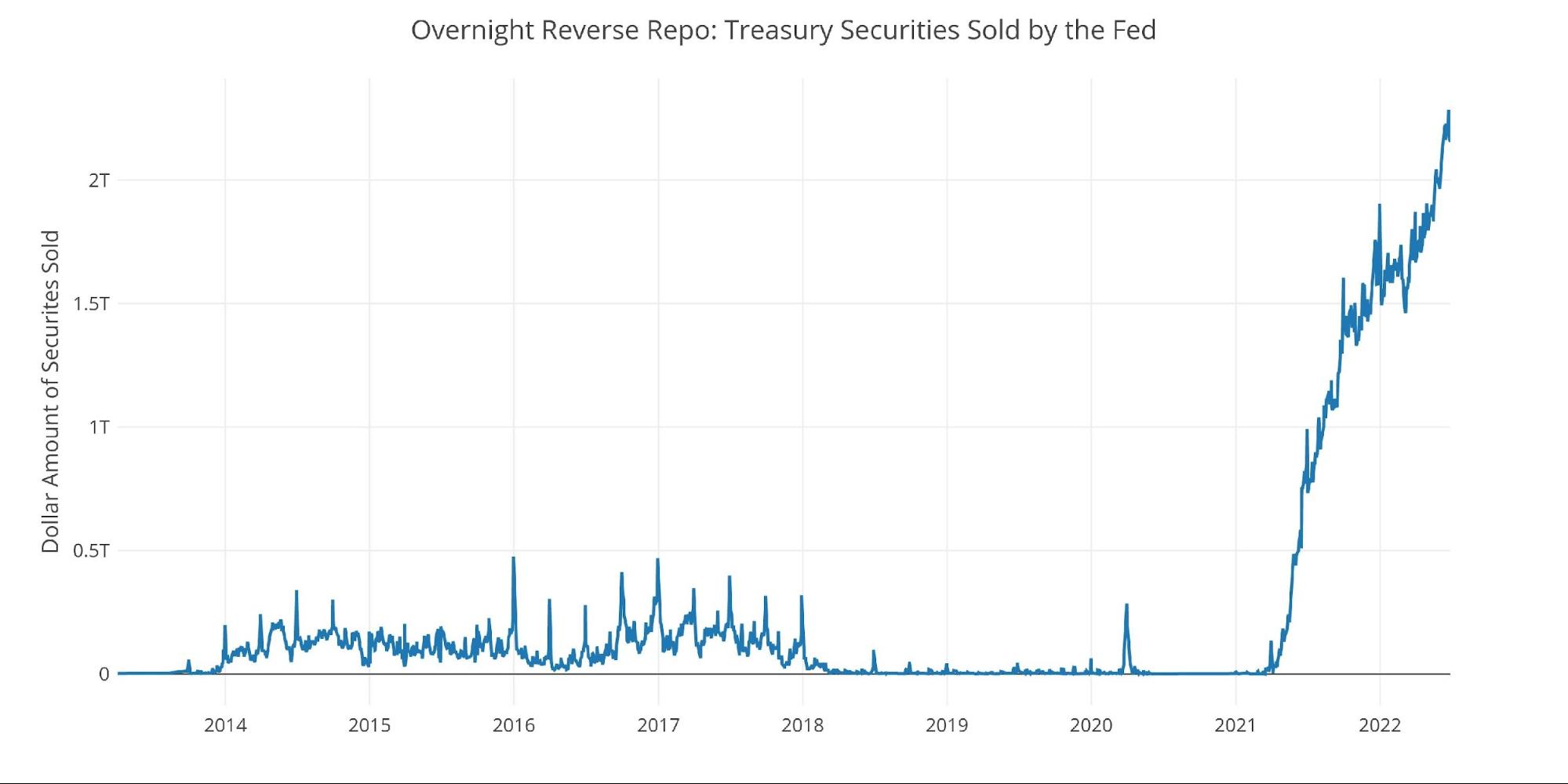
Figure: 11 Fed Reverse Repurchase Agreements
What it means for Gold and Silver
Inflation is an expansion of the Money Supply that generally leads to higher prices. To bring prices back down, Money Supply has to contract. So far, the market has experienced a single month of contraction (April) and simply slower growth in recent months. This has resulted in a bear market in stocks, a collapse in Crypto, and surging bond yields.
The Fed and mainstream are hoping that the coming recession will do the Fed’s dirty work for them, but the data does not support this view. Money supply is not falling fast enough. Furthermore, the Fed will have to pivot in order to keep the “everything” bubble from completely imploding in upon itself.
The Fed will not wait for inflation to return to 2%, they will be forced to stimulate again long before inflation is under control. When this happens, gold and silver will soar. The smart money has been taking steady delivery and moving metal out of Comex vaults. When the rest of the market wakes up and requests physical delivery, it will drive prices higher in a hurry.
Data Source: https://fred.stlouisfed.org/series/M2SL and also series WM2NS and RRPONTSYD. Historical data changes over time so numbers of future articles may not match exactly. M1 is not used because the calculation was recently changed and backdated to March 2020, distorting the graph.
Data Updated: Monthly on fourth Tuesday of the month on 3-week lag
Most recent data: Jun 06, 2022
Interactive charts and graphs can always be found on the Exploring Finance dashboard: https://exploringfinance.shinyapps.io/USDebt/

Call 1-888-GOLD-160 and speak with a Precious Metals Specialist today!
Buka akaun dagangan patuh syariah anda di Weltrade.
Source link