


The BLS reported that a whopping 339k jobs were added in May. This crushed median estimates of 190k jobs added. The Household Survey tells a very different story though, reporting a loss of 310k.
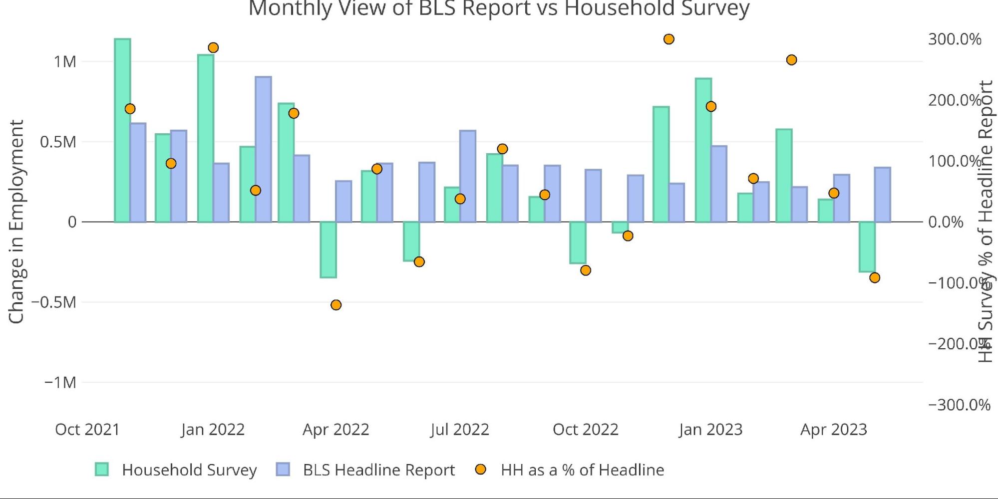
Figure: 1 Primary Report vs Household Survey – Monthly
As the chart above shows, the Household Survey exceeded the Headline Report in December, January, and March. This followed an extended period of coming in way below the Headline Report. Due to the big gap this month of more than 600k jobs, the Household Survey has fallen below the Headline Report YTD 1.47m vs 1.57m. Keep in mind, the Household Survey is still averaging 294k jobs a month which is quite strong.
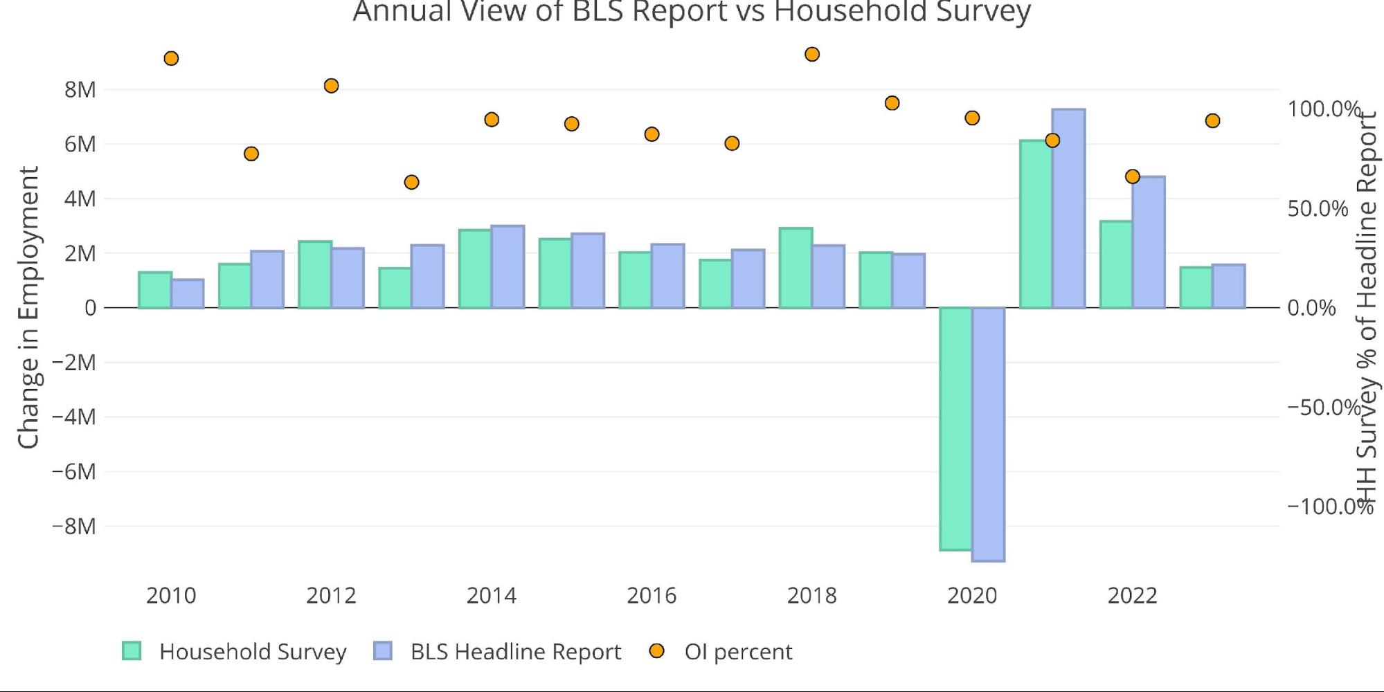
Figure: 2 Primary Report vs Household Survey – Annual
The BLS also publishes the data behind their Birth/Death assumptions. These are the jobs that the BLS assumes based on companies starting or closing. While the data is not seasonally adjusted, it directly impacts the Headline Report. The chart below shows the impact of Birth/Death jobs on the total raw number for the last several months.
May had Birth/Deaths responsible for 25% of total jobs. While this falls short of the 40% in April, it is still quite an elevated number. Given the economic uncertainty, it’s hard to believe that enough new businesses formed in May to employ 230k people.
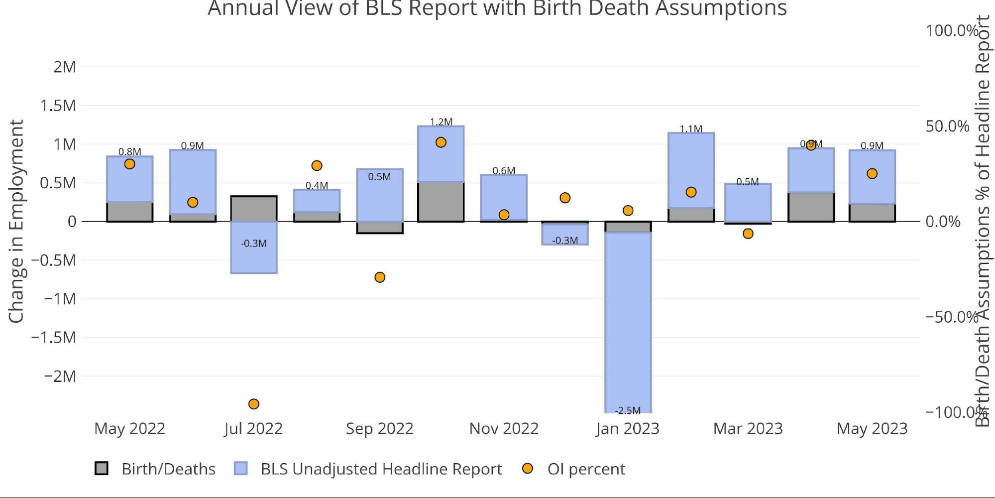
Figure: 3 Primary Unadjusted Report With Birth Death Assumptions – Monthly
YTD the Birth/Death assumptions have been responsible for the vast majority of jobs. 612k jobs have come from birth/death assumptions, with 350k coming from the base report.
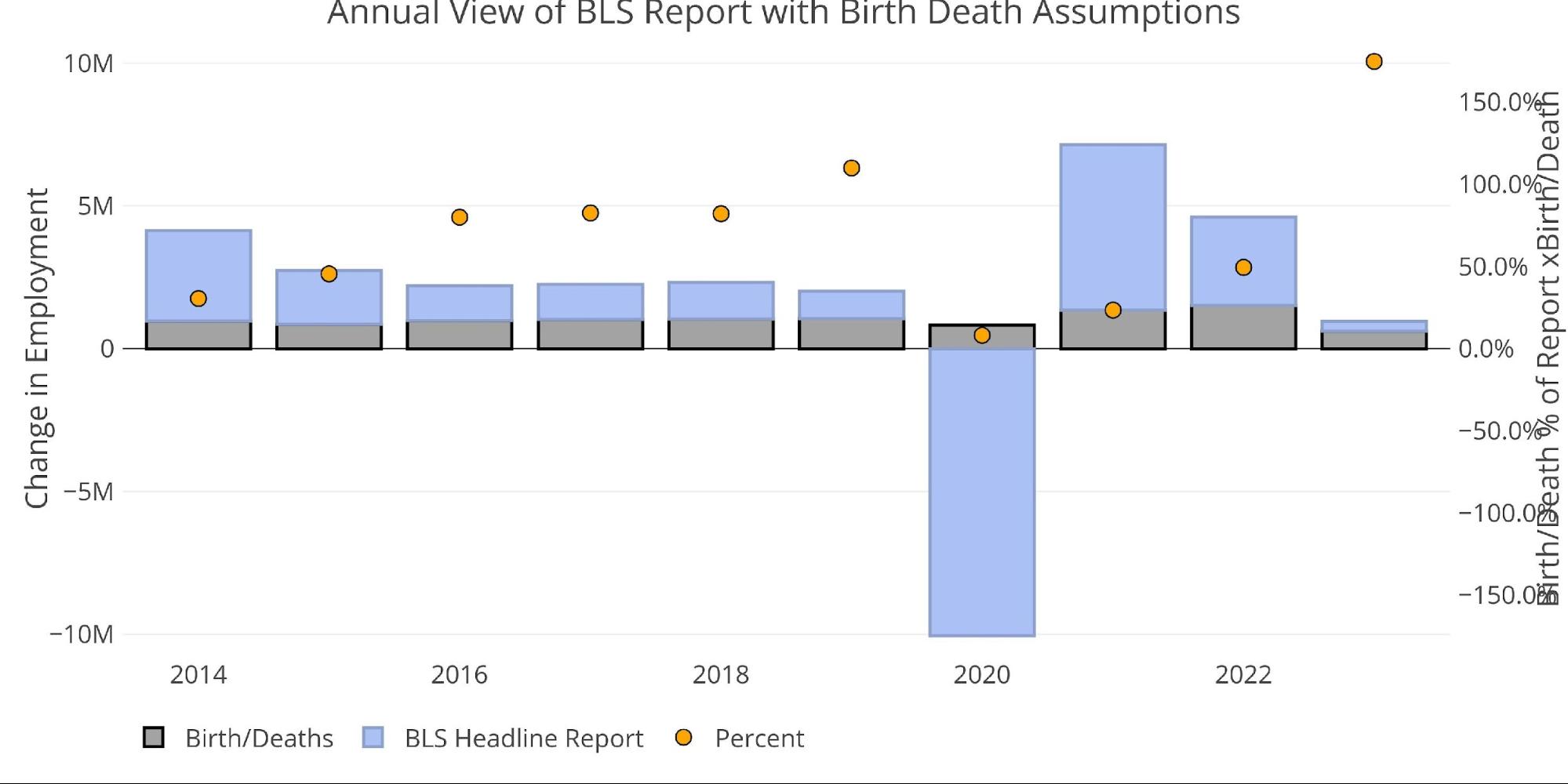
Figure: 4 Primary Unadjusted Report With Birth Death Assumptions – Annual
Digging Into the Report
The 339k jobs surprised to the upside, but the unemployment rate surged from 3.4% to 3.7%. The surge happened even though the labor force participation stayed flat at 62.6%. This is another data point that doesn’t jive with the base Headline Report.
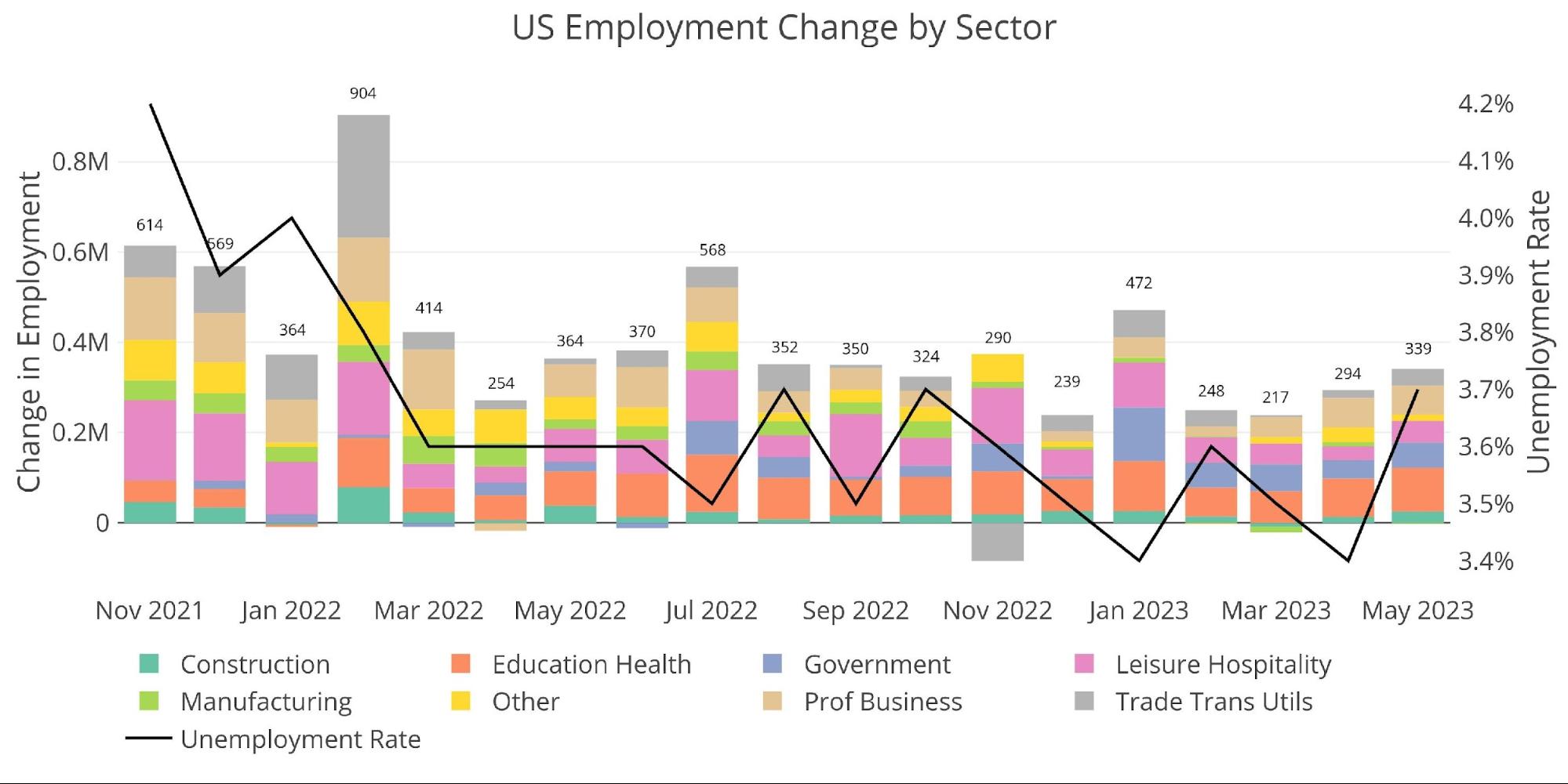
Figure: 5 Change by sector
Jobs by Category
With the unexpectedly strong report, 5 of the 8 employment categories were actually above the 12-month trend. Education and Health continue to be the standout categories.
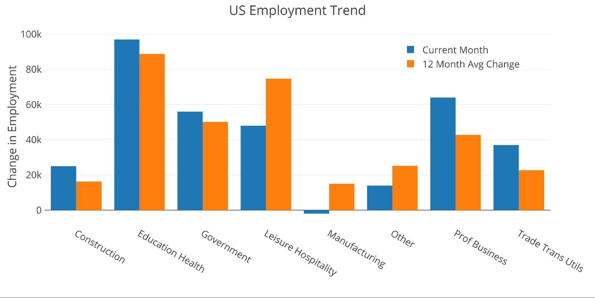
Figure: 6 Current vs TTM
The table below shows a detailed breakdown of the numbers.
Key takeaways:
-
- Two categories were actually negative on the month (Information and Manufacturing)
- Leisure and Hospitality was above the three-month trend but below the twelve-month trend
- Construction is well above the 3 and 12-month trends
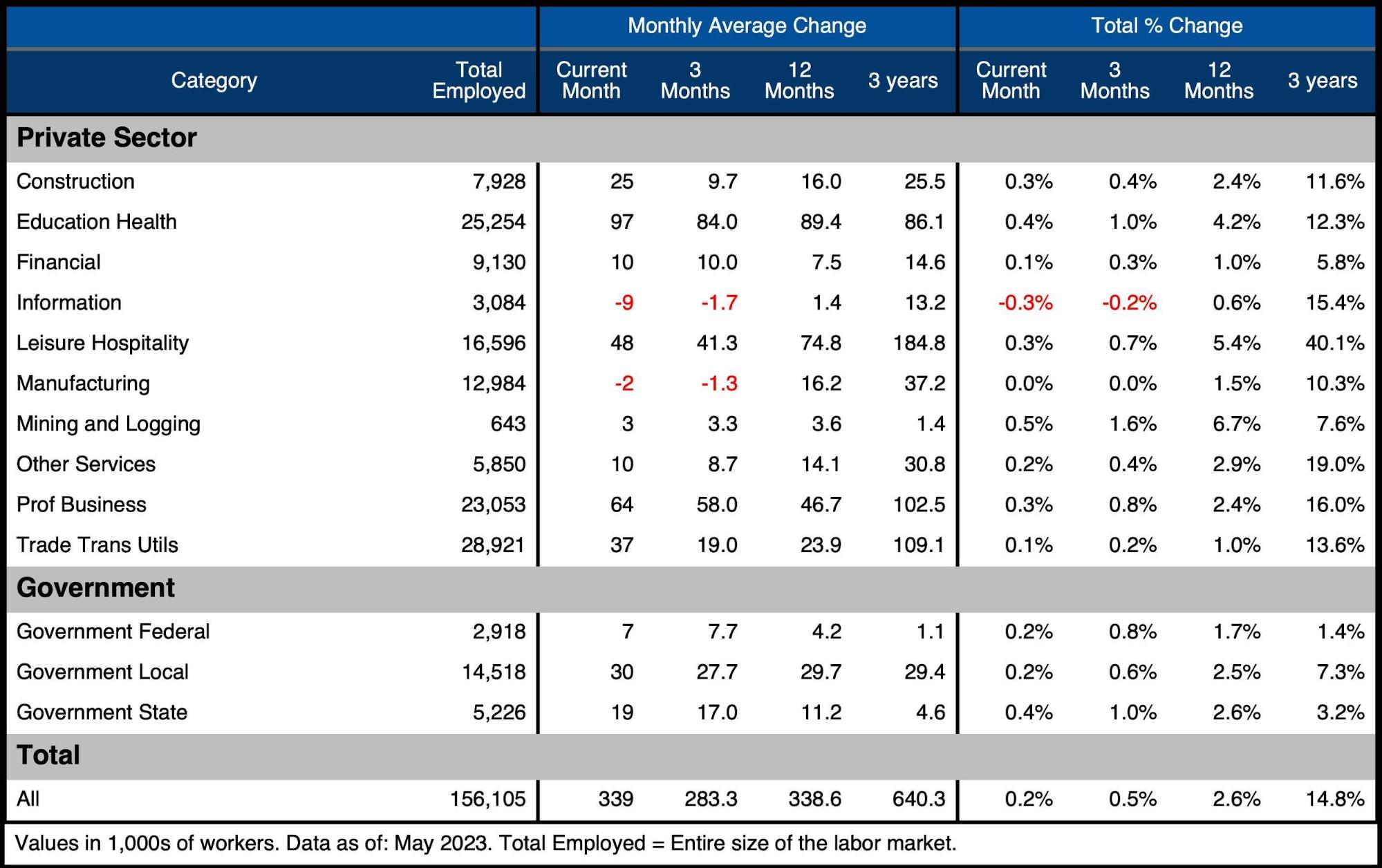
Figure: 7 Labor Market Detail
Revisions
Another data point to highlight is the number of revisions. From Feb-April, the BLS has revised total jobs down by 13.7k per month.
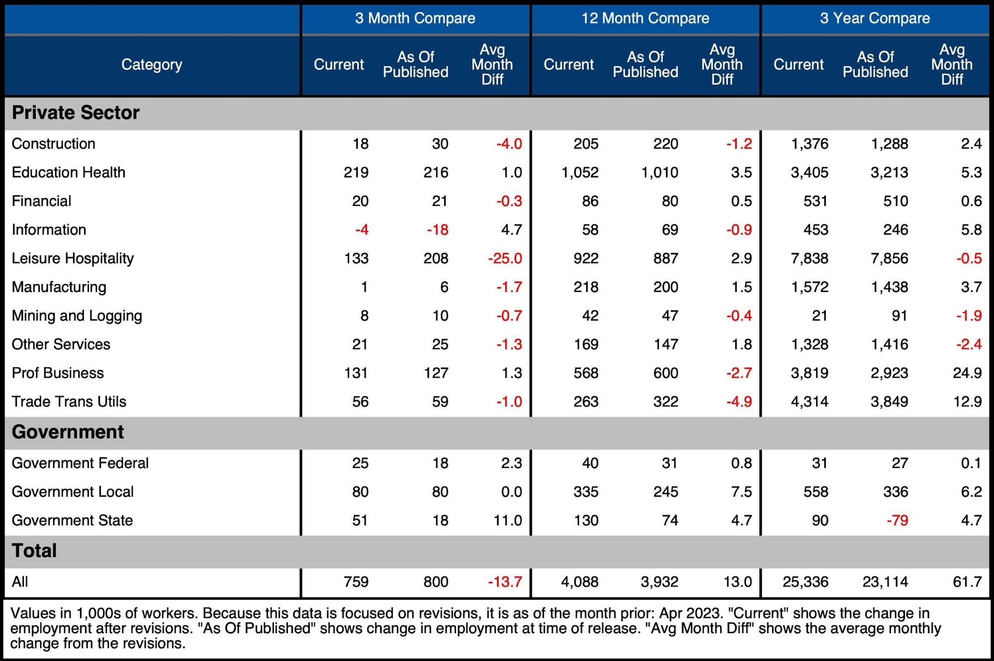
Figure: 8 Revisions
Historical Perspective
The chart below shows data going back to 1955. As shown, the economy is currently “enjoying” its lowest unemployment rate on record. This is quite hard to believe given the current economic environment and job losses that have been announced and implemented.
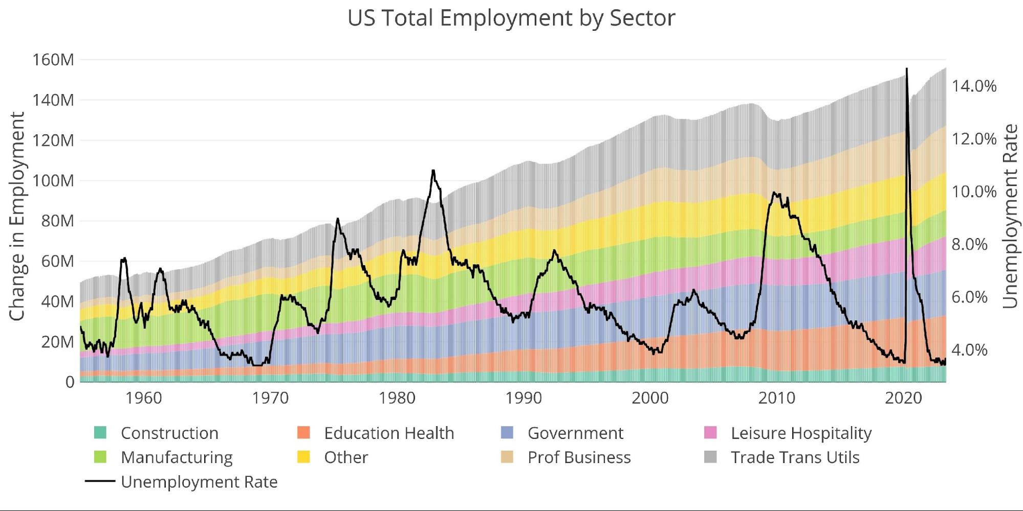
Figure: 9 Historical Labor Market
The labor force participation rate has reached a post-pandemic high of 62.6% but sits below the 63.3% in Feb 2020 and well below the 66% from before the Financial Crisis. This was the second month in a row where the labor force printed at 62.6%.
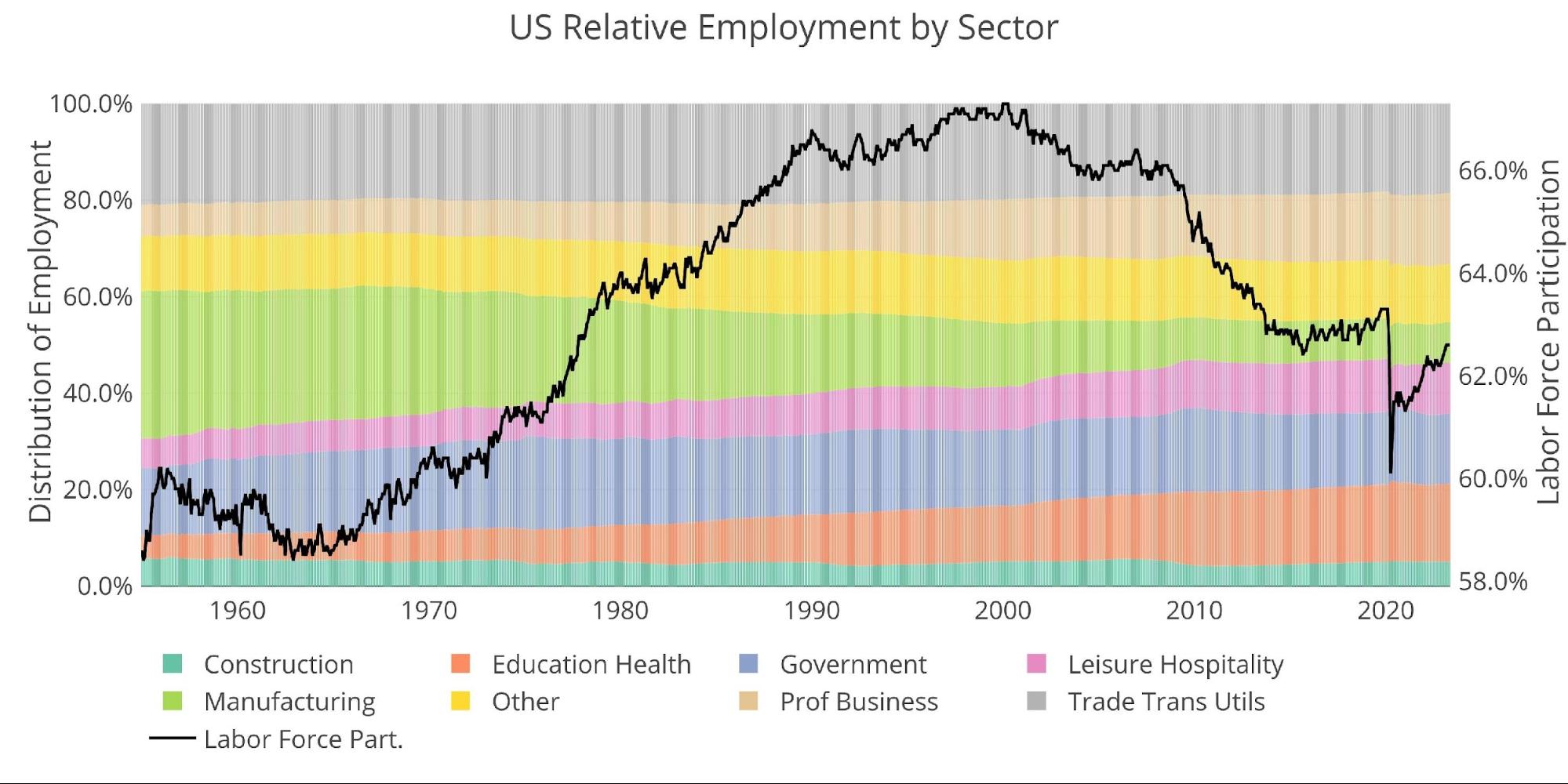
Figure: 10 Labor Market Distribution
Wrapping Up
The BLS continues to issue jobs reports that defy reality and expectations. Last month, the jobs report broke a record as having been the 13th consecutive job report where the market underestimated the numbers. This means that for the 14th month in a row, the jobs report has surprised to the upside. How is that possible? How much stock can we put in these numbers?
When the Fed’s “inflation is transitory” narrative fell apart, the Fed did a pivot and leaned hard into the jobs numbers. They say that the strong job market is evidence of a resilient economy. They are betting everything on the strong jobs report. What happens if the numbers turn out to be wrong? Or what if the jobs numbers finally reflect the rest of the economic numbers that continue to underwhelm?
If the Fed is living by the job’s numbers, they could die by the job’s numbers. More likely though, something will break before the jobs data reflects a collapsing economy. That’s when the Fed will rush to step in with liquidity. They already did it on a small scale with SVB. Expect the next one to be much bigger!
Data Source: https://fred.stlouisfed.org/series/PAYEMS and also series CIVPART
Data Updated: Monthly on first Friday of the month
Last Updated: May 2023
Interactive charts and graphs can always be found on the Exploring Finance dashboard: https://exploringfinance.shinyapps.io/USDebt/

Call 1-888-GOLD-160 and speak with a Precious Metals Specialist today!
Buka akaun dagangan patuh syariah anda di Weltrade.
Source link