


The latest seasonally adjusted inflation rate for August came in nearly flat again at 0.09% MoM, dropping to 8.3% YoY. Expectations had been for -0.1% MoM and 8.1% YoY so the market had a very negative reaction to the report.
While headline inflation was only surprised by about 20bps to the upside, the detailed data had many worried about the stickiness of inflation. Core CPI was up 0.6% MoM vs 0.3% expected and YoY it was up 6.3% vs 6% expected.
The reason for the big upside surprises in Core can be seen in the chart below where Energy accounts for nearly all the downside. Had Energy simply been flat, headline inflation would have clocked in at .53% MoM!
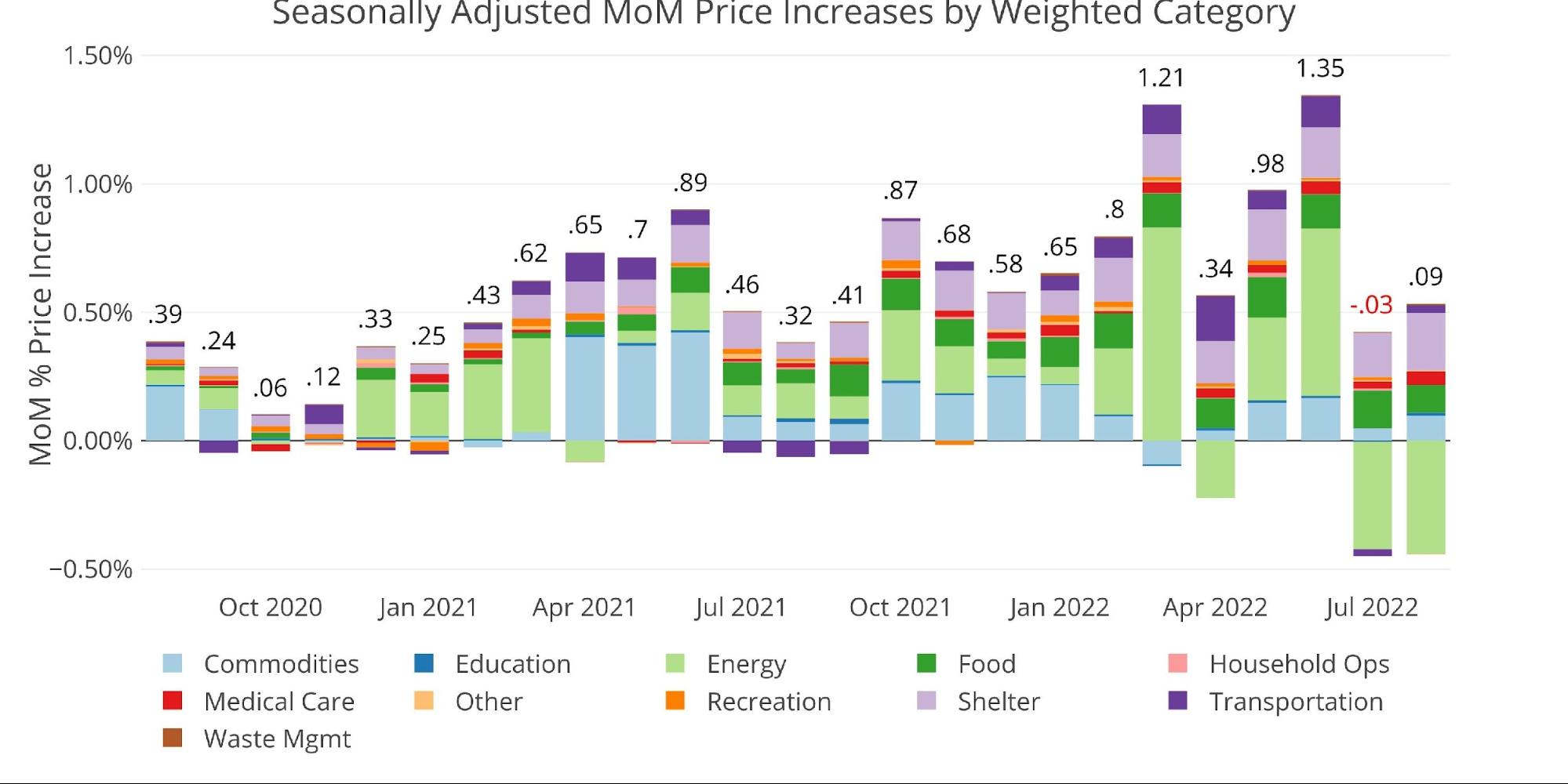
Figure: 1 Month Over Month Inflation
Over the past year, Energy had been really driving inflation higher, contributing 2.98% of the 9.1% YoY figure from June. That figure has fallen to 1.74% in August. In previous articles, it was highlighted that inflation was starting to spread beyond used cars (Commodities) and Energy. This is now clearly visible below.
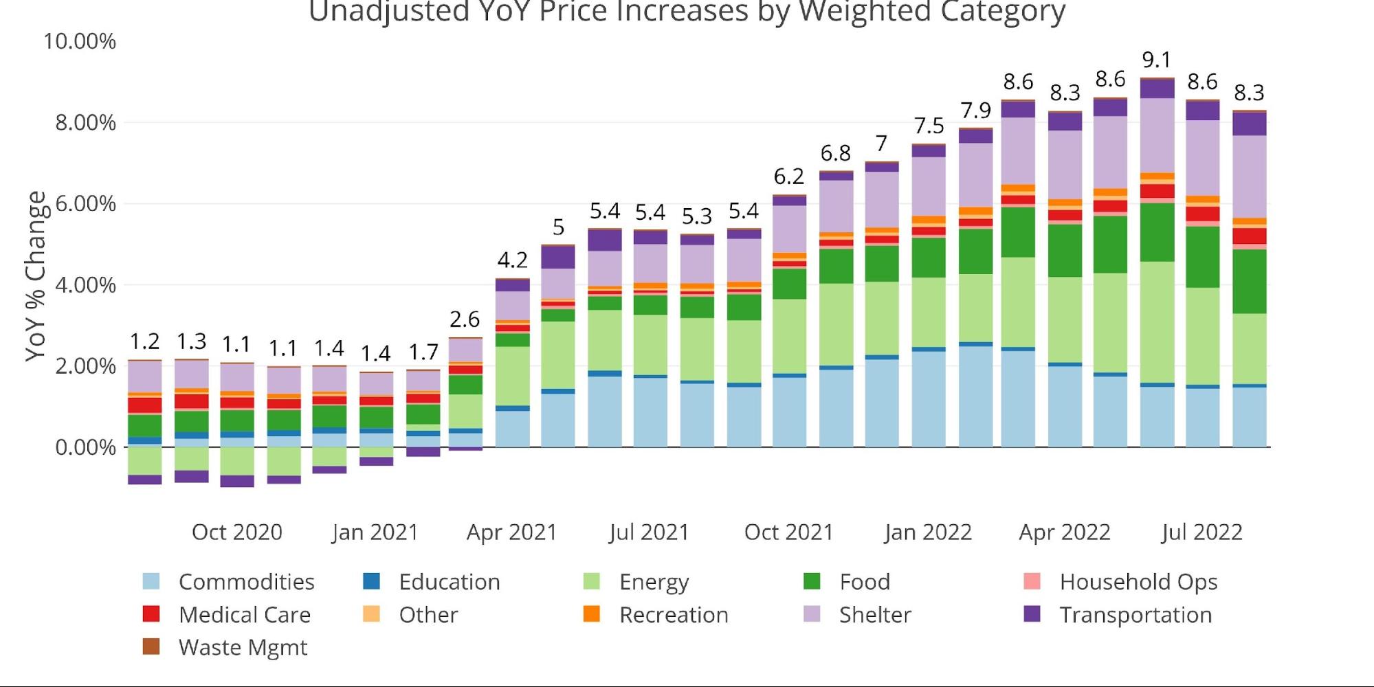
Figure: 2 Year Over Year Inflation
The chart below compares the current month to the 12-month average. Only 4 of the categories exceeded the 12-month average. One of those was Shelter, which was up 0.7% MoM, 6.25% YoY, and accounts for 32% of the CPI. This is the biggest MoM gain in Shelter thus far, but still understates the true market inflation rate which is closer to 10% YoY.

Figure: 3 MoM vs TTM
The table below gives a more detailed breakdown of the numbers. It shows the actual figures reported by the BLS side by side with the recalculated and unrounded numbers. The weighted column shows the contribution each value makes to the aggregated number. Details can be found on the BLS Website.
Some key takeaways:
-
- Energy fell by 5% MoM which exceeded the 4.56% drop last month
- Every other category was positive except for Recreation which was flat
- Shelter now contributes over 2% of the 8.3% YoY figure
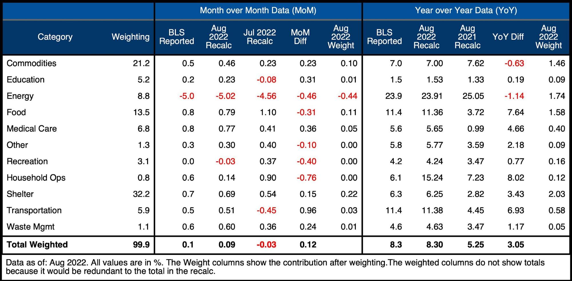
Figure: 4 Inflation Detail
Looking at the Fed Numbers
While the Fed does have different categories, its aggregate numbers match the BLS.
Their data goes back to the 1950s. Unfortunately, they do not publish the weightings of each category so it would be impossible to do a similar analysis showing the impact of each category on the overall number.
Looking at history back to 1950 puts the current spike into perspective. Remember that if the methodology was the same, inflation would likely be above 15% already!
Unfortunately for the Fed, things are different this time. Even the minor rate hikes so far have started to significantly impact the interest on the Federal debt with costs rising by $22B annually in a single month!
The reason why the Fed is so far behind the curve is that they have no other viable choice. If they raise rates too high, they will collapse the entire economy. However, elevated inflation has left them with no choice but to continue raising rates. The damage they will cause will prove catastrophic!
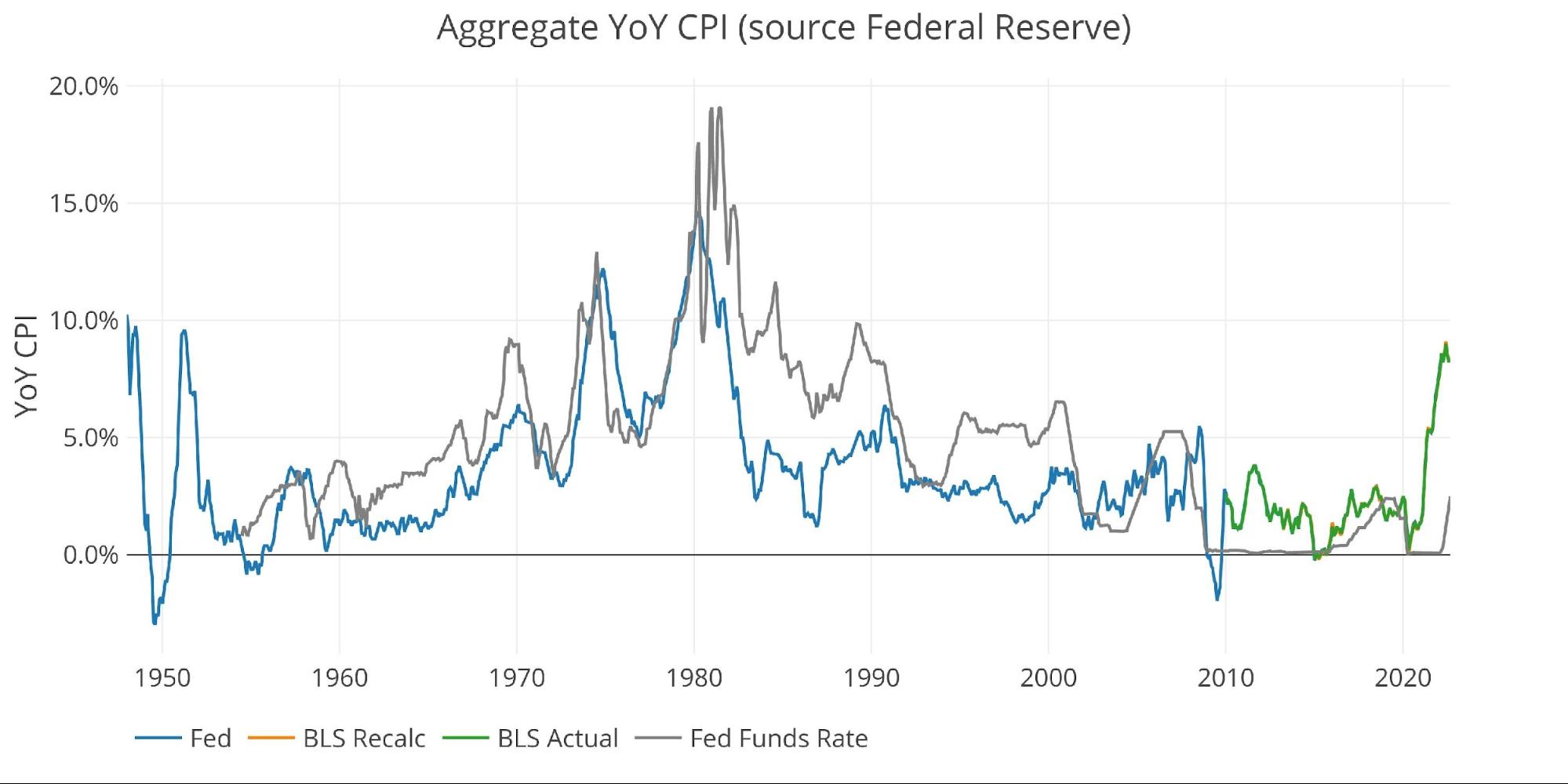
Figure: 5 Fed CPI
Using the Fed categorical data, which is different than the BLS, shows that Housing, Medical Care, and Other are all above the 12-month average. Every category except Transportation is above the 30-year average.
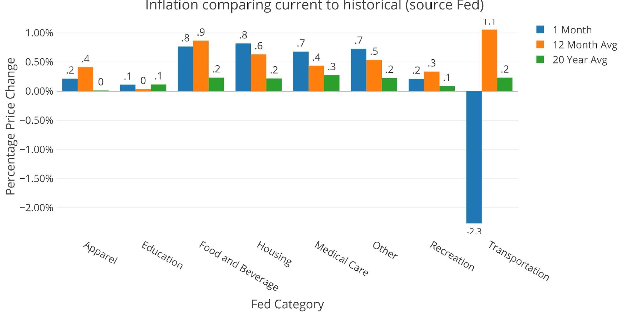
Figure: 6 Current vs History
Historical Perspective
The BLS weightings have only been scraped back to 2012, thus the chart below shows the past 10 years of annual inflation data, reported monthly. The volatility in Energy can be seen clearly over this time period.
The YoY CPI first went over 4% in April of 2021. While the recent drop is clearly noticeable, it’s not coming down nearly fast enough to give the Fed cover to stop raising rates.
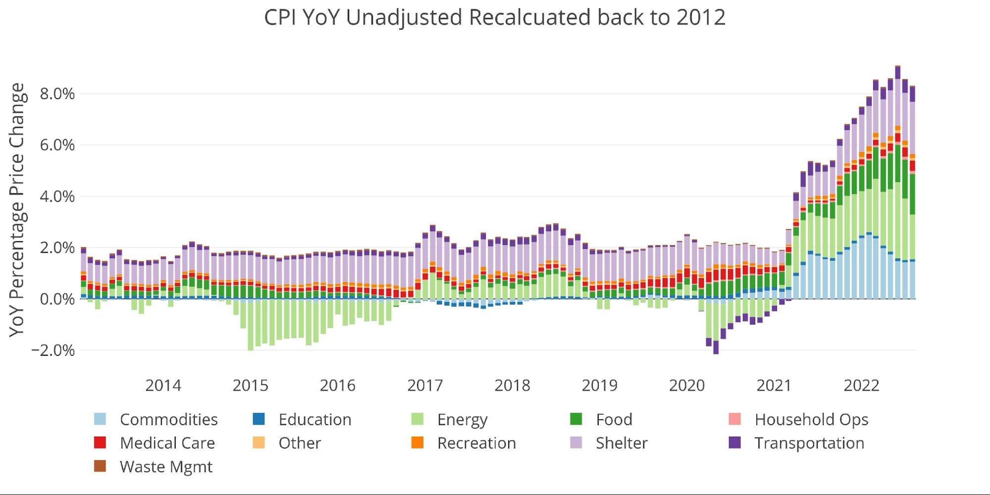
Figure: 7 Historical CPI
What it means for Gold and Silver
The Fed is running out of time. This inflation fight needs to be quick so they can get back to easy money. Unfortunately, the numbers are not cooperating. This is pushing the Fed to go bigger.
The CME Fed tool currently suggests a 38% probability that the Fed raises rates by a full percentage point in their meeting next week. After being so wrong last year on “transitory” inflation, the Fed appears to be trying to rebuild credibility.
However, what happens when they drive the economy over a cliff after claiming it can withstand much higher rates? What happens when they have to suddenly pivot to ward off a potential depression? The Fed might be setting up a situation where they hurt their credibility even more by being wrong twice!
How much leeway is the market willing to give the Fed in their horrendous forecasting ability. At some point, the Fed could completely lose credibility. At the moment, they are trying to thread the needle and reduce inflation without crashing the economy. They would have to really defy the odds to achieve success. Precious metals offer a great hedge and insurance against such a scenario. Gold and silver both sold off today in reaction to the inflation numbers, but this move is driven by paper speculators while smart money continues to stack physical metal!
Data Source: https://www.bls.gov/cpi/ and https://fred.stlouisfed.org/series/CPIAUCSL
Data Updated: Monthly within first 10 business days
Last Updated: Aug 2022
Interactive charts and graphs can always be found on the Exploring Finance dashboard: https://exploringfinance.shinyapps.io/USDebt/

Call 1-888-GOLD-160 and speak with a Precious Metals Specialist today!
Buka akaun dagangan patuh syariah anda di Weltrade.
Source link