

Seasonally Adjusted Money Supply in February fell $121B and the Money Supply in January was revised from positive $31B to -$142B. This is a major revision and now means the Money Supply has fallen for seven straight months.
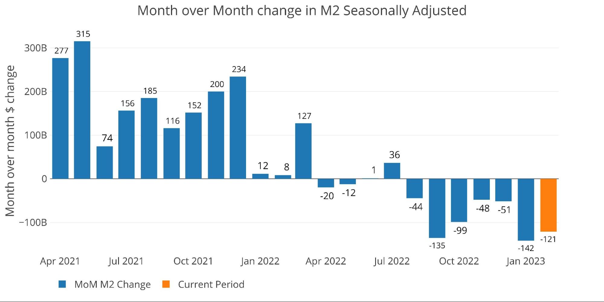
Figure: 1 MoM M2 Change (Seasonally Adjusted)
To show how much the Fed seasonal adjustments can impact the numbers, below are the raw numbers. The raw numbers are ahead of the adjusted numbers by a month so February is colored in orange below (barely visible at -$5B). March is showing at $43B unadjusted.
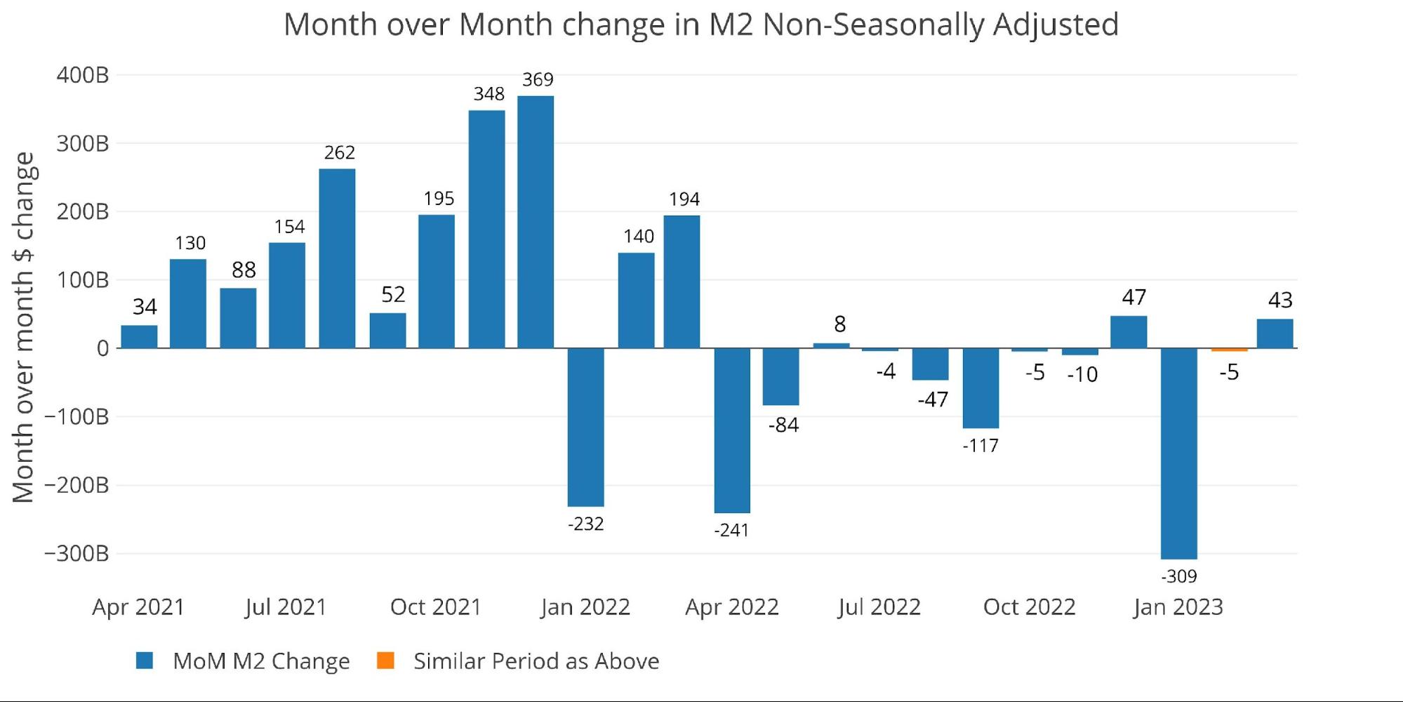
Figure: 2 MoM M2 Change (Non-Seasonally Adjusted)
Looking at the seasonally adjusted numbers shows that this month decreased the money supply by -6.6% annualized which is below both the 6-month and 12-month trend (-5.4% and -2.4% respectively).
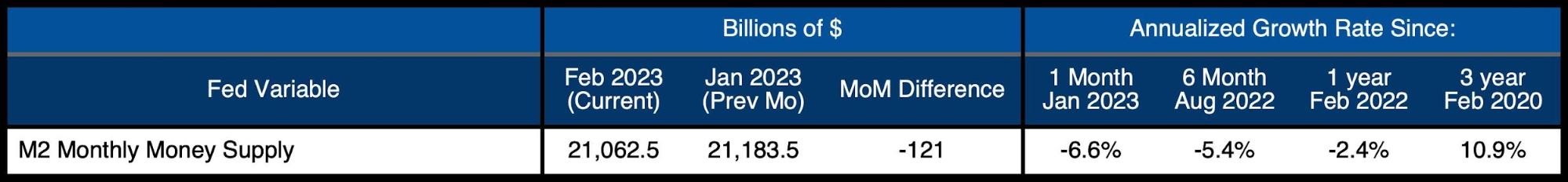
Figure: 3 M2 Growth Rates
The average for January (pre-Covid) was 7.4%, which means this month was below the average by an incredible 1400 bps!
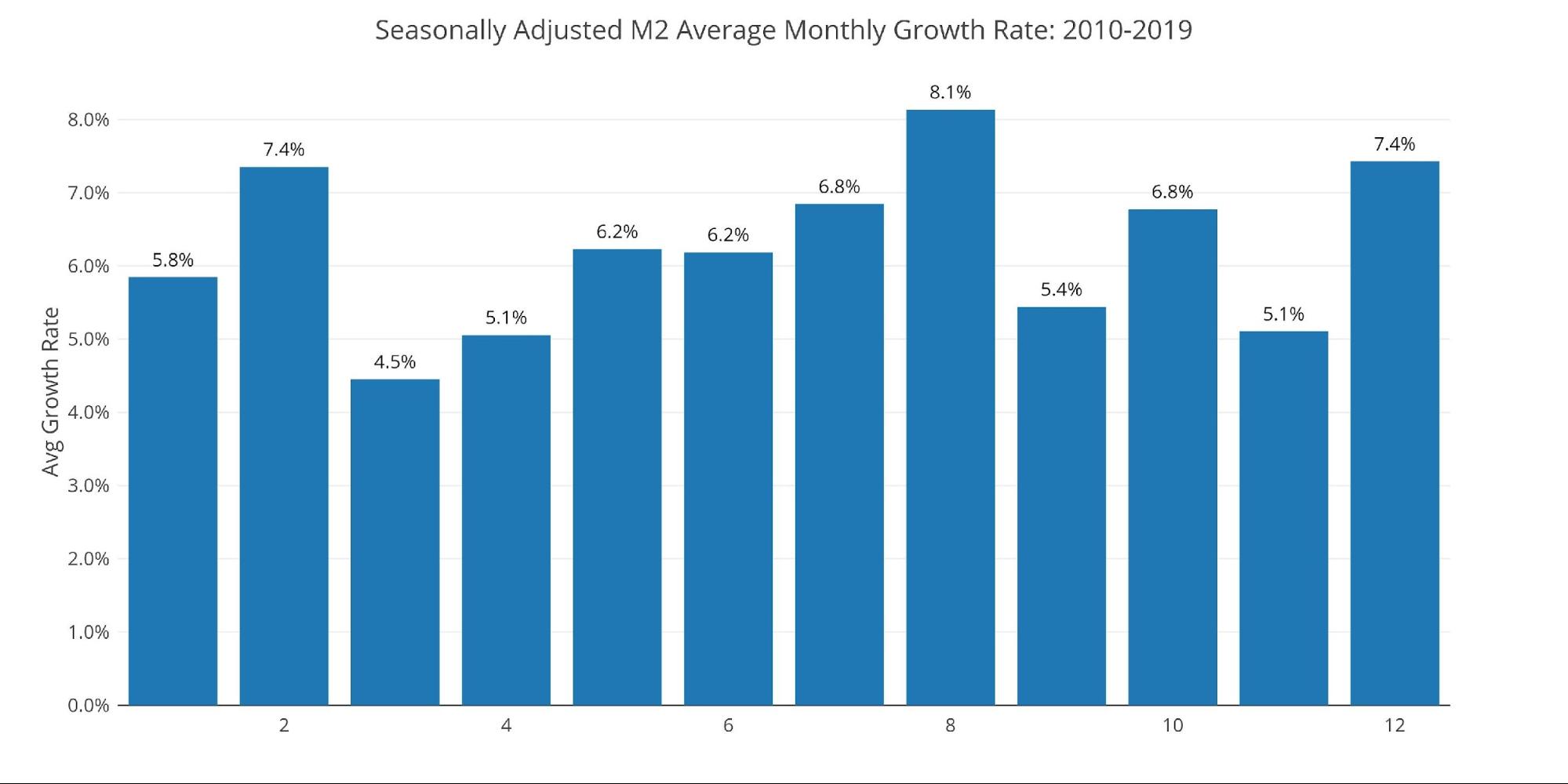
Figure: 4 Average Monthly Growth Rates
The Fed only offers weekly data that is not seasonally adjusted. As the chart below shows, 10 of the last 15 weeks have come in negative. The most recent week ending March 6th was positive by $43B, which is driving the positive value in Figure 2 above. March could very well turn negative as more data comes in.
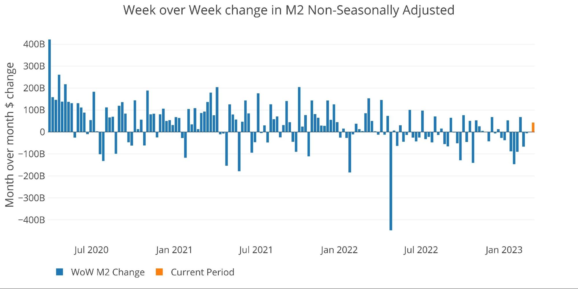
Figure: 5 WoW M2 Change
The “Wenzel” 13-week Money Supply
The late Robert Wenzel of Economic Policy Journal used a modified calculation to track Money Supply. He used a trailing 13-week average growth rate annualized as defined in his book The Fed Flunks. He specifically used the weekly data that was not seasonally adjusted. His analogy was that in order to know what to wear outside, he wants to know the current weather, not temperatures that have been averaged throughout the year.
The objective of the 13-week average is to smooth some of the choppy data without bringing in too much history that could blind someone from seeing what’s in front of them. The 13-week average growth rate can be seen in the table below. Decelerating trends are in red and accelerating trends in green.
The 13-week average is again trending down reaching the lows from last December and even approaching the all-time lows seen in August.
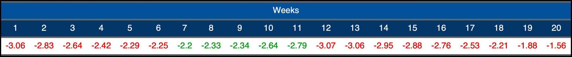


Figure: 6 WoW Trailing 13-week Average Money Supply Growth
The plot below really helps show the current divergence seen in 13-week M2. The current year is well below historical averages. Last year at the same time, 13-week Money Supply was growing at +9.6%, but decelerating rapidly. Over 5 months, it fell all the way to -3.5%.
Money Supply typically flattens at this time of year and then dips lower mid-Summer before picking back up. If Money Supply continues to show negative growth, it is only a matter of time before something else breaks in the economy. It is highly likely the damage has already been done and regardless of what happens with Money Supply, the next domino will fall. That said, if Money Supply does not reverse soon, things could get extremely ugly.

Figure: 7 Yearly 13-week Overlay
Behind the Inflation Curve
Incredibly, even with the contracting money supply, the Fed is still not doing enough to solve the inflation problem. To combat rising prices, the Fed would need to undo most of the money it has created over the last several years. This would require bringing interest rates above the rate of inflation to really collapse the money supply.
This can be seen in the chart below. The black line and blue line are converging, but they have not inverted yet. The blue line (interest rates) has always risen above the black line (inflation) to combat high inflation in the past. Remember, the CPI has been greatly modified since the 1970s and 80s to understate current inflation. Thus, the magnitude of the current divergence is definitely understated.
The fall in Money Supply over the last year looks very modest when compared to the massive increases seen recently. Even the modest dip that has been seen has created significant turmoil. The dominos started falling in crypto which is the furthest out on the risk curve. As time wears on, the dominos continue to move down the risk curve with SVB and Credit Suisse the latest casualties. The dominos are not done falling, and the next one will once again surprise everyone.
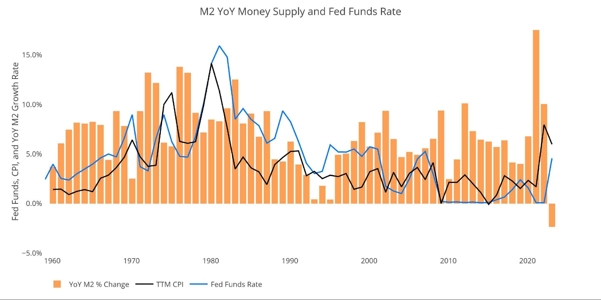
Figure: 8 YoY M2 Change with CPI and Fed Funds
Historical Perspective
The charts below are designed to put the current trends into historical perspective. The orange bars represent annualized percentage change rather than raw dollar amount. The current slowdown can be seen clearly on the right side.
The Money Supply slowdown is a major driver of the weakness seen in the stock market over the last year. The massive increase seen in 2020 is what pushed the market to explode higher. The stock market has been out of fuel for months which is why the major indices remain choppy.
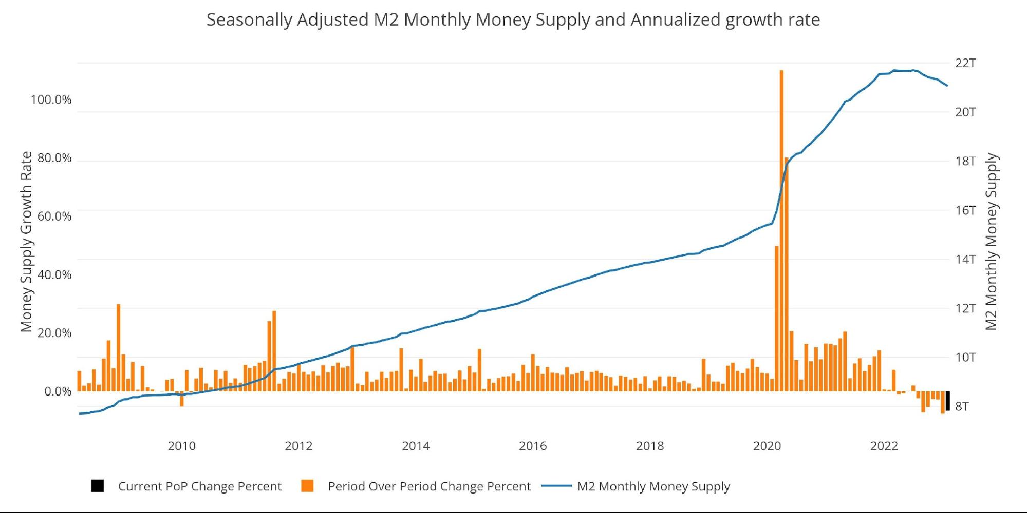
Figure: 9 M2 with Growth Rate
Taking a historical look at the 13-week annualized average also shows the current predicament. This chart overlays the log return of the S&P. Mr. Wenzel proposed that large drops in Money Supply could be a sign of stock market pullbacks. His theory, derived from Murray Rothbard, states that when the market experiences a shrinking growth rate of Money Supply (or even negative) it can create liquidity issues in the stock market, leading to a sell-off.
While not a perfect predictive tool, many of the dips in Money Supply precede market dips. Specifically, the major dips in 2002 and 2008 from +10% down to 0%. The economy is now grappling with a peak growth rate of 63.7% in July 2020 down to more than 7 months of negative growth rates.
Many people are saying that SVB and Credit Suisse were isolated incidents, specific to the challenges they faced. However, they were simply ready to fall with the drop in liquidity.
Amazingly, the stock market has held up as well as it has, but likely that is because most people still expect the Fed to fold and rescue the market if anything happens. Based on the Fed and Treasury response to SVB, that is probably a good bet! Regardless, the removal of liquidity from the system is going to manifest somewhere else.
Please note the chart only shows market data through March 6th to align with available M2 data.
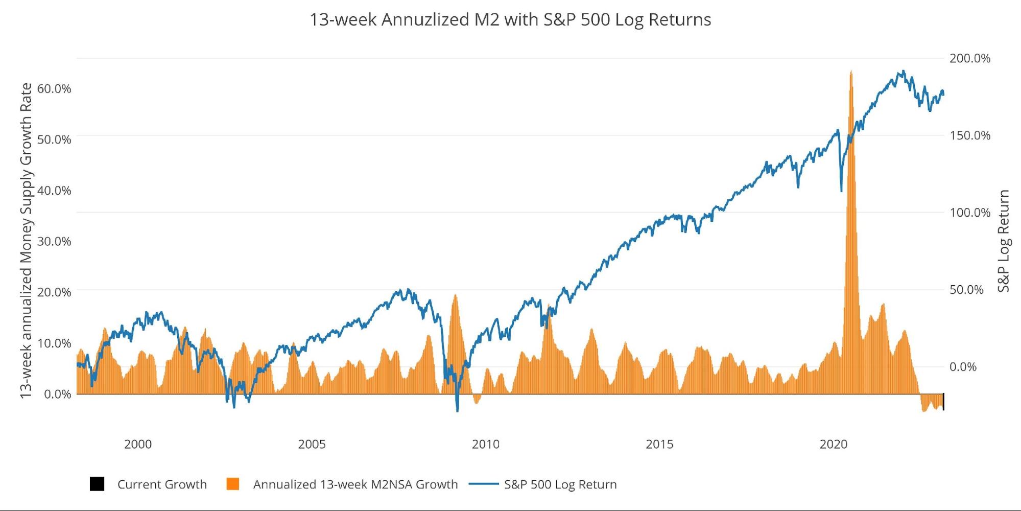
Figure: 10 13-week M2 Annualized and S&P 500
One other consideration is the massive buildup in the reverse repo market at the Fed. This is a tool that allows financial institutions to swap cash for instruments on the Fed balance sheet.
Current Reverse Repos peaked at $2.55T on Dec 30. This broke the previous record from September. The value always tops out at quarter end. It is possible that March could set a new record on Friday.
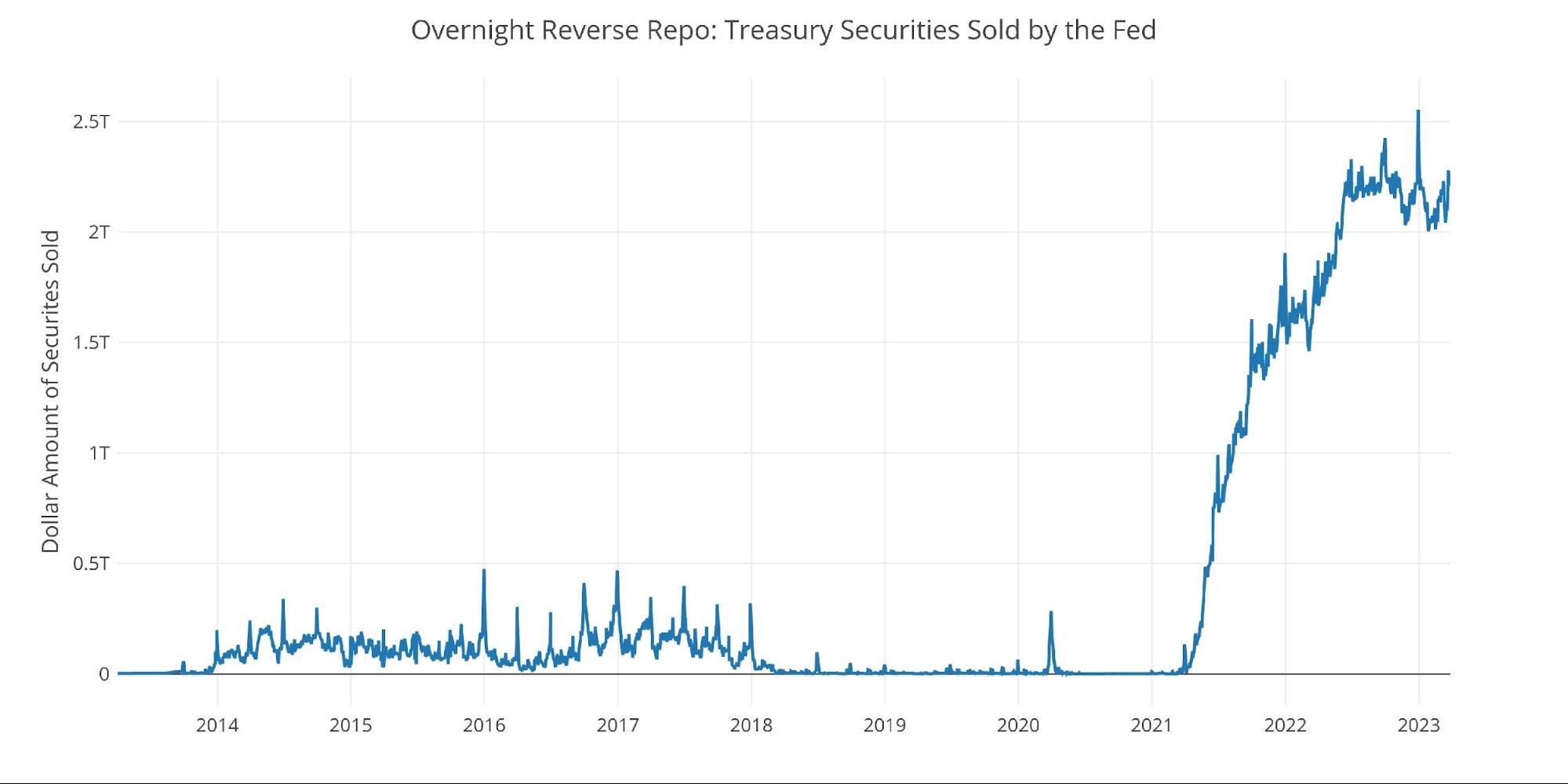
Figure: 11 Fed Reverse Repurchase Agreements
Wrapping Up
The Fed continues to play an extremely dangerous game. While they are actually not doing enough to rein in inflation, they have done more than enough to wreck the economy. Make no mistake, SVB and Credit Suisse were simply the next dominos. More are coming. The Fed cannot collapse Money Supply the way it has and not have major negative repercussions.
These things take time to develop. The Fed has moved so fast that the negative consequences have not yet had time to materialize. We have only seen the tip of the iceberg. There is way more danger that sits underneath the surface.
The Fed seems to be flying blind, unaware of how much havoc they could be about to cause. Powell has decided he does not want to be the next Arthur Burns and instead wants to be Paul Volker. Unfortunately for Powell, he does not have the same economy that Volker had. The economy he is dealing with is far more indebted and far more dependent on cheap money.
Powell will not be the next Burns or Volker. He will likely be remembered as the chair that was flying blind and drove the economy right off a cliff. Forget soft landing, the Money Supply data is pointing to an epic collapse. Better buckle up!
Data Source: https://fred.stlouisfed.org/series/M2SL and also series WM2NS and RRPONTSYD. Historical data changes over time so numbers of future articles may not match exactly. M1 is not used because the calculation was recently changed and backdated to March 2020, distorting the graph.
Data Updated: Monthly on fourth Tuesday of the month on 3-week lag
Most recent data: Mar 06, 2023
Interactive charts and graphs can always be found on the Exploring Finance dashboard: https://exploringfinance.shinyapps.io/USDebt/

Call 1-888-GOLD-160 and speak with a Precious Metals Specialist today!
Buka akaun dagangan patuh syariah anda di Weltrade.
Source link