

Despite hitting the debt ceiling, the Treasury was able to add $35B in new debt during January. Now that the Treasury has employed extraordinary measures, they are exchanging Non-Marketable (e.g., Government employee retirement funds) and Other forms of debt for short-term Bills. The balance on Bills grew by $241B which was the largest single-month growth since at least January 2021.
This exchange is temporary of course, but the debt ceiling saga is not set to end until June which means that the Treasury will be paying the high-interest rates on Bills for the next 6 months at least. Non-Marketable debt usually comes with lower interest payments, so this exchange is certainly not free. In short, the debt ceiling saga is actually not providing relief for the growing balance of the interest-incurring debt.
Note: Non-Marketable consists almost entirely of debt the government owes to itself (e.g., debt owed to Social Security or public retirement)
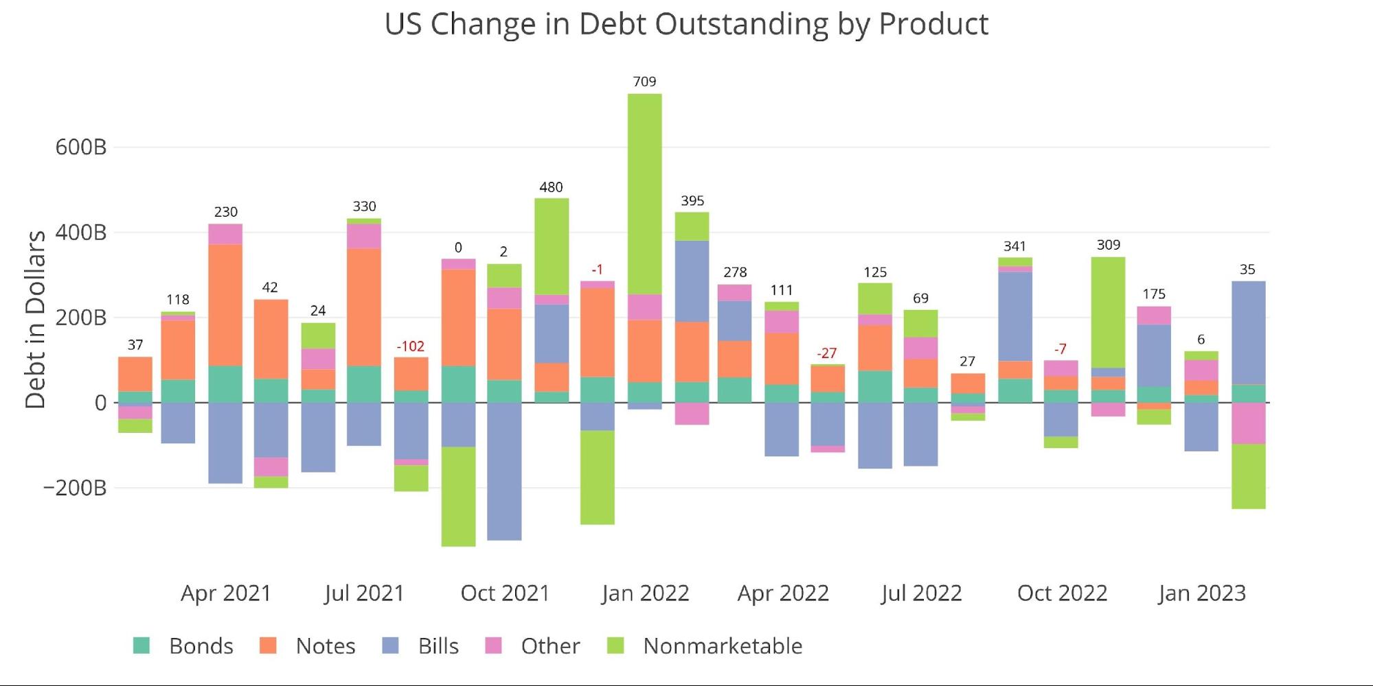
Figure: 1 Month Over Month change in Debt
The Treasury added an incredible $8.2T in new debt over the last three years, with $1.8T being added last year alone. People predict the Treasury can last until early summer with the current debt ceiling. This will mean that once it is raised, and make no mistake – it will be raised, the Treasury will likely add a similar amount of debt in 6 months.
The market likely cannot absorb that much debt in such a short period, which will cause the Treasury to rely more heavily on shorter-term debt.
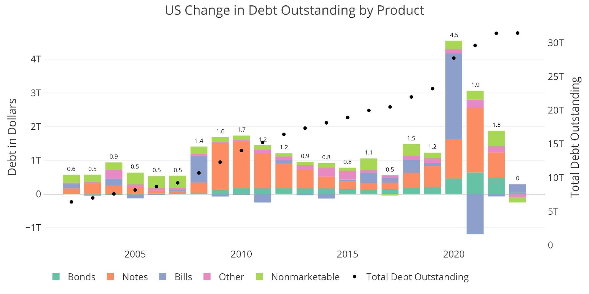
Figure: 2 Year Over Year change in Debt
With more short-term debt being added, the weighted average maturity on the debt has dipped from the recent high of 6.2 to 6.16 years. At the same time, over the same four months, weighted interest has risen from 1.72% to 2.13%.
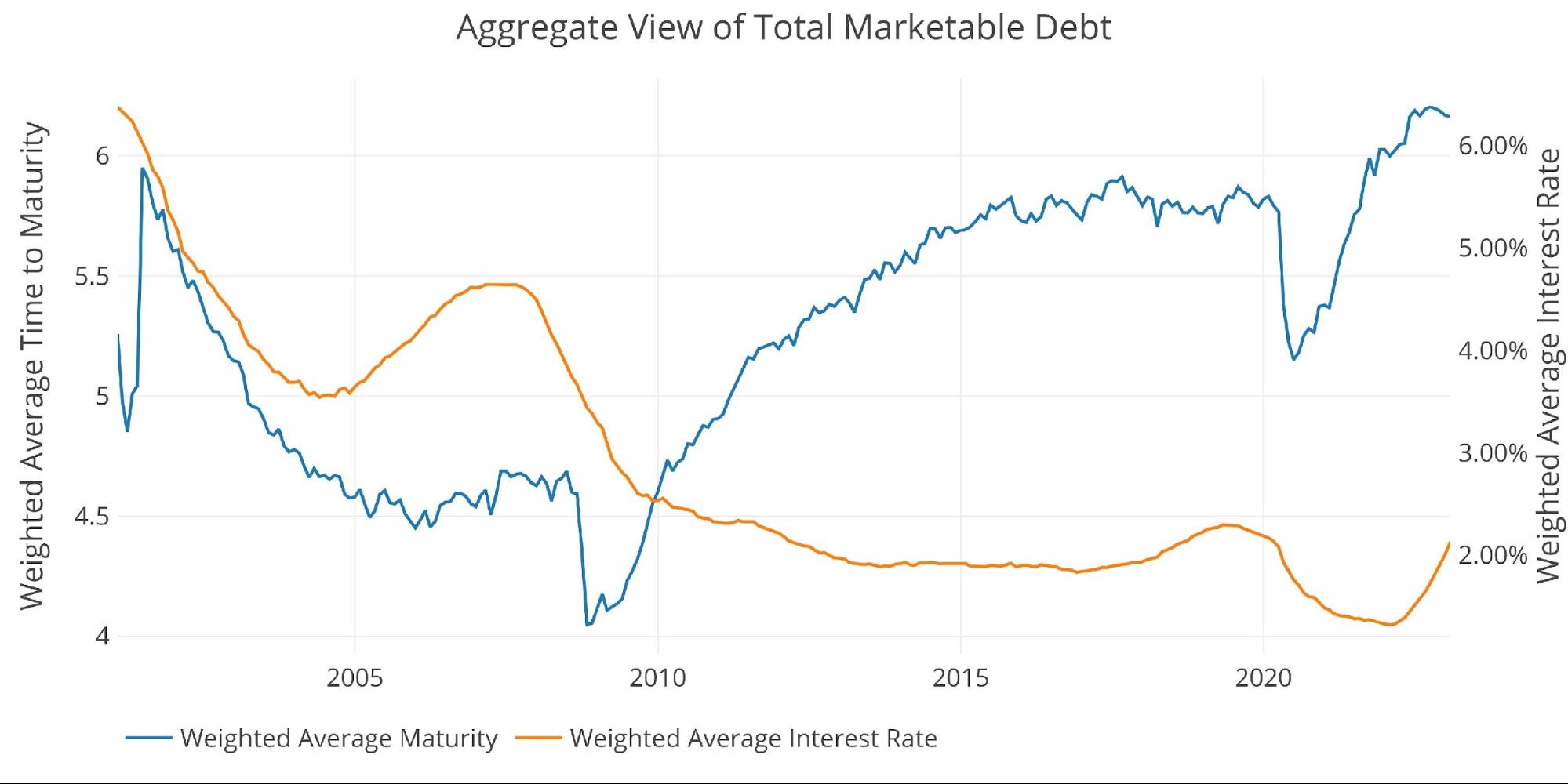
Figure: 3 Weighted Averages
The elephant in the room continues to be the interest paid on the debt. The chart below says it all… things are escalating quickly! Annualized interest on Bills has reached $141B. This is up from under $3B last January. That’s an almost 50-fold increase in 12 months! Interest on Notes have increased from $180B to $240B over that same period.
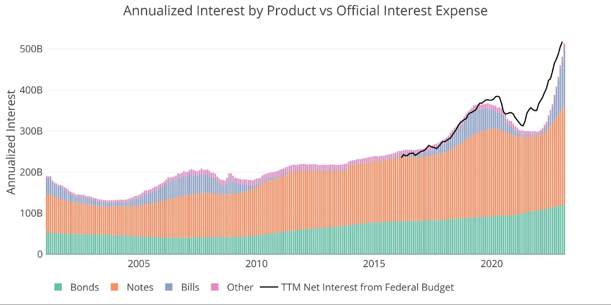
Figure: 4 Net Interest Expense
The next chart shows the trajectory of the rate of interest assuming the Fed sticks to the course laid out in the dot plot. As shown, we are well past where things were when the Fed last had to pivot. It’s not hard to imagine something breaking in the very near future given the steepness of the current move. While it is surprising nothing has broken yet, these things do tend to work on a lag. Sometimes as long as 12-24 months.

Figure: 5 Projected Net Interest Expense
In the meantime, more debt will be rolling over at higher rates. The rollover shown below is the primary driver of the increase in interest shown above looking out over the next 12-24 months.
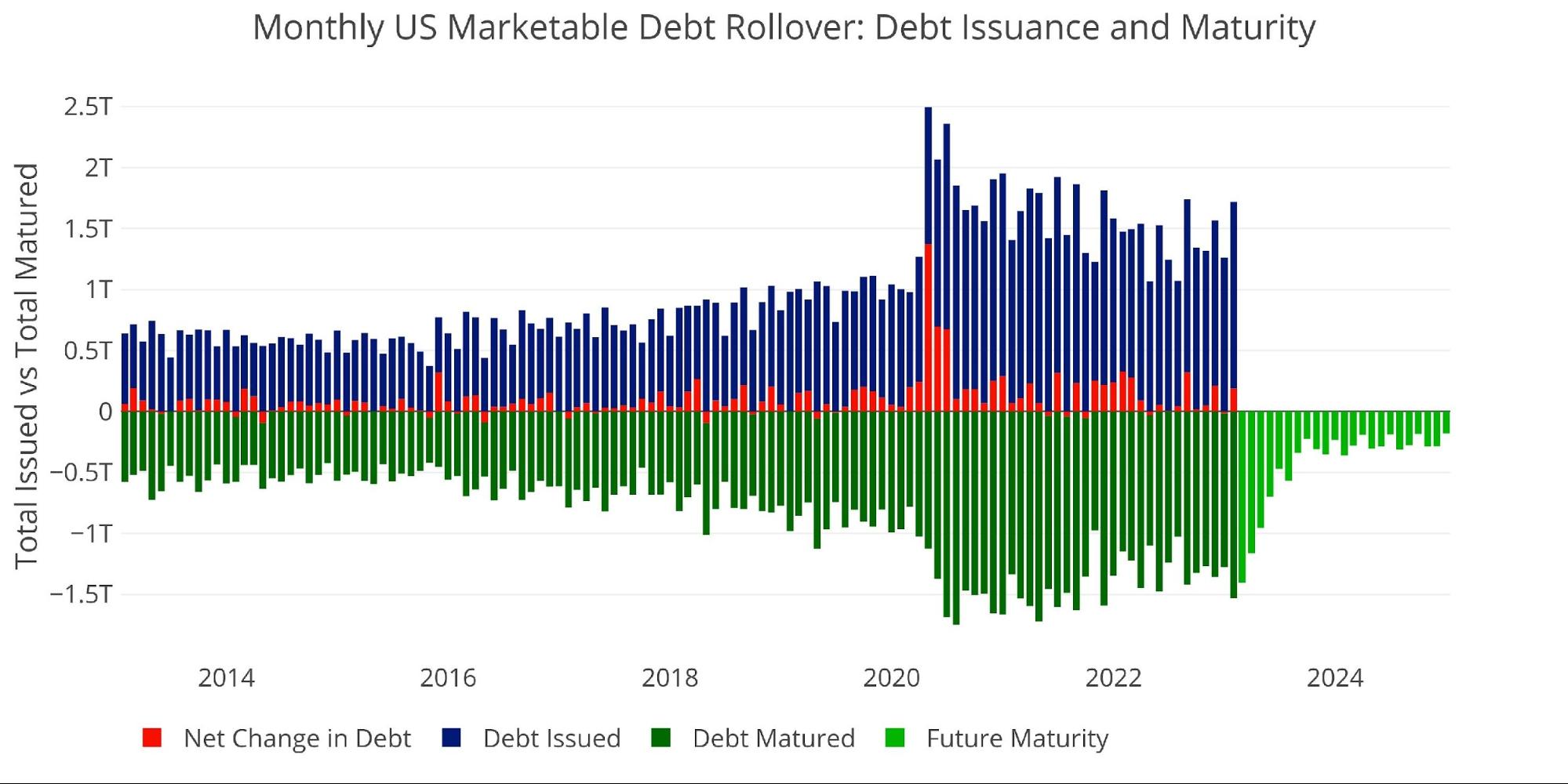
Figure: 6 Monthly Rollover
Note “Net Change in Debt” is the difference between Debt Issued and Debt Matured. This means when positive it is part of Debt Issued and when negative it represents Debt Matured
The current debt ceiling saga has just gotten started, but the Treasury has been planning for this. They have increased their cash balance by almost 100% since early January from $310B to $580B on Jan 31. The cash balance has fallen since then, but it still sits at over $500B.

Figure: 7 Treasury Cash Balance
Digging into the Debt
The table below summarizes the total debt outstanding. A few key takeaways:
On a monthly basis:
-
- The big move can be seen in 1-12 months, totaling $240B
- Notes were relatively flat over the month while Bonds jumped $42B
- Non-Marketable fell $153B
On a TTM Basis:
-
- Every category is now positive over the TTM period except for 6-month Bills
- 3-10 years combined for almost $600B increase in the last 12 months
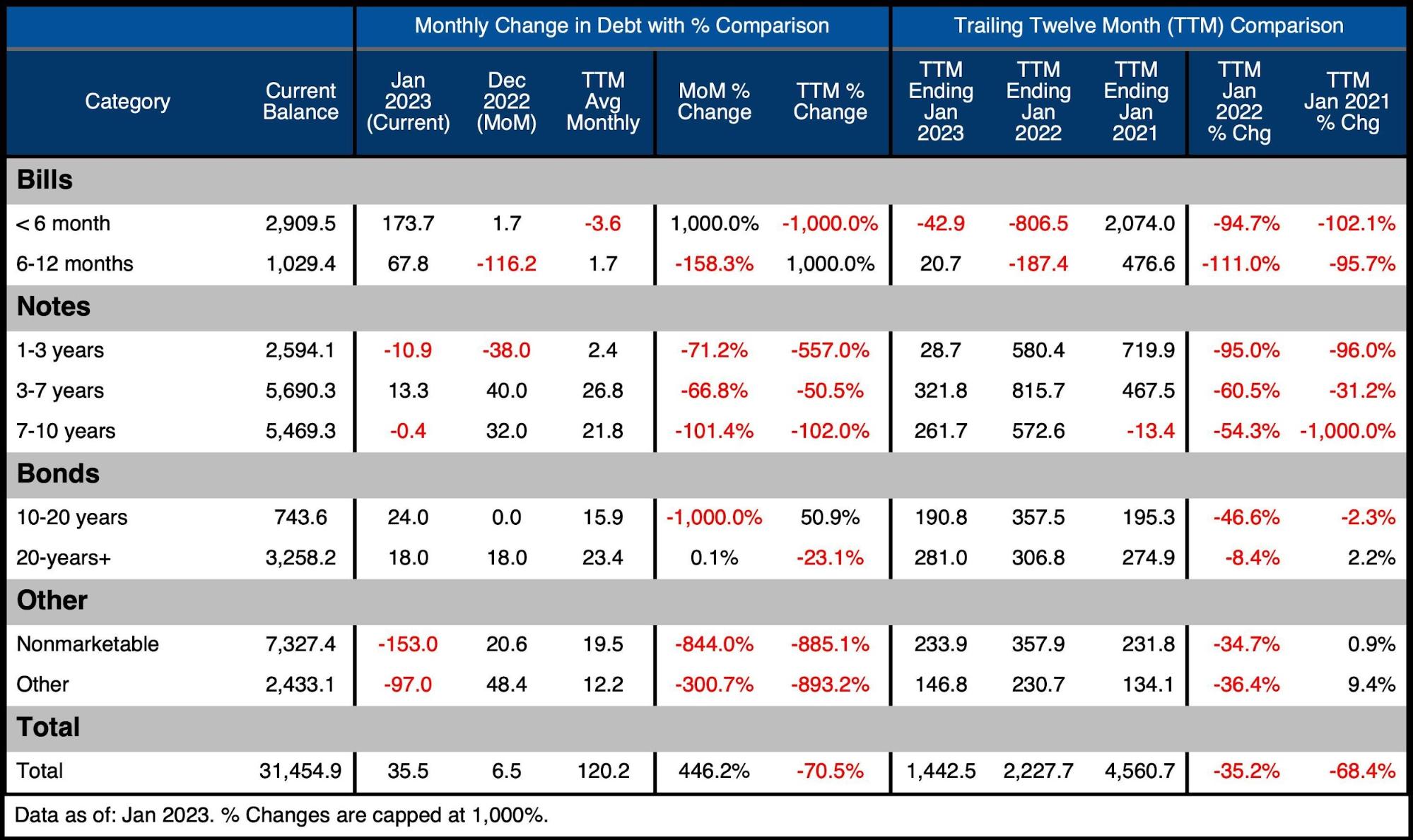
Figure: 8 Recent Debt Breakdown
A Looming Recession
The yield curve remains deeply inverted with the 10-year 77bps below the 2-year as of Feb 3rd.
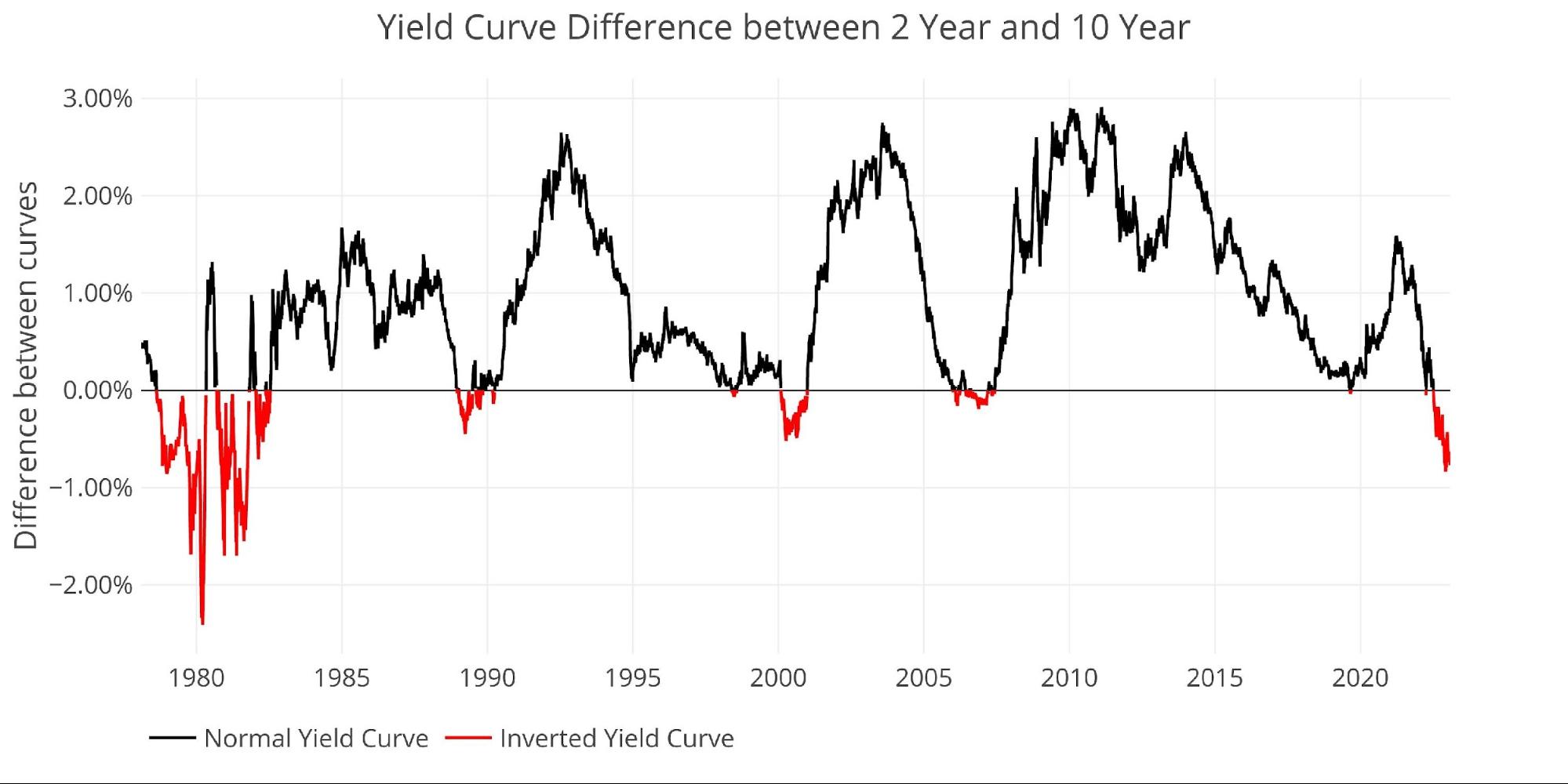
Figure: 9 Tracking Yield Curve Inversion
One interesting data point is the surge in the Bid-to-Cover for 2 and 10-year Notes. Both have seen a significant spike to the highest level since before Covid. This suggests there was an appetite for US Debt leading into the debt ceiling saga.
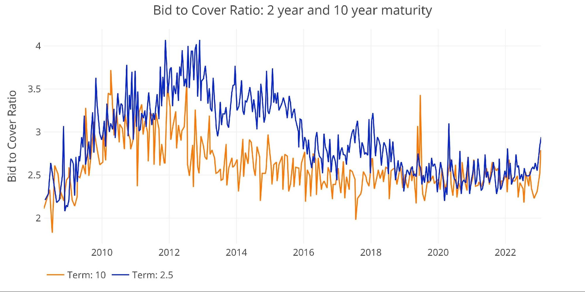
Figure: 10 2-year and 10-year bid to cover
Historical Perspective
While total debt now exceeds $31T, not all of it poses a risk to the Treasury. There is $7.5T+ of Non-Marketable securities which are debt instruments that cannot be resold and the government typically owes itself (e.g., Social Security).

Figure: 11 Total Debt Outstanding
Unfortunately, the reprieve offered by Non-Marketable securities has been fairly limited in recent years, as the Treasury has been forced to rely more heavily on private markets. This has made Non-Marketable fall from over 50% of the debt to less than 25% of total debt outstanding.
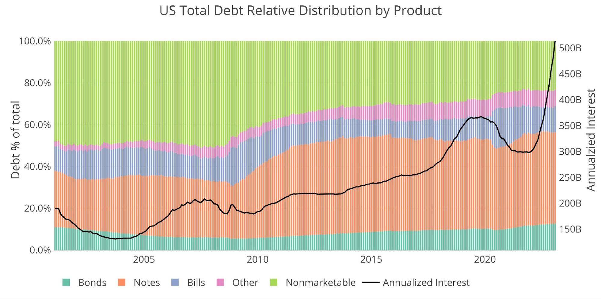
Figure: 12 Total Debt Outstanding
Historical Debt Issuance Analysis
The table below breaks down the trends shown above with specific numbers.
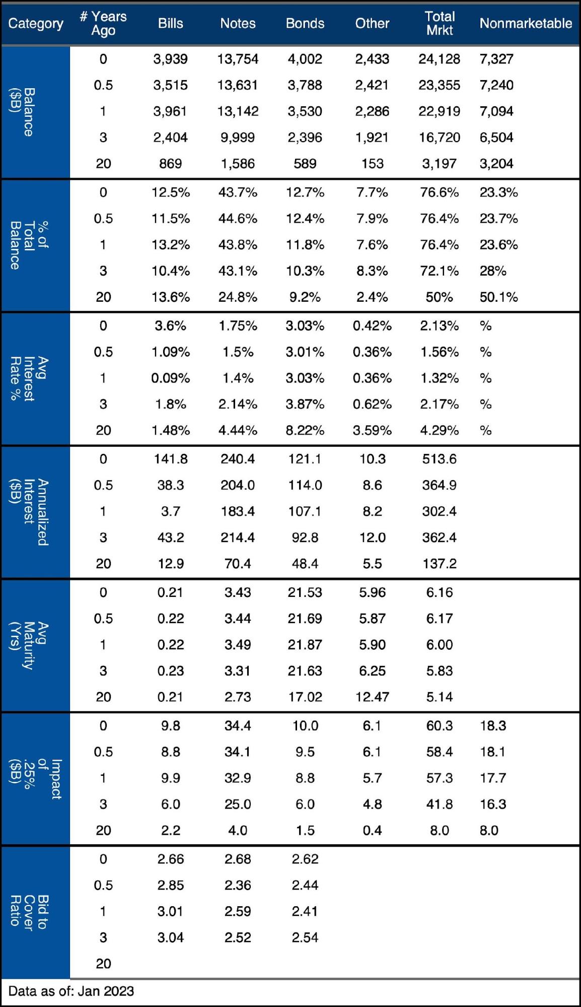
Figure: 13 Debt Details over 20 years
It can take time to digest all the data above. Below are some main takeaways:
-
- Average maturity has fallen across nearly every instrument over the last year
- The Fed may have slowed to 25bps increases, but this still translates to $60B per hike after it works through the entire curve
- Average interest rates on Bills have blasted higher from 0.09% to 3.6%, but there is still a full percentage point to go to reach the current Fed Funds rate
Wrapping Up
The debt ceiling saga is capturing headlines, but behind the scenes, the real story is the massive spike in debt servicing costs. This same effect of surging rates is rippling throughout the entire economy. The biggest difference is that only the US Government has a printing press. While something else will likely break before the Treasury defaults, there should be no doubt that money printing will enter the equation at some point in the near future. That is when inflation turns right back around and starts moving higher.
Data Source: https://www.treasurydirect.gov/govt/reports/pd/mspd/mspd.htm
Data Updated: Monthly on fourth business day
Last Updated: Jan 2023
US Debt interactive charts and graphs can always be found on the Exploring Finance dashboard: https://exploringfinance.shinyapps.io/USDebt/

Call 1-888-GOLD-160 and speak with a Precious Metals Specialist today!
Buka akaun dagangan patuh syariah anda di Weltrade.
Source link