

John P. Hussman, Ph.D.
President, Hussman Investment Trust
February 2022
Nothing will appear more logical and natural to this audience than the idea that a common stock should be valued and priced primarily on the basis of the company’s expected future performance. Yet this simple-appearing concept carries with it a number of paradoxes and pitfalls. For one thing, it obliterates a good part of the older, well-established distinctions between investment and speculation. The market has a tendency to set prices that will not be adequately protected by a conservative projection of future earnings.
– Benjamin Graham
Why is it so hard to accept that speculative bubbles can burst? Interest rates were driven to zero for a decade. Yield-starved investors chased stocks to valuations beyond the 1929 and 2000 extremes. That speculation front-loaded more than a decade of future market gains into the present. Those gains are now behind us, embedded in breathtaking multiples. If history is any guide, a collapse in valuations is likely to return those gains to the future.
The process of losing speculative gains and recovering them over time is what I’ve often called a “long, interesting trip to nowhere.” It bears repeating that the S&P 500 lagged Treasury bills from 1929-1947, 1966-1985, and 2000-2013. 50 years out of an 84-year period. When the investment horizon begins at extreme valuations, and doesn’t end at the same extremes, the retreat in valuations acts as a headwind that consumes the return that would otherwise be provided by dividends and growth in fundamentals.
There is no birthright to ever-rising valuations, particularly given that market internals, fiscal subsidies, and the Federal Reserve’s latitude for recklessness have all turned against this speculative bubble. The record stock prices that investors observe here are the product of a) record valuation multiples that have been inflated by a decade of zero interest rate policy and resulting speculation by yield-starved investors, times; b) record earnings that embed distorted profit margins inflated by trillions of dollars of temporary deficit spending.
Investors are paying top dollar for top dollar.
As usual, our outlook will change as the observable evidence changes – particularly the prospects for long-term returns and full-cycle risk, which we infer from valuations, and the inclination of investors toward speculation or risk-aversion, which we infer from market internals. We do not expect yield-starved investors to observe “limits” to speculation, but we also know that once investor psychology shifts to risk-aversion, a trap door opens that even easy money does not reliably close. That’s because when investors become risk-averse, they view safe liquidity as a desirable asset rather than an inferior one.
A market collapse is simply risk-aversion meeting a low risk-premium. Faced with a combination of record speculative extremes and deteriorating speculative conditions, investors may want to remember that the best time to panic is before everyone else does.
Valuation review
There are lots of charts below – some that I’ve presented before are updated with current data, and some are new. As my former students know, I often review prior material briefly to provide context for what’s new, so that the new material can provide additional insights and connections that build on what’s been presented before.
We’ll begin with an observation, followed by a broad range of historical evidence to demonstrate it. Across decades of market cycles, particularly at market extremes, I’ve emphasized that stocks are not a claim on a single year of income, but are instead a claim on a very long-term stream of future cash flows that will be delivered to investors over time. Using a single year of results as a metric is only appropriate if that single year of results can be considered a “sufficient statistic” that’s representative of the entire future stream.
A valuation multiple is nothing but shorthand for a proper discounted cash flow analysis. One can only reliably use a ‘price/X’ multiple to value stocks if ‘X’ is a sufficient statistic for the very long-term stream of cash flows that stocks are likely to deliver into the hands of investors for decades to come. Not just next year, not just 10 years from now, but as long as the security is likely to exist. Now, X doesn’t have to be equal to those long-term cash flows – only proportional to them over time (every constant-growth rate valuation model relies on that quality). If X is a sufficient statistic for the stream of future cash flows, then the price/X ratio becomes informative about future returns. A good way to test a valuation measure is to check whether variations in the price/X multiple are closely related to actual subsequent returns.
The truth is that in the valuation of broad equity market indices, and in the estimation of probable future returns from those indices, revenues are a better sufficient statistic than year-to-year earnings (whether trailing, forward, or cyclically-adjusted). Don’t misunderstand – what ultimately drives the value of stocks is the stream of cash that is actually delivered into the hands of investors over time, and that requires earnings. It’s just that profit margins are so variable over the economic cycle that year-to-year earnings, however defined, are flawed sufficient statistics of the long-term stream of cash flows that determine the value of the stock market at the index level.
– John P. Hussman, Ph.D., Margins, Multiples, and the Iron Law of Valuation, 2014
The first chart below offers an overview of where market valuations stand, based on the measures that we find best-correlated with actual subsequent S&P 500 total returns across a century of market history. Each is presented as a multiple to the norms that have been historically associated with subsequent S&P 500 total returns averaging 10% annually. Presently, all of these measures stand at levels near 3.6 times those historical norms. The proper interpretation here isn’t necessarily that the S&P 500 will collapse by 72% from its highs. Rather, the implication is that investors should not expect durable, long-term S&P 500 total returns anywhere near 10% annually until valuations approach those norms. Keep in mind that the 2000 market extreme reached “only” 2.5 times these historical norms. That peak was followed by negative S&P 500 total returns for nearly 12 years (after taking index down by more than half in the interim).
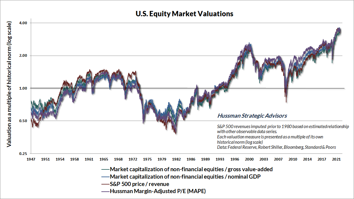
As a side note, I typically present valuations on log scale because, for example, valuations that are twice their historical norms have roughly the opposite implications for long-term returns as valuations that are half their historical norms.
The measures above are strongly correlated with actual subsequent S&P 500 total returns, and also with each other. The reason is that stocks are claims on decades and decades of cash flows, not just a year of earnings, and not even a decade of them. The most reliable “sufficient statistics” for those cash flows are not year-to-year earnings, but corporate revenues. To one degree or another, all of the measures above behave as broad price/revenue multiples. The apples-to-apples ones are the S&P price/revenue multiple, and nonfinancial market capitalization / nonfinancial gross value-added including estimated foreign revenues.
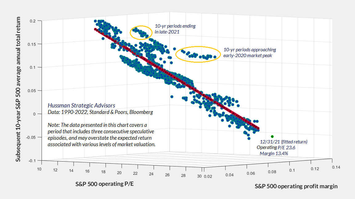
If you examine a century of market cycles, you’ll find that profit margins matter mainly if you are looking at P/E ratios. Even in recent decades, the price/revenue multiple alone has been much better correlated with actual subsequent S&P 500 total returns than the S&P 500 operating P/E multiple. Once you know the S&P 500 price/revenue ratio, adding information about S&P 500 profit margins results in very little improvement in projections of subsequent S&P 500 total returns.
In contrast, if you use the S&P 500 operating P/E as a predictor, your projections for market returns will improve substantially if you also include information about profit margins. But here’s the kicker. The profit margin gets assigned a negative coefficient. Stated another way, for any given S&P 500 price/earnings multiple, the higher the profit margin, the worse the subsequent market returns. As an investor, the higher the S&P 500 profit margin is, the less you want to pay for a dollar of earnings, because that high profit margin is probably not durable. When profit margins are extreme, paying a normal multiple for a dollar of earnings is equivalent to assuming that the extreme profit margin will be sustained forever.
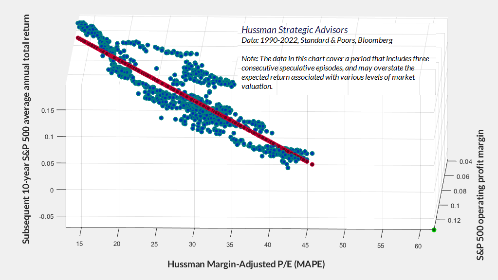
The chart below shows the S&P 500 operating P/E, operating margin, and subsequent 10-year average annual total return, in data since 1990. The red dots are fitted values based on multivariate regression, and the green dot shows the current P/E and margin, along with the current projection of estimated 10-year returns. As usual, the outliers on this chart typically represent 10-year periods that ended at bubble highs.
Note that the 1990-2022 period includes three separate bubbles and generally higher-than-average returns, so the chart may overstate the longer-term returns that investors should associate with any given multiple. Still, the data are clear: higher profit margins may accompany higher P/E multiples, but the combination is not helpful for investors.
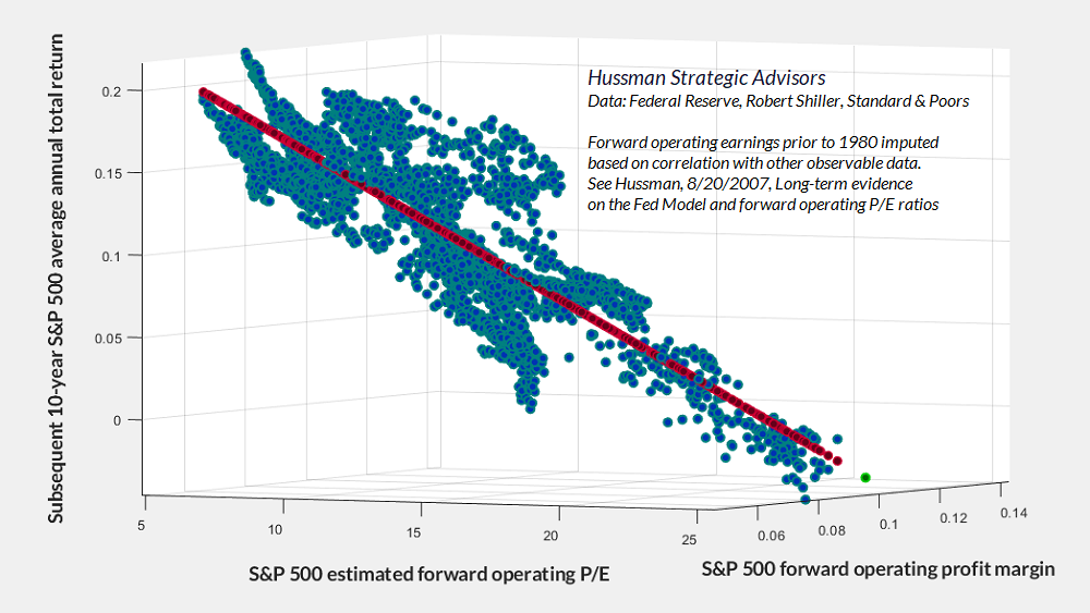
The chart below shows the same relationship using forward (year-ahead) operating earnings estimates. Note again that the most negative returns occur when investors pay top dollar for top dollar: high P/E multiples, on earnings that rely on elevated profit margins. The reason this is a bad combination is that paying high multiples on high margins requires both to be sustained indefinitely in order for prices to avoid very strong headwinds.
Now, it’s not impossible to “grow your way out” of extreme valuations, but the arithmetic can be daunting. For example, given that our most reliable valuation measures are about 3.6 times their historical norms, consider this. Even if these valuation measures were simply to touch their historical norms 30 years from today, prices would have to grow about 4% slower than fundamentals for that entire period (1/3.6 ^ 1/30 – 1 = -0.0418). When you realize that S&P 500 revenues, nonfinancial gross value-added, and nominal GDP have all grown at a rate of only about 4% over the past 10, 20, and 30 years, that 4% valuation headwind would combine to leave the S&P 500 unchanged over those 30 years.
Remember also that even if we examine the times in U.S. history when 10-year CPI inflation averaged even 4% annually, S&P 500 valuations at the end of those 10-year periods were always at or below their historical norms – on average more than 30% below those norms.
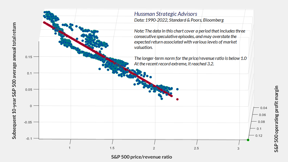
The chart below shows the same analysis for the S&P 500 price/revenue ratio. In this case, profit margins add very little information – if you could rotate the chart, you would see virtually no improvement in the scatter as you rotate away from price/revenue as the sole variable (which is why you see so little of that profit margin axis, compared with the P/E scatter plots above).
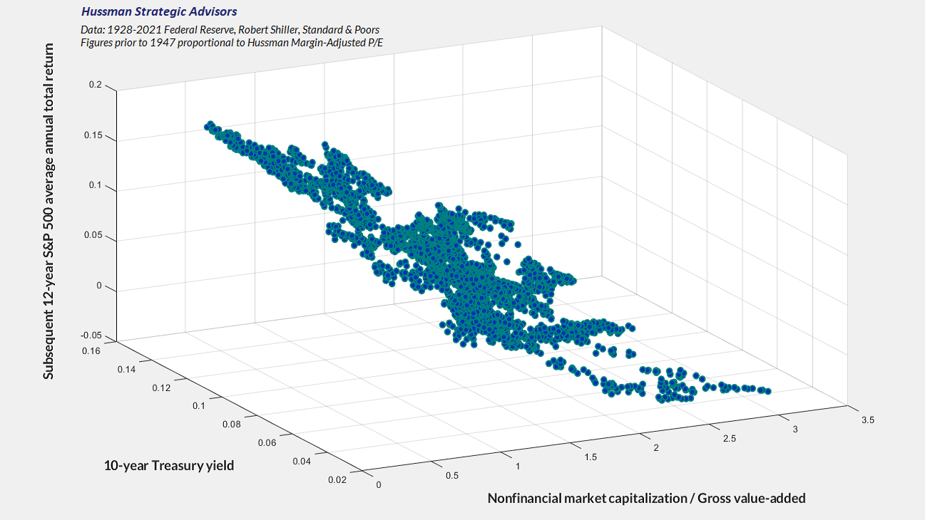
The chart below offers a broad historical perspective on where current valuations stand based on our Margin-Adjusted P/E in data since 1928. The S&P 500 price revenue ratio looks nearly identical, as does market cap/gross value-added, although the history for those measures doesn’t extend as far.
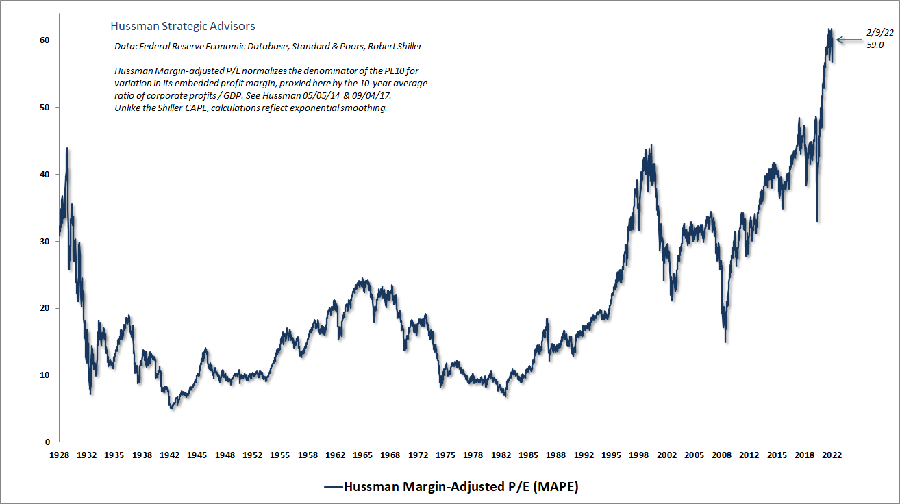
In the chart below, notice that knowing the level of S&P 500 profit margins doesn’t change the expected return implied by the MAPE. Even though the MAPE is a P/E based measure, the “margin adjusted” bit already captures the impact of varying profit margins, essentially resulting in a measure that correlates strongly with the price/revenue multiple, and with valuations based on actual subsequent discounted S&P 500 dividends. Again, a good valuation measure is nothing but shorthand for a proper discounted cash flow analysis.
A note on interest rates and expected returns
Three objects are related by pure arithmetic: the current price of a security, the future long-term cash flows, and the long-term rate of return. If you know the price, and you have a reliable fundamental that’s representative of future cash flows, you can estimate the long-term expected return directly. Interest rates are not required for that calculation. You can certainly compare that expected long-term return with interest rates, but if you know price and you know fundamentals, you already know the expected return, and interest rates don’t change it.
For example, if I tell you the cash flow is $100 a decade from today, and the current price is $82, I’ve also told you that the expected 10-year rate of return is 2% annually. Nobody needs to know the level of interest rates to do that math.
Interest rates become useful only if you don’t know the price. In that case, you can use the level of interest rates to choose the long-term expected return you want on your investment, and then discount the cash flows using that target return to get a target price. If you buy the security at that price, and the cash flows come in as expected, the discount rate you used is also your long-term expected return.
Remember this: while low interest rates often accompany rich valuations, low rates do nothing to mitigate the poor long-term returns that follow.
It’s tempting to believe that the recent near-10% decline in the S&P 500 has relieved the current valuation extremes, providing long-term investors with a durable investment opportunity. Easy now. Bear market declines typically comprise a whole series of market losses, punctuated by strong, short-term “clearing rallies” (which we often describe as fast, furious, and prone-to-failure). Though we would adopt a more constructive view if we observed uniformly favorable market action across our measures of broad market internals, any constructive stance would also require position limits and safety nets with valuations anywhere near present levels.
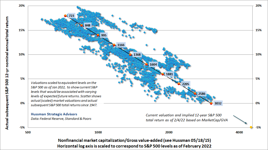
Meanwhile, we can map various levels of the S&P 500 Index to the long-term total returns that would currently be consistent with those levels. The chart below shows this mapping. The horizontal axis is scaled to show the levels of the S&P 500 that correspond to various levels of MarketCap/GVA (nonfinancial market capitalization to gross value-added). At present, a historically run-of-the-mill total return projection of 10% annually would correspond to a level of just under 1400 for the S&P 500.
I’ll say this again: the proper interpretation here isn’t necessarily that the S&P 500 will collapse by 72% from its highs. Rather, the implication is that investors should not expect durable, long-term S&P 500 total returns anywhere near 10% annually until valuations approach those norms. Indeed, until the S&P 500 drops below about 2600, I would consider even a Treasury bond yielding 2% to be a higher-return, lower-risk proposition than the S&P 500.
For now, here we are, at the most extreme market valuations in U.S. history – with investors paying top dollar for top dollar. This will not end well.
Margins, subsidies, and unit labor costs
Let’s take a closer look at corporate profit margins.
To begin, recall that every deficit of government emerges as a mirror-image surplus in other sectors. This isn’t a theory. It’s a mathematical identity. The chart below shows what this looks like in practice. Notice that the temporary multi-trillion dollar deficit of government during the pandemic emerged as a surplus in the sum of corporate earnings, personal savings, and the U.S. current account deficit (foreign savings).
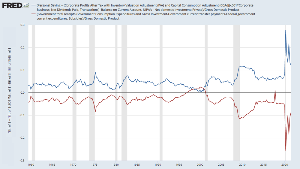
Indeed, in equilibrium, the surplus “savings” of the household, corporate and foreign sectors must be held in the form of exactly the same liabilities the government issued to finance the deficit (Treasury bonds or base money). Those government liabilities will now circulate from holder to holder, in that same form, until they are retired by the government, if ever. The Fed can change the mix by buying interest-bearing Treasuries and replacing them with zero-interest base money, but someone’s still got to hold the stuff until it’s retired.
As the federal deficit has abated, personal savings have narrowed even more rapidly than the deficit itself, and enough to leave corporate profits intact. As the savings rate has collapsed, consumption expenditures have surged well-beyond the pre-pandemic trend. In my view, this demand from households has contributed to recent inflation pressure but has also contributed to a temporary and misleading elevation of corporate profit margins. Given that government deficits in the coming quarters are projected to contract further, the combination of smaller deficits and a diminished reservoir of household savings may place surprisingly strong downward pressure on corporate profits in the quarters ahead.
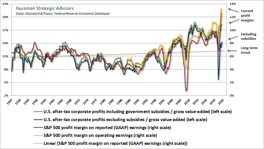
Labor costs also strongly affect corporate profit margins, as labor costs continue to be the largest component of corporate expenses. If you think carefully about profits, it’s clear that if the labor cost per unit of output increases more than the selling price of a unit of output, the profit margin will narrow. So we should expect corporate profit margins to move inversely with real unit labor costs (unit labor cost/output price). That’s exactly what we observe. Changes in unit labor costs are tightly associated with changes in profit margins. Indeed, much of the strength in profit margins during the past decade can be traced to weak growth in labor compensation coming out of the global financial crisis (yet another cost that yield-seeking speculation imposes on working families).
The chart below shows the impact of pandemic related subsidies on corporate profit margins, along with the margins that should be expected as those subsidies abate and profit margins better reflect their longer-term relationship with real unit labor costs.
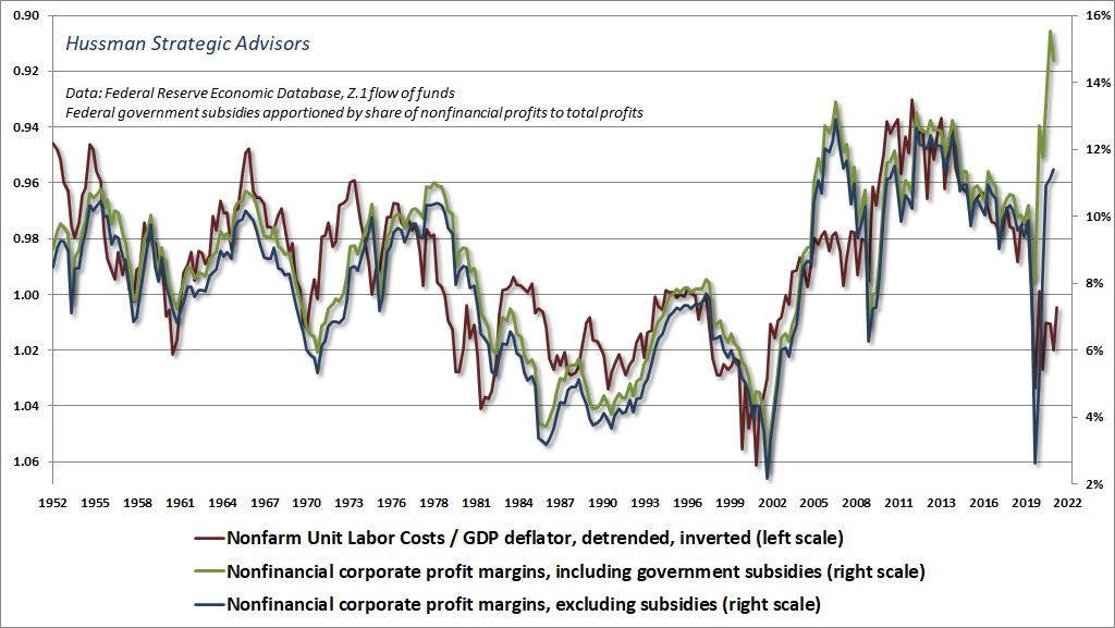
There are differences between national income data and corporate earnings reports in how profits are defined. The chart below shows how they are related. Notice that while margins have enjoyed a rising trend over time, the slope of that trend is much flatter than investors seem to imagine. When investors consider the recent distortion from temporary pandemic-related subsidies, coupled with upward pressure on labor costs in an economy that is now within 0.5% of estimated potential GDP, they may want to think twice about pricing stocks on the assumption that current profit margins will be sustained indefinitely. That, of course, is exactly what investors do when they take P/E multiples at face value.
When profit margins are extreme, paying a normal multiple for a dollar of earnings is equivalent to assuming that the extreme profit margins will be sustained forever.
How QE doesn’t help
The futility of it. The reckless futility.
“Quantitative easing” is a simple operation with profound financial consequences. The Fed purchases interest-bearing Treasury securities from investors and replaces them with zero-interest base money (bank reserves and currency) which some investor must hold, at every moment in time, until the Fed removes it. When the Fed “increases its balance sheet,” it holds more Treasury securities as assets, and issues more base money as liabilities (see the top line of a dollar bill). As a result, the public holds fewer interest-bearing Treasury securities as assets, and more zero-interest base money instead.
Fed policy is not, and cannot be, “independent” of fiscal policy. When the government runs a deficit, it issues liabilities in return for goods and services. These liabilities must show up as somebody’s “savings” (which they received in return for producing goods and services that they did not consume). The government liabilities take the form of either Treasury securities or base money. Congress determines the size of the deficits, and thus the total quantity of government liabilities. The Fed determines how much of these liabilities must be held by the public as base money rather than Treasury securities. While Fed policy is often described as “pumping money into the economy,” it only exchanges interest-bearing government liabilities with zero-interest ones. These liabilities must be held by someone until they are retired.
Investors hold base money indirectly, mainly as bank deposits. The problem is that the only way for an investor to get rid of zero-interest base money is by trading it for something else – stocks for example. Yet the moment a share of stock is delivered from the seller to the buyer, the zero-interest base money goes from the buyer to the seller. In aggregate, someone still has to hold that zero-interest cash. It can change hands, but it can’t “go into” something else without coming right back “out.”
As long as investor psychology is not risk-averse (which we gauge using market internals), investors view zero-interest cash as an “inferior” asset rather than a desirable one. They seek riskier alternatives in the hope of avoiding “zero,” and seem to pay no attention to the valuation of these alternatives. This maddening psychological discomfort with “zero” is how the Fed has created what we view as the broadest and most extreme speculative financial bubble in history.
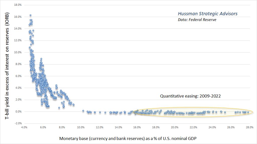
Here is what QE looks like. It’s my version of what economists call the “liquidity preference curve.” Increase the quantity of zero-interest hot potatoes as a share of GDP, and investors respond by chasing yield in other securities. Treasury bills are the closest substitutes, so their yields are affected most reliably. Once base money hit the unprecedented level of 16% of GDP back in 2011, not a dollar more was actually needed in order to hold short-term interest rates at zero. Every additional dollar of QE simply ensured that the speculative reach for yield would become broader.
Probably needless to say, the only way that the Fed will be able to raise interest rates above zero, for the foreseeable future, will be to explicitly pay interest to banks. At the point that rate goes above the yield to maturity at which the Fed purchased these bonds, the Fed will have crossed into fiscal policy – creating base money without a corresponding asset.
Given the relationship between the fed funds rate and the quantity of base money, it can be useful to disentangle their effects. One approach is to estimate the curve above. One finds that a 2% fed funds target implies base money of about 8% of GDP, while a 4% fed funds target implies base money of about 6% of GDP. Base money currently amounts to nearly at 28% of GDP, and yet the Fed is still expanding its balance sheet.
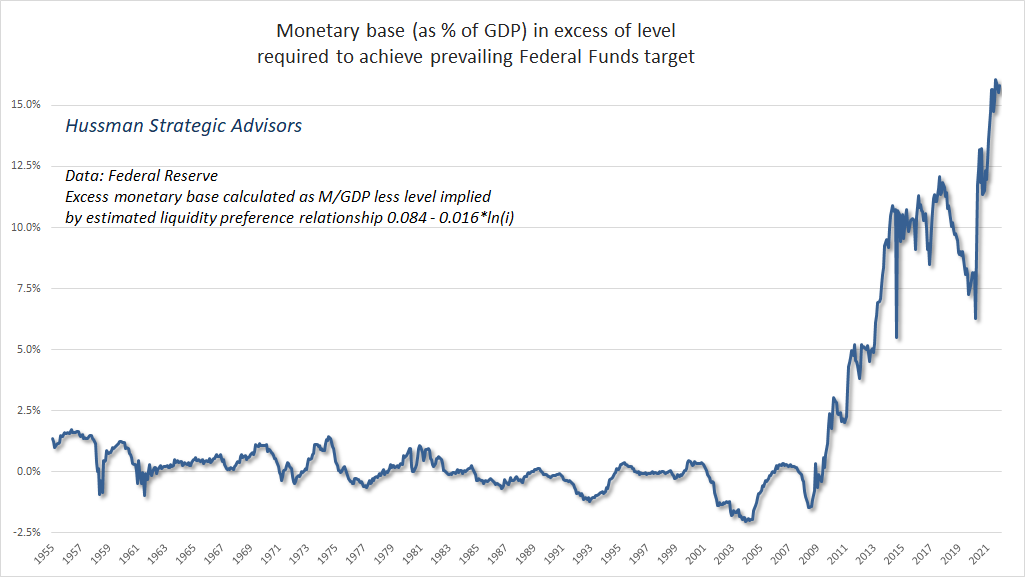
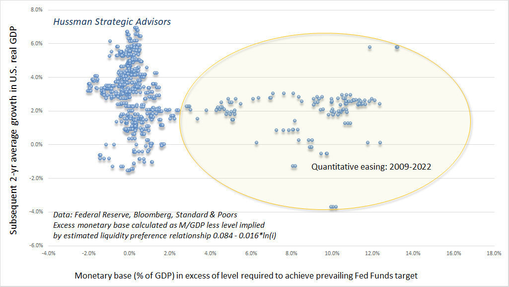
The chart below shows the amount of base money in excess of the amount actually required (as implied by the liquidity preference curve) in order to achieve the federal funds rate that prevailed at each point in time. This gives a sense of the component of Fed policy that is “pure” QE, apart from the interest rate effect.
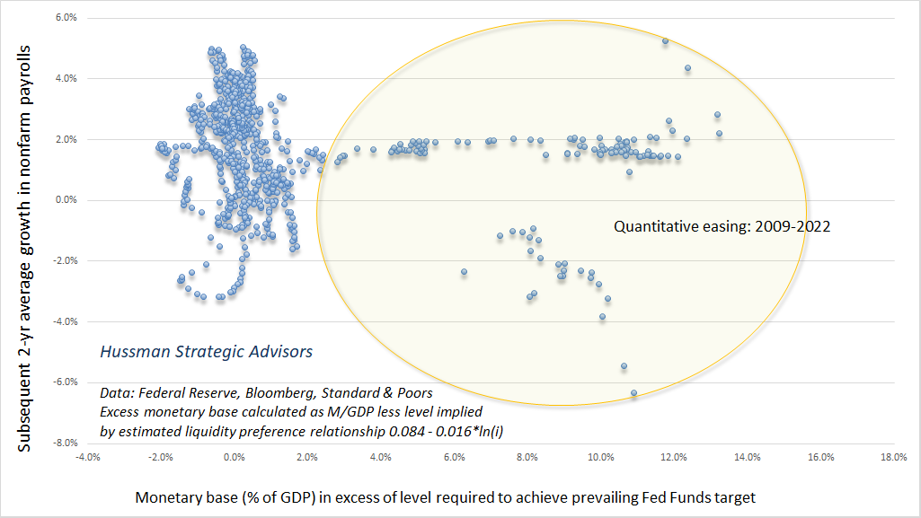
If we examine the relationship between this “excess” base money and other economic variables, we find that it has no beneficial relationship to subsequent GDP growth and employment growth. Indeed, the correlation goes the wrong direction, and is negative whether one examines one, two, or three years into the future.
The chart below shows the relationship between “excess” base money (essentially QE) and subsequent average 2-year growth in real U.S. GDP. It’s a scatter of birdshot, with no reliable or even discernable impact. If you estimate the slope, it’s slightly negative.
Ditto for subsequent growth in U.S. employment.
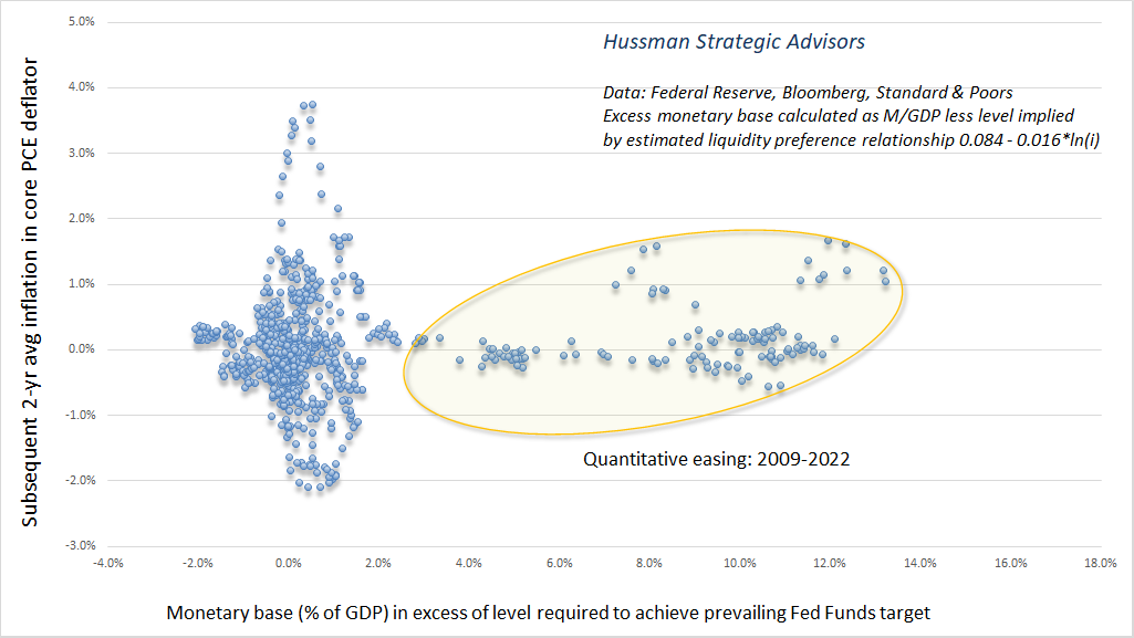
Now, if your goal is to produce inflation, excess base money does have a slightly discernable upward impact on inflation, but even that scatter is wide and unreliable.
There is, however, one area that has been very strongly affected by the enormous pile of zero-interest hot potatoes that the Fed has created: financial market valuations. The chart below plots excess base money versus the S&P 500 price revenue ratio. Put simply, quantitative easing is an exercise in amplifying yield-seeking speculation.
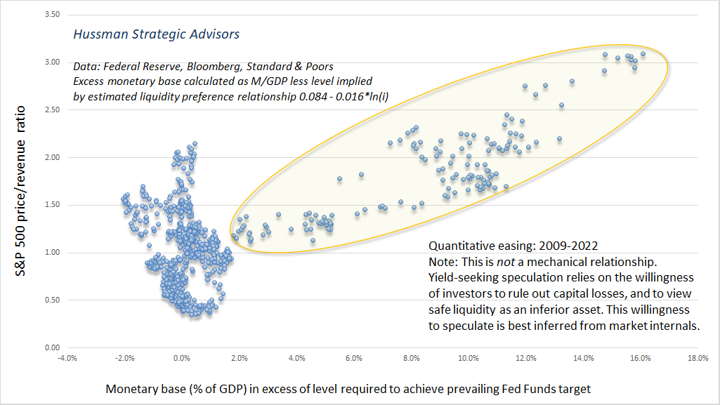
Emphatically, this relationship between zero interest base money and market valuations is not mechanistic. Instead, the relationship relies entirely on the condition of investor psychology. See, when investors are inclined to speculate (which we infer from the uniformity of market internals), they psychologically rule out the possibility of capital losses. In that environment, zero-interest money burns a hole in their psyche, and is considered “inferior” to any asset that offers the possibility of gain, whether it’s a Treasury bond, a mortgage security, covenant-lite junk debt, common stock, or a digital Pokémon. When investors are inclined to speculate, they tend to be indiscriminate about it.
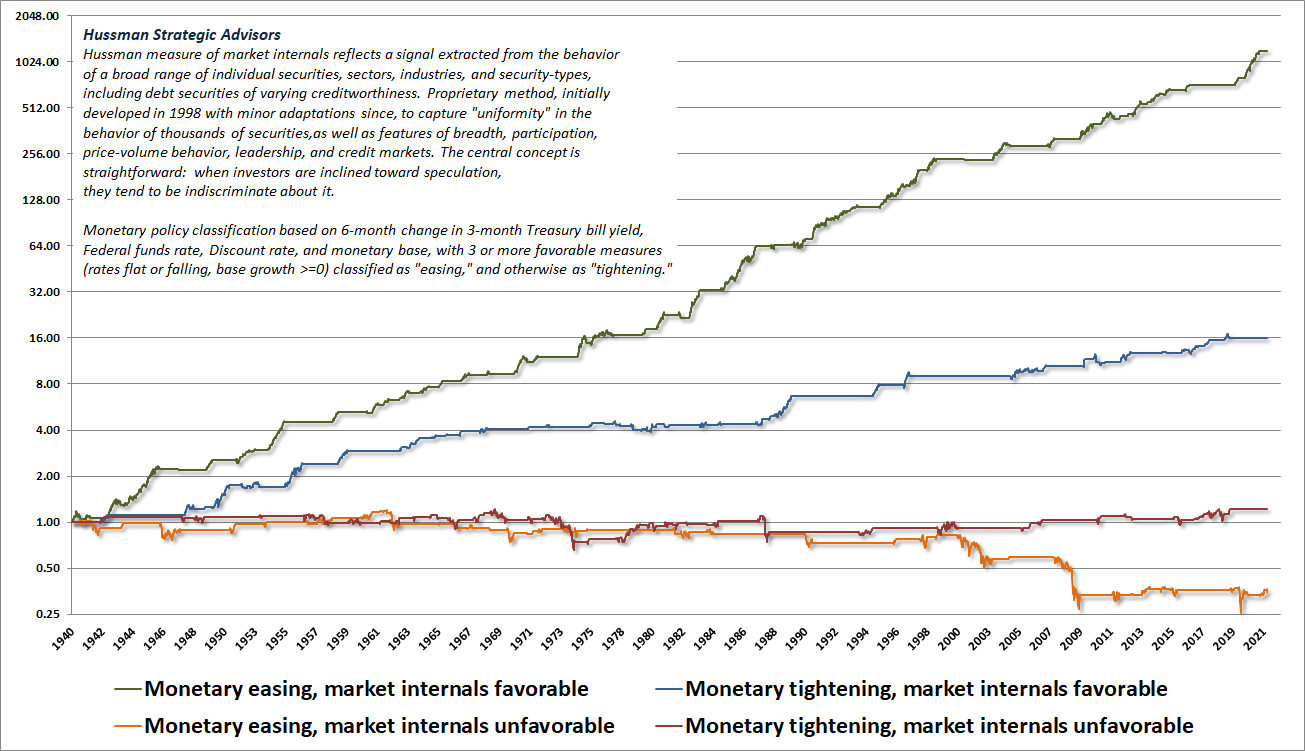
In contrast, when investors become risk-averse (which we infer from dispersion and deterioration across market internals), zero-interest liquidity becomes a desirable asset instead of an inferior one. So creating more of the stuff doesn’t necessarily provoke speculation. That’s how the S&P 500 lost half its value during both the 2000-2002 and 2007-2009 collapses, despite persistent and aggressive Fed easing the whole way down.
The chart below illustrates this dynamic. Each line shows the cumulative total return of the S&P 500 in one of four possible combinations of market internals (favorable/unfavorable) and Fed policy (easing/tightening). The flat parts of each line are where a given combination was not “active.”
It’s clear is that Fed easing amplifies speculation. During the recent bubble, we learned the hard way that, faced with the novelty of zero interest rates, yield-seeking speculation can go beyond any historically reliable limit. We had to adapt our own discipline to allow for that, but it’s also important to recognize that even in recent years, Fed easing has not reliably supported stocks during periods when investor psychology has shifted toward risk-aversion. That’s a distinction that many investors are likely to overlook, with devastating consequences, as this Fed-induced yield seeking bubble collapses.
Meanwhile, it may help for the Federal Reserve to recognize that elevated market capitalization is not “wealth.” Every security that is issued must be held by someone until it is retired. During that time, the only thing the security will ever deliver to its holder, or series of holders, is the long-term stream of cash flows that it distributes over time. The “wealth” is in those cash flows. It is certainly true that any given holder can sell at an elevated price, and obtain a larger amount of purchasing power than would be available otherwise, but in equilibrium, that sale corresponds to somebody else’s purchase of the same security at that same elevated price, and all the new holder will ever obtain from that security is its underlying stream of cash flows. In short, juicing the valuation of securities higher does not create “wealth,” but only the opportunity for sellers to obtain a transfer of savings from some buyer, who will then hold the bag of poor long-term returns. Small wonder that equity sales by corporate insiders are at record highs.
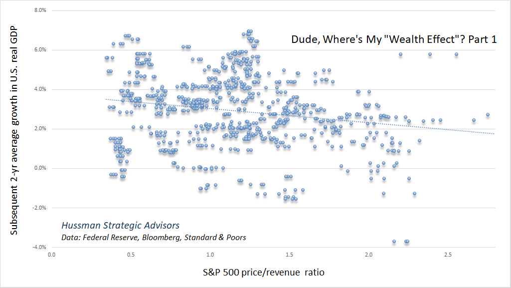
Moreover, you don’t get a “wealth effect” by encouraging speculation. Elevating the market capitalization of securities relative to their fundamentals does nothing favorable for subsequent economic outcomes. The relationship isn’t just an unreliable scatter – to the extent that there’s any correlation at all, it goes the wrong direction. The chart below shows the relationship between the S&P 500 price/revenue multiple and subsequent 2-year growth in real U.S. GDP.
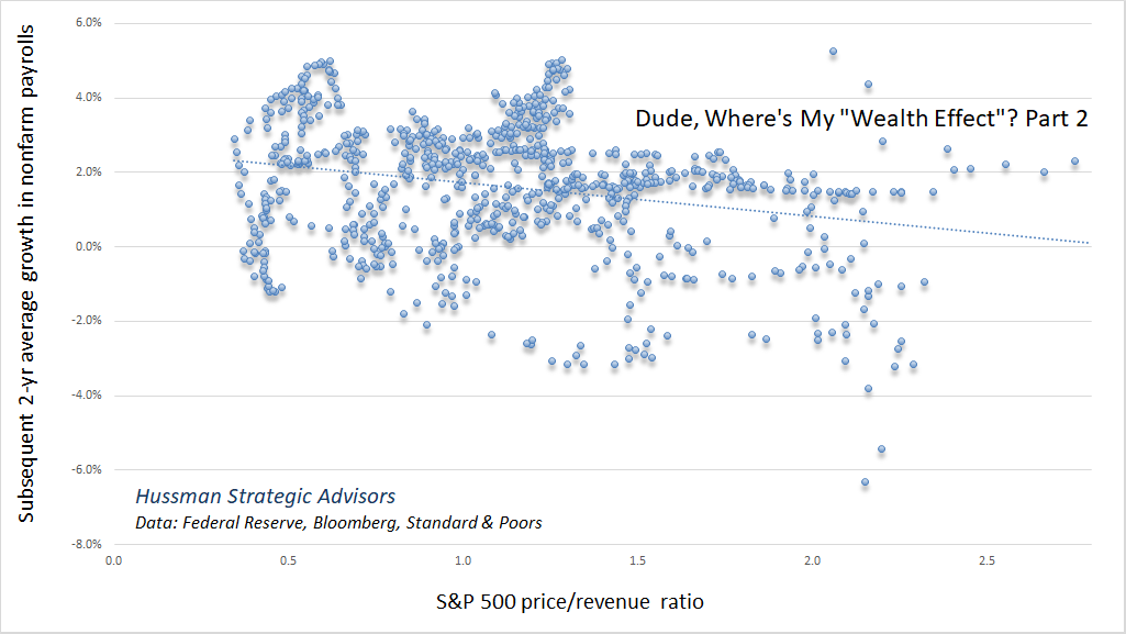
The same lack of a “wealth effect” is evident in the relationship between S&P 500 valuations and subsequent job growth.
The hazard and the moral
Ultra-low interest rates and more than a decade of QE have delinked the normal trade-off between risk and rewards. Investors no longer anticipate bearing all the risk that they are taking, and many are ignoring risk altogether, because they are counting on policymakers to safeguard the price of their holdings forever. In other words, they believe that there is a trustable ‘Fed put’ on asset markets. When moral hazard becomes so widespread, magical thinking inevitably follows, because market participants no longer believe that they are responsible for their commitments, or that calculated risks are genuine.
– Mario Blejer & Peroska Nagy-Mohacsi, The New Crisis of Central Banking, Feb 4, 2022
In the coming years, and perhaps the coming quarters, the Federal Reserve will have to navigate the collapse of a yield-seeking speculative bubble created by its own policies. The greatest difficulty will be during periods when investors are inclined toward risk-aversion.
I’m well aware that some investors are relying on the Fed to buy equities if the stock market declines substantially. On that note, it may be useful to understand that buying corporate equities without collateral “sufficient to protect taxpayers from losses” would be a violation of Section 13(3) of the Federal Reserve Act, and would amount to bailing out individual private investors with public money. Recall that the only reason the Fed was able to buy even $14 billion (billion, not trillion) of corporate debt during the pandemic is because Congress specifically allocated funds in the CARES Act for that purpose. Even then, the Fed was quickly reminded of the 4003(c)(3)(b) requirement that collateral must be “sufficient to protect taxpayers from losses,” which may be why the Fed immediately terminated its junk bond purchases.
It’s also worth noting that Congress wrote the Federal Reserve Act in a way that clearly intended 13(3) collateral to be tangible, and is quite hostile to the idea of using securities as collateral – see 13(2) and 13(8) for example. During the pandemic, the Fed essentially got a pass on treating $14 billion of unsecured corporate debt as if it somehow stood as its own collateral, but I do think that the sentiment of both Congress and the general public has moved to a less tolerant view of Fed actions.
For our part, we’ll respond to market conditions as they change, without relying on any “limit” to speculation, or even any respect by the Fed for the fiscal authority of Congress or the constraints of the Federal Reserve Act. Regardless of the policy environment, the strongest market return/risk profiles typically emerge at points where investors have valuations, market internals, or both on their side.
For now, the market continues to be in a “trap door” situation. Our gauges of market internals remain unfavorable, and valuations remain obscene. The market capitalization of non-financial and financial corporate equities hit $67 trillion at the recent peak. That’s a lot of stock market capitalization. The ratio of U.S. market cap/GDP began 2022 at a record extreme of 2.82, compared with a multiple of 1.88 at the 2000 bubble peak, and a historical norm of just 0.78. When you look at market capitalization, recognize that as much as 72% of it may be air. That is the hazard.
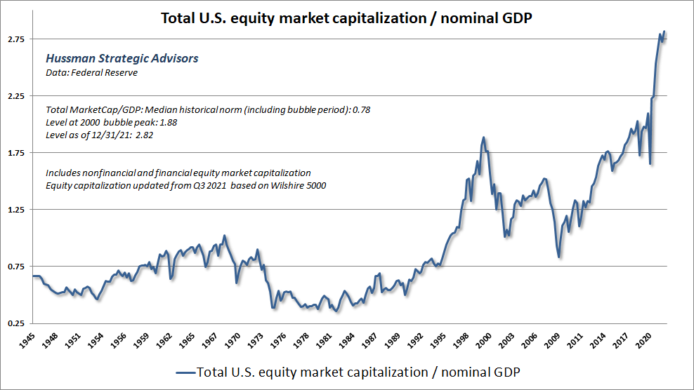
The chart shows the market value of all publicly traded securities as a percentage of the country’s business. The ratio has certain limitations in telling you what you need to know. Still, it is probably the best single measure of where valuations stand at any given moment.
– Warren Buffett, Warren Buffett on the Stock Market, Fortune, December 10, 2001
Though it’s tempting to flatter extreme valuations as “wealth,” market capitalization is not wealth. The wealth is in the cash flows. A retreat in valuations impairs “wealth” only to the extent that employment, value-added output, and productive investment are impaired. The good news here is that the stock market can fluctuate quite a bit without reliable consequences for the real economy.
The moral is this. Encouraging yield-seeking speculation, malinvestment, and risk of financial crises does not augment the wealth of the nation. Every security is both an asset to the holder and a liability to the issuer. When one nets out the financial assets and liabilities, one recognizes that the true basis of a nation’s wealth is its accumulated stock of productive investment, education, organizational structures, inventions, and unused resources. These are what our policies should encourage and protect.
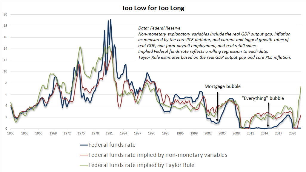
Finally, there’s a great deal of chatter these days about whether the Fed might be risking a “policy mistake” by raising rates, or by not raising rates. This chatter vastly overstates the correlation between small monetary policy actions and economic outcomes. In my view, the Fed’s major “policy mistake” is well behind us. I described the error – abandoning a systematic policy framework for more than a decade, in favor of purely discretionary one, in a recent Op-Ed for the Financial Times: The Fed Policy Error That Should Worry Investors.
The chart below shows how far the Fed has strayed from systematic policy.
The foregoing comments represent the general investment analysis and economic views of the Advisor, and are provided solely for the purpose of information, instruction and discourse.
Prospectuses for the Hussman Strategic Growth Fund, the Hussman Strategic Total Return Fund, the Hussman Strategic International Fund, and the Hussman Strategic Allocation Fund, as well as Fund reports and other information, are available by clicking “The Funds” menu button from any page of this website.
Estimates of prospective return and risk for equities, bonds, and other financial markets are forward-looking statements based the analysis and reasonable beliefs of Hussman Strategic Advisors. They are not a guarantee of future performance, and are not indicative of the prospective returns of any of the Hussman Funds. Actual returns may differ substantially from the estimates provided. Estimates of prospective long-term returns for the S&P 500 reflect our standard valuation methodology, focusing on the relationship between current market prices and earnings, dividends and other fundamentals, adjusted for variability over the economic cycle.
Source link