


January showed very strong growth with 467k jobs being reported by the BLS. This crushed expectations of 150k. Some analysts even expected a contraction given the reported loss by ADP on Wednesday.
However, the bigger story is the revisions of prior months. October to December saw upward revisions of nearly 900k jobs! The story is more complex though. The BLS has updated their models to “smooth” out the job numbers for seasonality. Much of the gains were pulled from job reports last summer (more on this below).
It’s possible the updated models are now anticipating strong job growth this summer and fall, counting that growth ahead of time. For example, the updated models revised last January up by 281k jobs (from 233k to 520k)! Is the BLS making a similar adjustment for this January? What if the expected job gains do not materialize?
Regardless, the analysis has to be done on the best and current data available.
The unemployment rate ticket up to 4% from 3.9%, but this can be attributable to a surge in the Labor Force Participation Rate from 61.9% to 62.2%, again due to “model adjustments”.
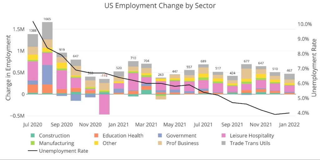
Figure: 1 Change by sector
Despite the higher revisions, the last 4 months have shown a downward trend that can be seen in the chart below more clearly. Seven of the eight job categories are actually below the 12 month average.
- Trade Transportation and Utilities is above trend (132k vs 81.6k)
- All Other categories are below the 12-month trend
- Construction saw a contraction in January (perhaps due to weather)
- Leisure and Hospitality was below trend, but still added 150k jobs in Jan
- Manufacturing saw 13k vs 30k TTM avg
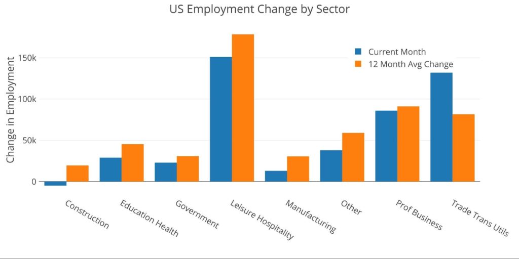
Figure: 2 Current vs TTM
The table below shows a detailed breakdown of the numbers. Similar to the 12-month trend, the current month is also below the 3-month trend in all categories except for Trade, Transportation, and Utilities and Local Government Services.
- Leisure and Hospitality has averaged nearly 200k a month for 12 months but is still down over 3 years by 8.4%
- Many categories are actually higher than 3 years ago as shown by the far right column
- Over 12 months, total employment increased by 6.6M workers or 4.4% and is now down only 0.3% from 3 years ago
- The 3 month average is only slightly below the 12 month average (541.3k vs 551k)
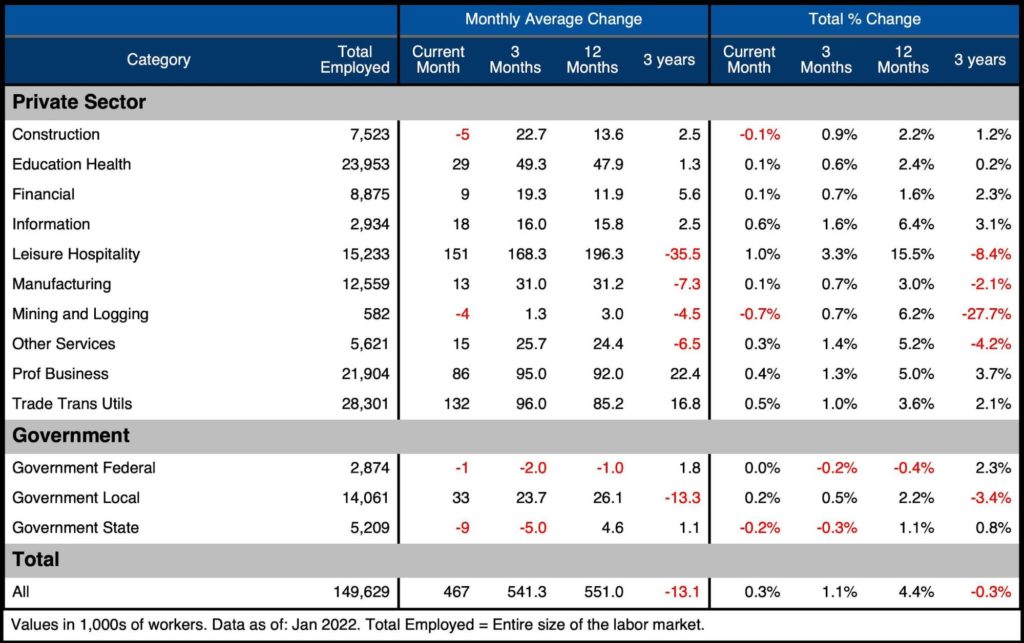
Figure: 3 Labor Market Detail
Revisions
As mentioned above, the major thing to review this month are the revisions. For several months, weak jobs reports have been published and revised slightly higher. However, in the recent report, numbers were revised much higher for Oct-Dec.
- Leisure and Hospitality saw an additional 85k jobs per month from Oct-Dec
- Professional Businesses and Education/Health also saw an additional 67k and 36k per month over the same period
- The 12-month revisions are much smaller in Leisure and Hospitality, with only 8.2k per month
- Trade Transportation and Utilities saw almost 42k jobs more per month than originally reported
- In aggregate, the job market was stronger by almost 111k per month for all of 2021
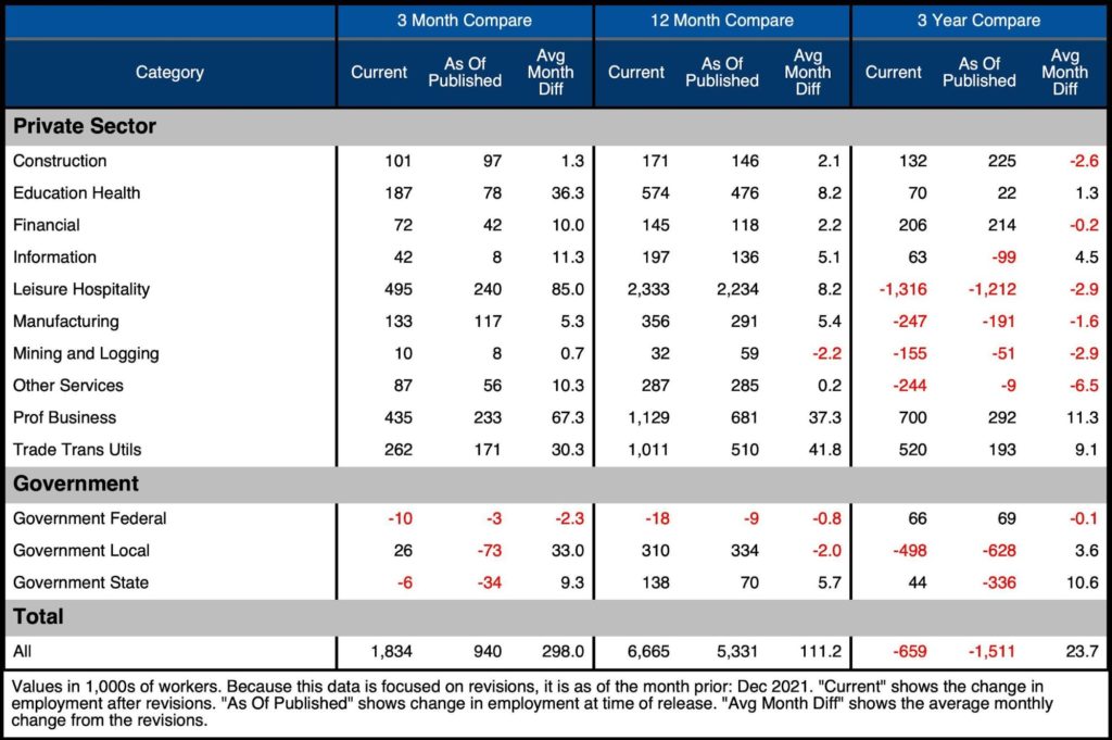
Figure: 4 Revisions
These massive revisions beg the question: what happened? The answer is not as simple as, “we are counting jobs that we missed”. It gets into the weeds of complex forecasting models and seasonality adjustments. As reported by the BLS:
“As part of the [annual] benchmark process, the seasonal adjustment models are also updated. These models remove normal seasonal fluctuations–such as regular employment changes due to major holidays–from the data series, making it easier to observe cyclical and other economic trends. Now that there are more monthly observations related to the historically large job losses and gains seen in the pandemic-driven recession and recovery, the models can better distinguish normal seasonal movements from underlying trends. As a result, some large revisions to seasonally adjusted data occurred with the updated models; however, these monthly changes mostly offset each other. For example, the over-the-month employment change for November and December 2021 combined is 709,000 higher than previously reported, while the over-the-month employment change for June and July 2021 combined is 807,000 lower.”
This language can be translated quite simply: “we pulled jobs from last summer and had them show up the last three months to smooth things out”. In aggregate, the last 12 months were only revised upwards by a combined 211k jobs since the December jobs report.
Please note: this represents only the difference between December until now. Total revisions from first publishing still total 1.3M for all of 2021 as shown in the table above.
In addition to adjusting the models for post pandemic seasonality, the BLS updated their census population figures. The results showed a large increase in the total population and the number of people employed. This directly resulted in the surge in Labor Force Participation. Again, from the BLS:
“Although the total unemployment rate was unaffected, the employment-population ratio and labor force participation rate were each increased by 0.3 percentage point. This was mostly due to an increase in the size of the population in age groups that participate in the labor force at high rates (those ages 35 to 64) and a large decrease in the size of the population age 65 and older, which participates at a low rate.”
The BLS uses survey data and highly complex economic models with key assumptions. Making small changes to assumptions can dramatically change how the report looks. How much can this data be trusted? Hopefully, it’s more accurate than the CPI report, but this recent reshuffling does call the reliability into question.
Regardless, this is how the financial markets view the US employment situation, and thus is should be reviewed and analyzed even if it raises red flags. Perhaps for this month, the ADP report has a better pulse on the market because it was not subject to so many methodology changes. It did show a 301k job loss.
Historical Perspective
The chart below shows data going back to 1955. As the labor force has grown in total aggregate numbers, the recessions along the way have caused dips in the general trend. But the trend is still clearly upward.
The Covid recession can be seen as the greatest job market loss. The chart also shows how much work the labor market still requires to regain the employment level seen prior to Covid (top far right draw down). As mentioned above, the job market had 152.5M people. That number currently sits just below 150M. The job market is still 2.5M people short. This does not account for the recent increases in census population estimates that likely require a higher employment level to equate to Feb 2020.
In the latest period, the unemployment rate increased from 3.9% to 4.0% (it was 3.5% pre-Covid). This occurred as labor force participation increased 30 bps (due to population changes as noted above).
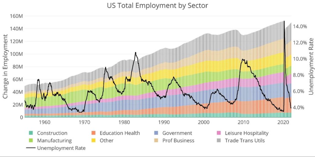
Figure: 5 Historical Labor Market
The distribution of the workforce has changes significantly over the last 65+ years. For example, in 1955, manufacturing accounted for 30% of jobs vs 8.4% today. Education/Health Care has tripled from 5% to 16%.
Although the unemployment rate has been sharply falling over the last year (chart above), the labor force participation (62.2%) is still below pre-pandemic levels (63.4%) and much lower than the 66% pre financial crisis.
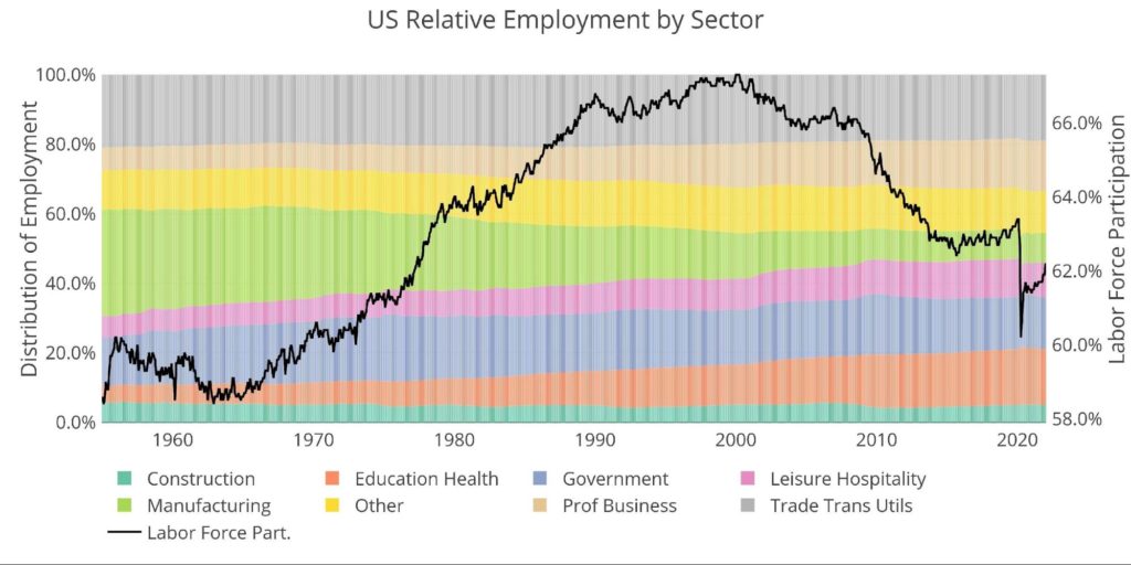
Figure: 6 Labor Market Distribution
What it means for Gold and Silver
In the hour after the BLS release, gold sold off hard. It bounced back above $1800 though and is at $1806 as of publishing. Perhaps the headline number and revisions took the market by surprise. Once traders spent the time to read the BLS report and understand the implications of the methodology changes they realized the job report is not nearly as strong as it first appears.
Regardless, barring some massive change in the February report, this gives the Fed plenty of ammunition to raise interest rates in March. This will likely keep pressure on prices in the near term. However, it won’t be long until the market realizes the Fed can only go so high before the house of cards fall. There are tremors in the Comex gold market. These tremors could be the early warning signs of a major market shift coming.
Data Source: https://fred.stlouisfed.org/series/PAYEMS and also series CIVPART
Data Updated: Monthly on first Friday of the month
Last Updated: Jan 2022
Interactive charts and graphs can always be found on the Exploring Finance dashboard: https://exploringfinance.shinyapps.io/USDebt/

Call 1-888-GOLD-160 and speak with a Precious Metals Specialist today!
Buka akaun dagangan patuh syariah anda di Weltrade.
Source link