


M2 increased by $201B in December. This represents a 0.94% MoM increase which annualizes to 11.9%. For the entire year of 2021, M2 grew by an incredible $2.5T or 13.1%! This is extremely rapid money supply growth! The Fed can taper their asset purchases, but shrinking the Money Supply is the only way to rein in inflation.
Despite this being extremely fast growth from a historical perspective, based on the most recent period, this recent deceleration could make it harder for the market to keep making new all-time highs. More on this below.
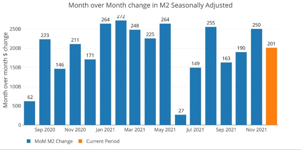
Figure: 1 MoM M2 Change
Comparing M2 and the CPI
Looking at a much longer historical perspective the chart below shows the YoY growth rate for each December dating back to 1960 and how it may impact the CPI. It also puts into context how extraordinary the last two years have been.
The current YoY 13.1% is behind only 2020 (24.8%), 1971 (13.4%), and 1976 (also 13.4%). The chart below shows this growth rate (bars) alongside CPI (black line) and the Fed Funds Rate (blue line).
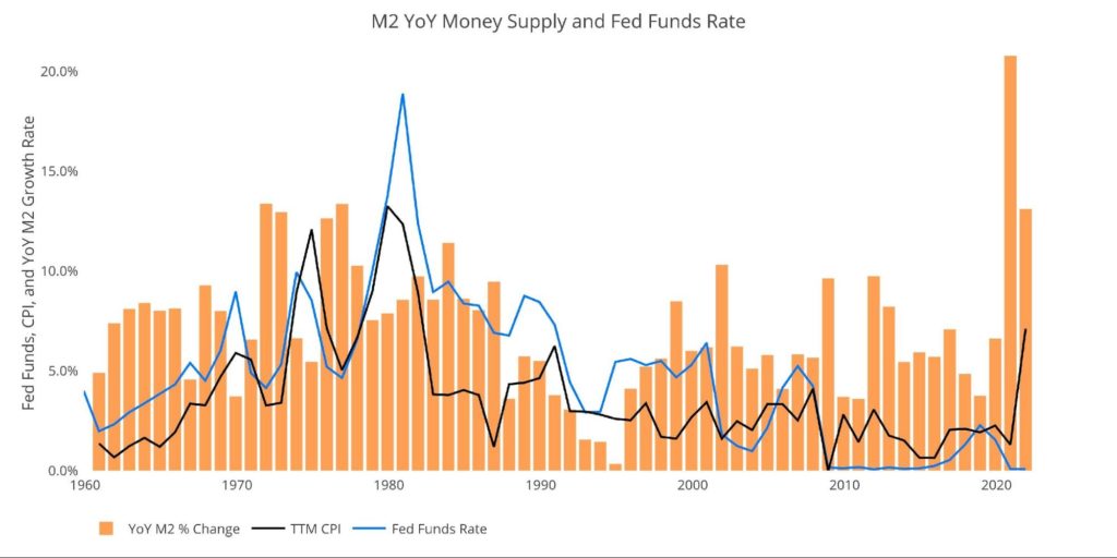 Figure: 2 YoY M2 Change with CPI and Fed Funds
The chart above shows how far behind the Fed is on the inflation curve. They have never been this far behind in 60 years (the difference between black and blue lines). The Fed is currently 7.1% behind inflation. The next closest was when they were 3.6% behind in 1974.
More concerning is the delayed correlation between expansion in the money supply and inflation. This is particularly visible in the 1970s when two years of rapid money supply growth would be followed by 2+ years of rapid inflation (the correlation has fallen as the CPI has been re-engineered). In each case, not only did Money Supply slow in the subsequent years, but the Fed had rates above the rate of inflation. Neither of these two headwinds exists today to restrain inflation.
The table below shows a more detailed look at the current money supply.
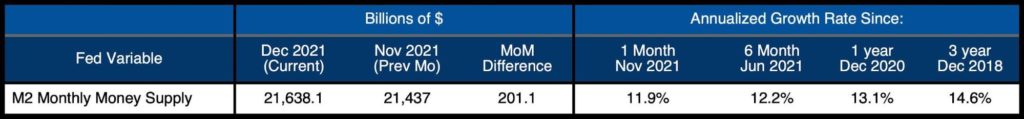
Figure: 3 M2 Growth Rates
While the most recent month is below the 6-month, 1-year, and 3-year trend, 11.1% is still very rapid growth. As shown in the chart below, this is still greater than the average monthly growth rate in any month from 2010-2019.
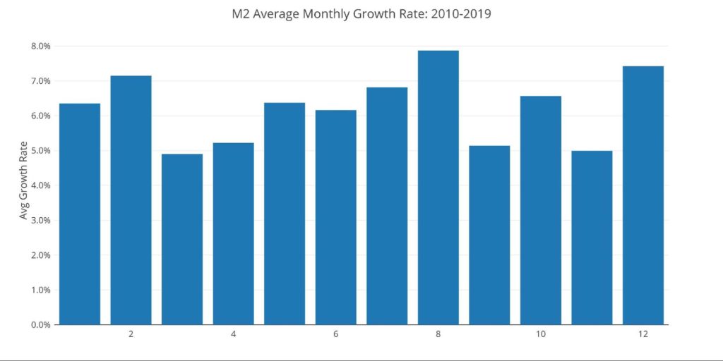
Figure: 4 Average Monthly Growth Rates
Zooming into the weekly view shows the noisier data that is not seasonally adjusted by the Fed (the charts and table above are seasonally adjusted).
The most recent week available, ending Jan. 3, showed a slight dip of -$26.8B. That represented the first weekly drop in the money supply over a 10-week span.
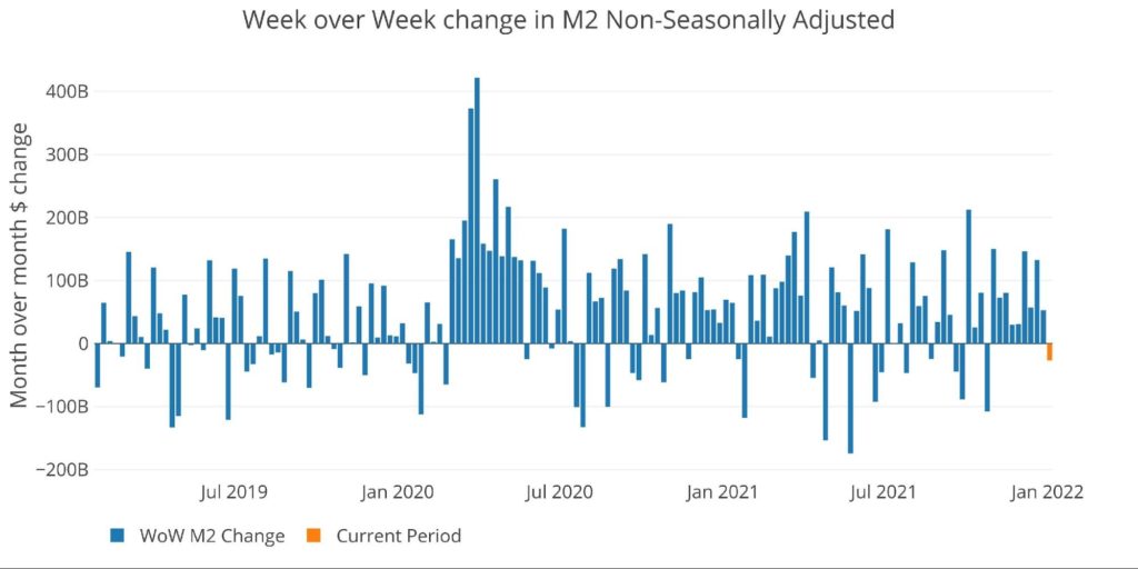
Figure: 5 WoW M2 Change
The “Wenzel” 13-week Money Supply
The late Robert Wenzel of Economic Policy Journal used a modified calculation to track Money Supply. He used a trailing 13-week average growth rate annualized as defined in his book The Fed Flunks. He specifically used the weekly data that was not seasonally adjusted.
The objective of this analysis is to normalize the choppy data and get a better sense of the general Money Supply trend. In the table below, decelerating trends are in red and accelerating trends in green. Money Supply growth on a 13-week annualized basis has now been accelerating for 16 weeks in a row. But is it enough?


Figure: 6 WoW Trailing 13-week Average Money Supply Growth
The plot below helps show the seasonality of the Money Supply and compare the current year to previous years. The range of the y axis has been capped at 25% so that the massive spike in 2020 up to 60%+ does not skew the graph.
As shown, the current year is now on par with 2020. Is this a new normal? Money Supply will have to keep growing at higher rates to keep a floor under the market.
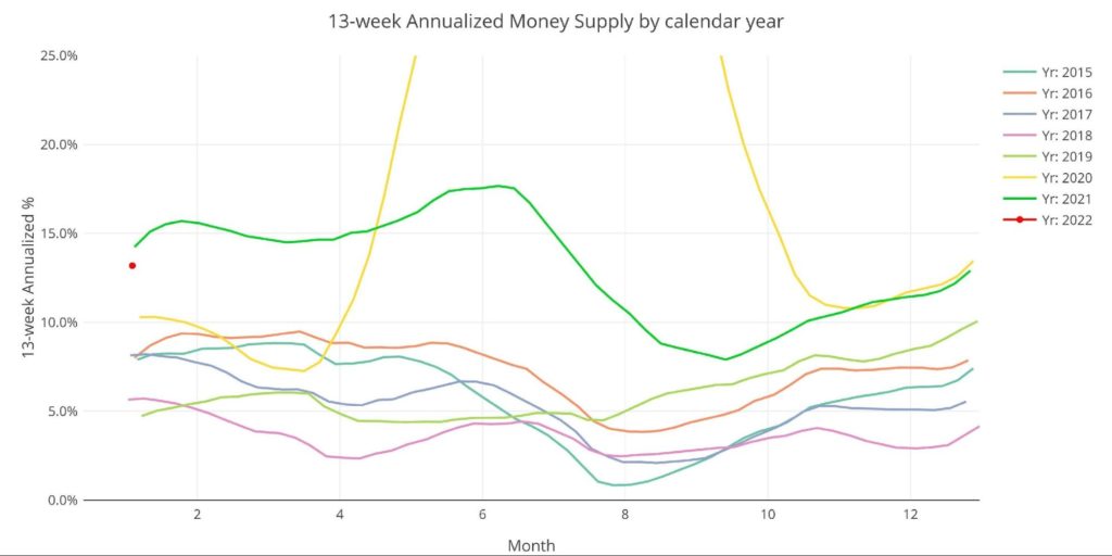
Figure: 7 Yearly 13-week Overlay
Historical Perspective
The charts below are designed to put the current trends into a historical perspective. The orange bars represent annualized percentage change rather than raw dollar amount. As can be seen, even the recent periods remain quite elevated compared to pre-Covid.
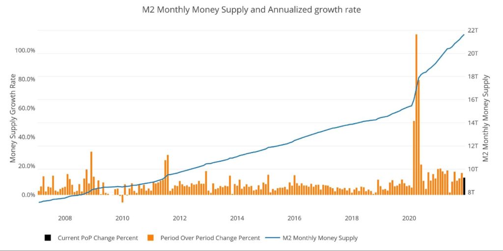
Figure: 8 M2 with Growth Rate
Taking a historical look at the 13-week annualized average also shows the unprecedented growth seen over the past 24 months. This chart overlays the log return of the S&P. Mr. Wenzel proposed that large drops in Money Supply could be a sign of stock market pullbacks.
His theory, derived from Murray Rothbard, states that when the market experiences a shrinking growth rate of Money Supply (or even negative) it can create liquidity issues in the stock market, leading to a sell-off. While not a perfect predictive tool, many of the dips in Money Supply precede market dips. Specifically, the major dips in 2002 and 2008 from 10% down to 0%.
It could also be argued the pullback in 2018 could be due to an extended lead up of low Money Supply growth compared to previous years. More recently, Money Supply dipped over the summer of 2021, and the market stalled out shortly thereafter. It’s now experiencing an even bigger pullback, perhaps due to a growth rate that is not strong enough to keep propelling the market higher. Does the market need more stimulus?
Please note the chart only shows market data through Dec 27 to align with available M2 data.
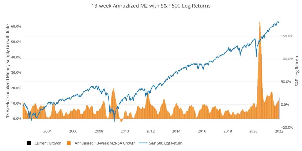
Figure: 9 13-week M2 Annualized and S&P 500
One other consideration is the massive liquidity buildup in the system. The Fed offers Reverse Repurchase Agreements (reverse repos). Essentially this is a tool that allows financial institutions to swap cash for instruments on the Fed balance sheet.
Current Reverse Repo hit a record $1.9T on Dec 31, dwarfing the old records of ~$500B in 2016-2017. The latest rate is $1.6T. The reverse repos typically top out at the quarter-end before coming back down. However, unlike past periods, the recent pullbacks after quarter-end are much smaller in magnitude, staying elevated throughout the quarter. This shows the massive liquidity difference in the current environment.
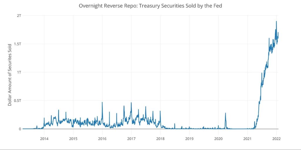
Figure: 10 Fed Reverse Repurchase Agreements
What it means for Gold and Silver
Inflation is an expansion of the Money Supply that generally leads to higher prices. Therefore, gold and silver can be used as insurance assets to protect against dollar devaluation (higher prices). Money Supply has been growing at alarming rates for years, and absolutely exploded over the last 2 years. This has started to show up in the highly doctored CPI.
Considering the massive expansion seen in M2, it was easy to predict the Fed’s “transitory” narrative would prove false. They appear to be the only ones who didn’t see that as a possibility. Is it still possible that inflation gets back under 2%? Possibly, but it doesn’t look probable. Looking at how things unfolded in the 1970s and the similar lead-up, wealth preservation with precious metals may be something to consider.
Data Source: https://fred.stlouisfed.org/series/M2SL and also series WM2NS and RRPONTSYD. Historical data changes over time so numbers of future articles may not match exactly. M1 is not used because the calculation was recently changed and backdated to March 2020, distorting the graph.
Data Updated: Monthly on fourth Tuesday of the month on 3-week lag
Most recent data: Jan 03, 2022
Interactive charts and graphs can always be found on the Exploring Finance dashboard: https://exploringfinance.shinyapps.io/USDebt/

Call 1-888-GOLD-160 and speak with a Precious Metals Specialist today!
Buka akaun dagangan patuh syariah anda di Weltrade.
Source link