


M2 increased by $249.2B in November. This represents a 1.16% MoM increase which annualizes to 15.1%. Although only a single month, 15.1% annualized growth exceeds the 6-month, 1-year, and 3-year averages. At this rate, it’s hard to believe inflation will subside on its own. The Fed can taper their asset purchases, but shrinking the Money Supply is the only way to rein in inflation.
Speaking of tapering, last month showed the balance sheet grew by $126B, which was higher than the targeted $105B. Thursday will reveal the latest Fed balance sheet which, according to Powell and the Fed, should expand by less than $100B. It’s not looking good though given that $92B was added in a single week.
In either case, the Money Supply growth in the chart below shows that this year is closing even hotter than last year. Looking at Aug to Nov from the last two years shows that 2020 saw total M2 increase by $642B. In 2021, that number has climbed to $858B!
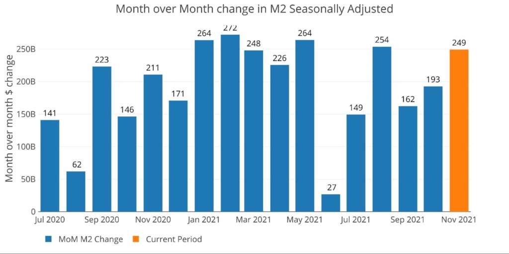
Figure: 1 MoM M2 Change
Comparison to November 1972
Looking at a much longer historical perspective in the chart below shows the YoY growth rate for each November dating back to 1960. The current November clocks in at 13.1% which is behind only Nov 2020 (24.3%) and Nov 1971 (13.4%). The chart below shows this growth rate (bars) alongside CPI (black line) and the Fed Funds Rate (blue line).
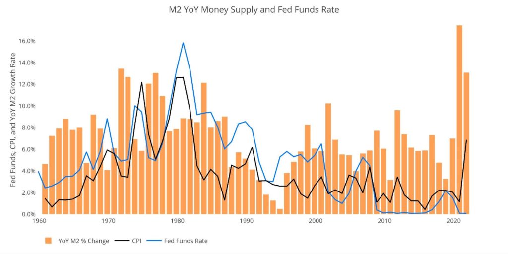
Figure: 2 MoM M2 Change
As shown above, 1973 and 1974 is when inflation really took off, after two years of significant increases in the Money Supply. From 1969-1972 M2 annual increases were: 4.1%, 6.1%, 13.4%, and 12.7%. The 1969-1972 M2 setup looks quite similar to the 2018-2021 setup in the current environment, only this time is more extreme where M2 has grown: 3.3%, 7.0%, 24.3%, and 13.1%.
While the M2 growth looks similar, the current actions by the Fed do not. Unfortunately, the current Fed is way behind the Fed of Nov 1972. While Money Supply was growing at 12.7% in 1972, the Fed Funds rate was set at 5.1% against a CPI of 3.4%. In the current environment, with M2 growing at 13.1%, the Fed Funds rate is still at 0% while CPI is closing in on 7%.
In 1972, before inflation really spiraled out of control (and the CPI had been completely doctored), real interest rates were actually positive by 1.7%. Compare that to today where real interest rates are -6.88%! So, while money supply was growing at about the same aggressive YoY 13% growth, the difference in real rates from 1972 to 2021 is -8.58%. Forget being behind the curve, the Fed isn’t even on the same planet!
Simple math tells you why: higher interest payments would blow a hole through the Federal budget and shatter the entire bubble economy. Therefore, the CPI has left the Fed in the dust, resulting in the largest negative real interest rates in the last 60 years by a wide margin!
The Fed can keep hoping inflation will come back down, but history shows it requires the Fed to actually stand and fight (notice in the chart how the blue line stayed above the black line). But as Peter Schiff says, “The Fed won’t even enter the ring”.
Getting Back to the Current Money Supply
The table below shows the change in M2 over different period lengths. All numbers have been annualized for consistency. As can be seen, the growth in M2 is accelerating compared to the recent 6-month, 1 year, and 3-year average growth rates. At the current rate, M2 will eclipse $22T in about 2.5 months!
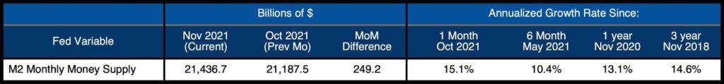
Figure: 3 M2 Growth Rates
M2 used to be published weekly, so the chart below shows the noisier weekly data that is not seasonally adjusted by the Fed (the chart and table above are seasonally adjusted).
The most recent week available, ending Dec. 6, showed growth of $144B. Growth has been positive for the last 6 weeks in a row, the longest such stretch since April.
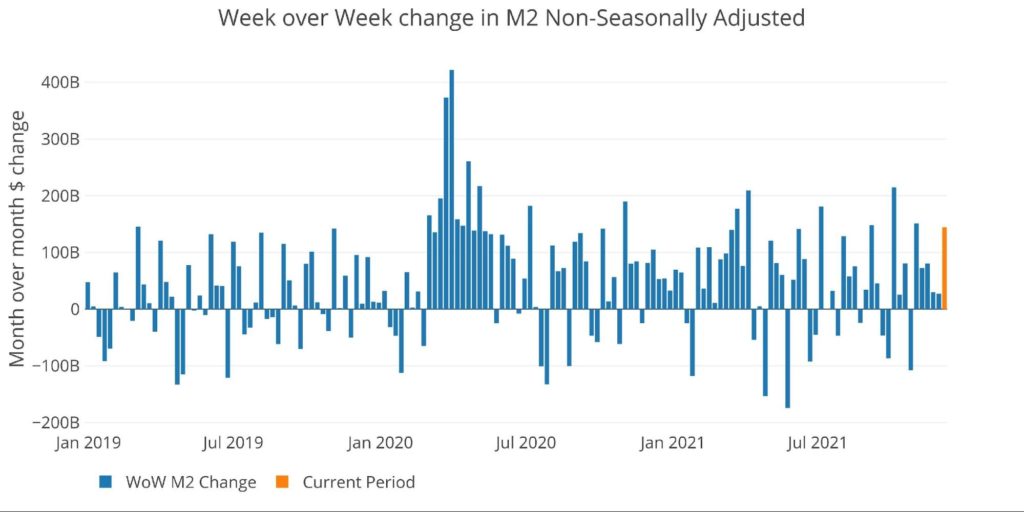
Figure: 4 WoW M2 Change
The “Wenzel” 13-week Money Supply
The late Robert Wenzel of Economic Policy Journal used a modified calculation to track Money Supply. He used a trailing 13-week average growth rate annualized as defined in his book The Fed Flunks. He specifically used the weekly data that was not seasonally adjusted.
The objective of this analysis is to normalize the choppy data and get a better sense of the general Money Supply trend. In the table below, decelerating trends are in red and accelerating trends in green. Money Supply growth on a 13-week annualized basis has now been accelerating for 12 weeks in a row.


Figure: 5 WoW Trailing 13-week Average Money Supply Growth
The plot below helps show the seasonality of the Money Supply and compare the current year to previous years. The range of the y axis has been capped at 25% so that the massive spike in 2020 up to 60%+ does not skew the graph.
As shown, the current year is now on par with 2020. Is this a new normal? Money Supply will have to keep growing at higher rates to keep a floor under the market. Even if the Fed tapers, Money Supply may continue growing at above-average rates.
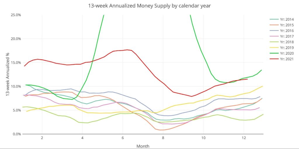
Figure: 6 Yearly 13-week Overlay
Historical Perspective
The charts below are designed to put the current trends into historical perspective. The orange bars represent annualized percentage change rather than raw dollar amount. As can be seen, even the recent periods remain quite elevated compared to pre-Covid.
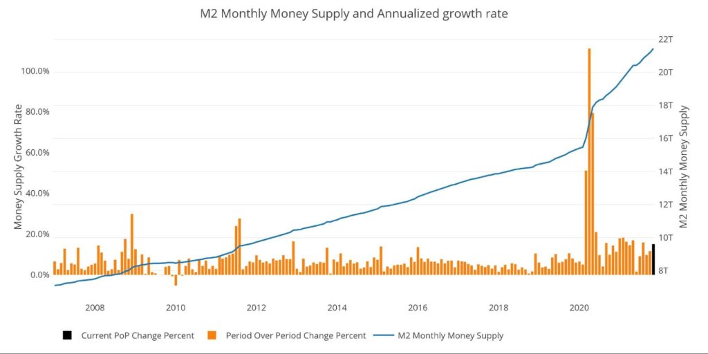
Figure: 7 M2 with Growth Rate
Taking a historical look at the 13-week annualized average also shows the unprecedented growth seen over the past 18 months. This chart overlays the log return of the S&P. Mr. Wenzel proposed that large drops in Money Supply could be a sign of stock market pullbacks.
His theory, derived from Murray Rothbard, states that when the market experiences a shrinking growth rate of Money Supply (or even negative) it can create liquidity issues in the stock market, leading to a sell-off. While not a perfect predictive tool, many of the dips in Money Supply precede market dips. Specifically, the major dips in 2002 and 2008 from 10% down to 0%.
It could also be argued the pullback in 2018 could be due to an extended lead up of low Money Supply growth compared to previous years. More recently, Money Supply dipped over the summer, and the market stalled out shortly thereafter. It wasn’t until Money Supply started to pick back up in the fall when the market was able to make new all-time highs.
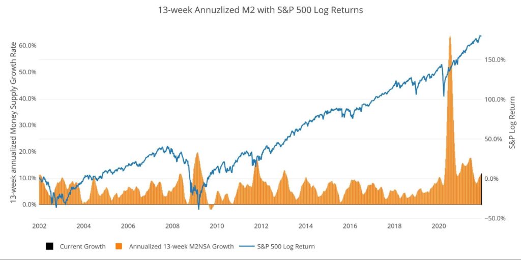
Figure: 8 13-week M2 Annualized and S&P 500
Finally, it is important to consider the massive liquidity buildup in the system. The Fed offers Reverse Repurchase Agreements (reverse repos). Essentially this is a tool that allows financial institutions to swap cash for instruments on the Fed balance sheet.
Current Reverse Repo hit a record $1.75T on Dec 20, dwarfing the old records of ~$500B in 2016-2017. The latest rate is $1.63T, but this could climb rapidly in the next 3 days as quarter-end approaches. The reverse repos typically top out at quarter-end before coming back down rapidly. However, unlike past periods, the recent pullbacks after quarter-end are much smaller in magnitude, staying elevated throughout the quarter. This shows the massive liquidity difference in the current environment.
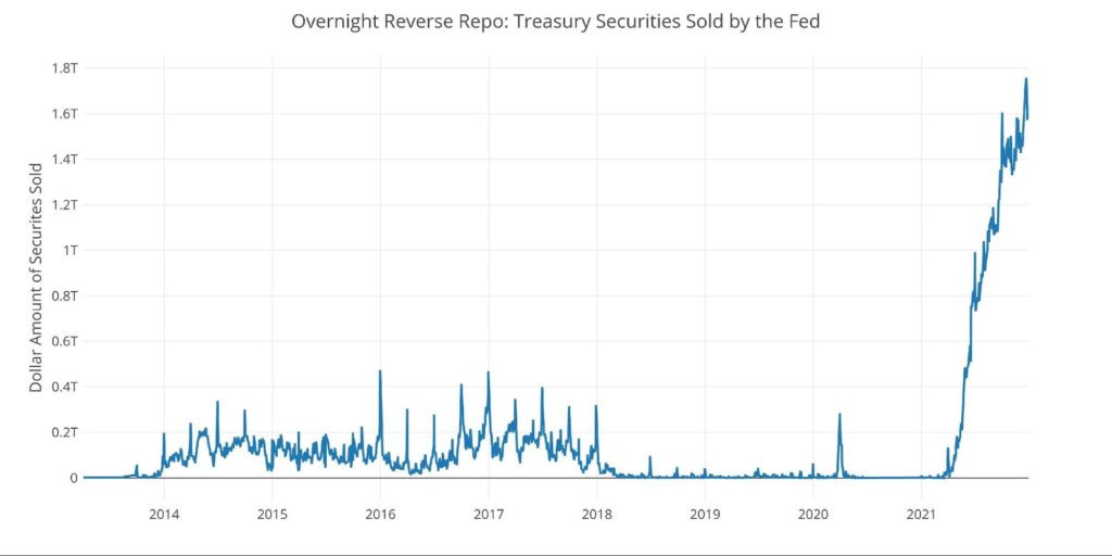
Figure: 9 Fed Reverse Repurchase Agreements
What it means for Gold and Silver
Inflation is an expansion of the Money Supply that generally leads to higher prices. Therefore, gold and silver can be used as insurance assets to protect against dollar devaluation (higher prices). Money Supply has been growing at alarming rates for years, and absolutely exploded over the last 2 years. This has started to show up in the highly doctored CPI.
Considering the massive expansion seen in M2, it was easy to predict the Fed’s “transitory” narrative would prove false. They appear to be the only ones who didn’t see that as a possibility. Is it still possible that inflation gets back under 2%? Possibly, but it doesn’t look probable. Looking at how things unfolded in the 1970s and the similar lead-up, wealth preservation with precious metals may be something to consider.
Data Source: https://fred.stlouisfed.org/series/M2SL and also series WM2NS and RRPONTSYD. Historical data changes over time so the numbers of future articles may not match exactly. M1 is not used because the calculation was recently changed and backdated to March 2020, distorting the graph.
Data Updated: Monthly on fourth Tuesday of the month on 3-week lag
Most recent data: Dec 06, 2021
Interactive charts and graphs can always be found on the Exploring Finance dashboard: https://exploringfinance.shinyapps.io/USDebt/

Call 1-888-GOLD-160 and speak with a Precious Metals Specialist today!
Buka akaun dagangan patuh syariah anda di Weltrade.
Source link